


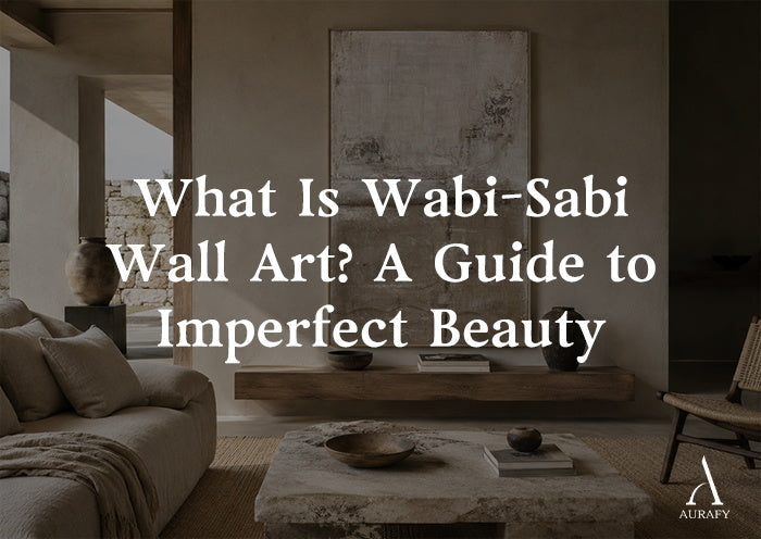
What Is Wabi-Sabi Wall Art? A Guide to Imperfect Beauty

Wabi-sabi wall art is contemporary art shaped by a Japanese appreciation of simplicity, impermanence, natural variation, and the marks of time. It often uses restrained compositions and tactile materials, but it is not defined by beige color, rough texture, or asymmetry alone. Its meaning comes from how material, process, space, and change work together.
That distinction matters. As wabi-sabi has become a popular interior-design term, it is often reduced to a shopping aesthetic: neutral colors, uneven plaster, and a few organic shapes. Those elements can support a wabi-sabi sensibility, but copying the surface without understanding the idea produces a look rather than a meaningful object.
This guide explains what wabi-sabi means in art, how to recognize its qualities, and how to choose a piece that feels considered rather than trend-driven.
What Does Wabi-Sabi Mean?

There is no single visual formula for wabi-sabi. It is better understood as an aesthetic sensibility—a way of noticing value in restraint, irregularity, transience, and objects shaped by use or natural forces.
The terms wabi and sabi developed through different histories before becoming closely associated. In the context of the Japanese tea ceremony, the Metropolitan Museum of Art describes wabi as an aesthetic that values austerity, spontaneity, and apparent artlessness. Tea practitioners found artistic merit in humble ceramics whose forms, clay, ash, and firing created unpredictable colors and textures. The value was not simply that the vessels were imperfect; it came from trained attention to particular material qualities and their setting.
Sabi is commonly associated with the beauty that can emerge through age, patina, weathering, and the passage of time. In modern English-language design, the combined term often refers to an appreciation of imperfection and aging. Japan House Los Angeles, for example, summarizes wabi-sabi as an appreciation of imperfection and the beauty of aging.
These concise definitions are useful, but they should not be turned into a rigid checklist. Wabi-sabi is not a license to label every worn, unfinished, or neutral object as culturally authentic.
Is Wabi-Sabi an Art Style or a Philosophy?

Wabi-sabi is best understood as an aesthetic and philosophical lens, not a fixed art style with mandatory colors, techniques, or motifs.
Contemporary retailers use “wabi-sabi wall art” as a practical category. It helps shoppers find art with quiet compositions, tactile surfaces, natural materials, and visible human variation. Yet the commercial label is broader and less precise than the cultural ideas behind it.
This distinction lets you appreciate contemporary work without making exaggerated claims. A newly made abstract plaster painting can be informed by wabi-sabi. It does not become a historical Japanese object simply because it has an uneven surface.
What Makes Wall Art Feel Wabi-Sabi?

No single trait is decisive. The strongest work usually combines several qualities in a coherent way.
Natural or visibly worked materials
Plaster, mineral pigment, raw or lightly primed canvas, handmade paper, wood, and other tactile materials can reveal how a work was made. Tool marks, fibers, layers, and edges become part of the composition rather than flaws to hide.
Material honesty matters more than the material’s name. A printed texture that imitates relief may look attractive, but it creates a different experience from a physically built surface that changes with viewing angle.
Irregularity with intention
Wabi-sabi-influenced art often uses off-center balance, uneven edges, restrained brushwork, or shapes that resist perfect repetition. This does not mean randomness or weak construction. Thoughtful asymmetry still creates visual order; it simply avoids mechanical perfection.
Evidence of process and time
A layered surface can record pressure, drying, abrasion, pigment absorption, or the movement of a tool. Some materials may change subtly over time. These traces make process visible.
Artificial distressing is not automatically meaningful, however. Cracks, stains, or roughness should support the work’s structure and material logic rather than act as decorative shortcuts.
Restraint and negative space
Negative space gives the eye somewhere to rest. A limited number of forms can make small differences in texture, edge, and tone more noticeable.
This is why wabi-sabi wall art can feel calm without being empty. The goal is not to remove all detail, but to make each detail carry more weight.
Muted color relationships
Warm white, stone, clay, brown, charcoal, gray, muted green, and soot black frequently appear in wabi-sabi-inspired interiors. They echo materials found in earth, wood, paper, ash, and weathered surfaces.
They are common choices, not rules. A restrained blue, red, or deeper black can work when its saturation, undertone, and relationship to the material remain deliberate. Wabi-sabi is not another name for beige décor.
Incompleteness and open interpretation
An interrupted line, unresolved edge, or partially obscured form can invite slower viewing. The work leaves room for the viewer rather than explaining everything at once.
This does not mean every defect is beautiful. Wabi-sabi encourages attention and discernment, not an automatic celebration of damage or neglect.
Core Characteristics at a Glance
|
Principle |
How it may appear in wall art |
What it does not necessarily mean |
|
Simplicity |
Limited forms, colors, or gestures |
Empty, generic, or unfinished work |
|
Asymmetry |
Off-center balance and varied edges |
Careless composition |
|
Material honesty |
Visible fibers, layers, tool marks, or grain |
Any rough-looking surface |
|
Time and change |
Patina, fading, wear, or process traces |
Artificial damage for effect |
|
Negative space |
Areas that allow visual breathing room |
A blank canvas with no structure |
|
Muted color |
Low-saturation, material-led relationships |
Beige as a mandatory palette |
|
Handmade variation |
Small differences created by human process |
Proof of cultural authenticity |
The most useful test is this: convincing wabi-sabi art develops meaning through the relationship between material, process, restraint, and time—not through any one color or texture.
Wabi-Sabi Compared with Similar Design Labels

Several popular interior styles overlap visually with wabi-sabi. Their meanings are not interchangeable.
|
Label |
Shared qualities |
Important difference |
|
Japandi |
Restraint, natural materials, uncluttered space |
A contemporary Japanese-Scandinavian design language that is often cleaner and more controlled |
|
Minimalist art |
Limited elements and strong negative space |
Does not necessarily value patina, material change, or imperfection |
|
Organic modern |
Natural forms and materials in contemporary rooms |
Has no necessary connection to wabi-sabi’s Japanese cultural context |
|
Rustic art |
Handmade character, weathering, and natural materials |
Can be more decorative, nostalgic, or visually busy |
You can mix these approaches successfully. The point of the distinction is not to police a room’s style; it is to make more accurate choices and avoid treating every neutral artwork as the same thing.
Seven Common Misconceptions
1. “Wabi-sabi means beige.” Beige is one possible color family, not the definition.
2. “Any distressed artwork is wabi-sabi.” Surface damage without material or compositional purpose is simply distressing.
3. “Wabi-sabi and minimalism are identical.” Both may use restraint, but wabi-sabi places greater emphasis on impermanence, material variation, and time.
4. “Imperfection excuses poor workmanship.” Intentional irregularity still requires sound materials, construction, and artistic judgment.
5. “The art must be antique or made in Japan.” Contemporary artists anywhere can make work informed by wabi-sabi, provided they describe it accurately and respectfully.
6. “The entire room must follow one style.” A single well-chosen piece can add quiet texture to a modern, organic, or eclectic interior.
7. “Wabi-sabi celebrates neglect.” Aging and impermanence are not excuses to ignore unsafe damage or necessary care.
Where Does Wabi-Sabi Wall Art Work Best?

Wabi-sabi wall art can work in many rooms because it is more about visual relationships than a prescribed setting.
In a living room, one tactile focal piece can balance clean furniture and open wall space. In a bedroom, restrained contrast and low visual complexity can support a quieter atmosphere without making wellness promises. An entryway lets visitors see fine surface detail at close range, while a dining room gives textured art changing ambient light across the day. In a small apartment, one intentional work often feels calmer than a dense collection of competing pieces.
Use the room’s existing visual activity as a guide:
· If the room already contains several patterns, choose quieter surface variation.
· If the room is very neutral, consider deeper relief or controlled dark contrast.
· If the viewing distance is short, prioritize fine material detail over monumental scale.
· If the wall is wide, compare one large canvas with a diptych before adding several unrelated works.
Room-specific sizing, lighting, installation, and care deserve their own guides. Keeping them separate prevents a foundational article like this one from repeating the same advice in every section.
How to Choose Wabi-Sabi Wall Art

Use this seven-point checklist before buying:
1. Define the visual need. Decide whether the room needs a focal point, warmer material, stronger balance, or subtle texture.
2. Measure the real space. Record wall width, nearby furniture width, viewing distance, and any obstructions.
3. Check the construction. Confirm the support, surface material, depth, weight, and fragility.
4. Study more than the front image. Look for close-ups, side views, edges, the back, and images under different angles of light.
5. Look for evidence of authorship. An artist profile, process images, material notes, and clear customization limits are more useful than vague “handmade” claims.
6. Review practical terms. Understand framing, hanging hardware, packaging, delivery, return, and care requirements before ordering.
7. Choose for continued attention. Ask whether the piece rewards slow looking or merely matches a current trend.
If available, request a room mockup or size preview. It will not reproduce texture perfectly, but it can reveal whether the work’s scale and contrast fit the wall.
How to Spot a Generic Imitation

Begin with evidence rather than price. Repeated digital textures across many listings, identical “one-of-a-kind” images, and vague material descriptions deserve closer inspection.
Ask whether the texture is physically built or printed. Request close-ups of the surface and edges, process photographs, the artist’s or studio’s name, and an explanation of what customization changes are actually possible. For large work, also ask how the surface is protected during shipping.
Handmade status alone does not prove cultural authenticity, artistic quality, or durability. It is one piece of evidence within a larger evaluation.
Frequently Asked Questions
What does wabi-sabi mean in art?
In art, wabi-sabi refers to an appreciation of restraint, imperfection, transience, and material qualities shaped by process or time. It is not a fixed technique. The idea may appear through asymmetry, patina, natural variation, simplicity, or open space, but no single feature defines it.
Is wabi-sabi an art style?
Not in the strict sense. Wabi-sabi is better understood as a Japanese aesthetic and philosophical sensibility. “Wabi-sabi art” is a useful modern category for work informed by that sensibility, but it should not be treated as a formal style with mandatory colors and materials.
What colors are used in wabi-sabi wall art?
Common colors include warm white, stone, clay, brown, gray, muted green, and black. These tones often relate naturally to plaster, earth, wood, paper, and ash. They are not requirements; material honesty and balanced color relationships matter more than a fixed neutral palette.
Does wabi-sabi art have to be handmade?
No, although a handmade process can create meaningful variation and visible evidence of the maker’s decisions. A work should be judged by its material, composition, authorship, and accuracy of description. “Handmade” alone does not establish cultural authenticity or artistic quality.
Is wabi-sabi the same as Japandi?
No. Japandi is a contemporary design approach that combines Japanese and Scandinavian influences. It often shares natural materials and restraint with wabi-sabi, but it tends to emphasize clean functionality. Wabi-sabi places more attention on impermanence, irregularity, and the effects of time.
Can modern abstract art be wabi-sabi?
Modern abstract art can be informed by wabi-sabi when material, process, restraint, and irregularity are central to the work. It is more accurate to describe such art as “wabi-sabi-inspired” than to imply that every neutral abstract painting represents the full cultural tradition.
How can I tell whether textured wall art is printed or handmade?
Look at side-angle images, edges, shadows, and surface close-ups. Physical relief changes with viewing angle, while printed texture remains visually flat. Ask the seller for material details, process photographs, and confirmation of whether raised areas are built by hand or digitally reproduced.
Choose Slowly, Then Look Closely

Wabi-sabi wall art is not defined by a fashionable palette or a rough finish. Its depth comes from a thoughtful relationship among imperfection, restraint, natural material, human process, and time.
Choose a piece slowly. Examine how it was made, how honestly it is described, and what it contributes to the room beyond color matching. The right work should continue to reveal small differences long after the trend label has faded.
If you are comparing pieces, begin with material, scale, and close-up surface detail. Then request a room preview or explore a curated collection that provides clear information about authorship, construction, and delivery.
Share:
How to Build a Full-Home Minimalist Abstract Art Collection
Wabi-Sabi vs. Japandi Wall Art: Key Differences Explained