


Wabi-Sabi Colors: Beige, Gray & Earth Art

Direct Answer: What Colors Define Wabi-Sabi Wall Art?

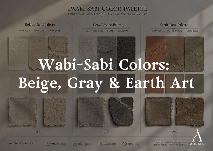
A neutral wabi sabi wall art color palette is built around quiet, natural tones that reflect the appearance of earth, stone, clay, wood, and other organic materials.
Rather than relying on bold decorative colors, neutral wabi sabi wall art emphasizes subtle texture, natural materials, and harmonious relationships between artwork and interior finishes.
Common colors found in wabi-sabi interiors include:
raw clay beige
warm sand
weathered grey
muted charcoal
soft chalk white
earthy terracotta
faded olive
The defining quality is not one specific color. It is restraint.
Wabi-sabi colors usually avoid overly bright or artificial-looking tones. Instead, they create depth through subtle variation, natural undertones, and the feeling that the colors could exist in the materials around us.
A wabi-sabi room does not need to be entirely beige or neutral. The focus is on creating a relationship between color, texture, and material character.
Neutral Palette Compatibility Guide

If you are choosing beige wall art or brown abstract art, understanding how different neutral undertones interact with your walls can make selecting artwork much easier.
|
Wall Color / Undertone |
Artwork Color Direction |
Material Inspiration |
Design Purpose |
|
Warm ivory or cream |
Clay beige, sandstone, soft brown |
Raw earth, aged plaster, natural stone |
Adds warmth while maintaining a calm atmosphere |
|
Cool limestone or grey |
Slate, charcoal, ash tones |
Concrete, stone, mineral surfaces |
Creates a quiet architectural connection |
|
Warm greige or taupe |
Oat, chalk white, muted terracotta |
Clay, linen, weathered ceramics |
Creates organic balance |
|
Soft olive or forest tones |
Pale mineral tones, muted ochre, warm grey |
Weathered wood, moss, natural landscapes |
Adds contrast while keeping a grounded feeling |
Use this as a starting point rather than a strict formula. Wall colors can shift significantly depending on lighting, surrounding materials, and paint undertones.
Warm vs. Cool Neutrals in Wabi-Sabi Art

Warm Neutrals: Beige, Clay, and Terracotta
Warm neutrals are often used to introduce softness into spaces with cooler architectural materials.
Beige wall art is one of the most versatile choices because it blends naturally with wood, linen, stone, and plaster while maintaining the understated feeling associated with neutral wabi sabi wall art.
A clay-toned or sandstone-inspired artwork can work especially well with:
concrete floors
metal details
pale plaster walls
neutral upholstery
The purpose is not to add strong color contrast. Instead, warm earth tones create a sense of connection between the artwork and natural materials already present in the room.
Cool Neutrals: Grey, Slate, and Charcoal
Cool neutrals can help balance rooms that already contain warm elements such as:
oak furniture
linen fabrics
natural wood finishes
A grey or charcoal artwork can introduce visual grounding while maintaining the quiet atmosphere associated with wabi-sabi interiors.
Cool neutrals are especially effective when the goal is a more architectural or minimalist interpretation of wabi-sabi.
Why Low-Saturation Colors Work Well in Wabi-Sabi Interiors

Wabi-sabi spaces often feel calm because they avoid excessive visual intensity.
Muted colors generally create a softer relationship with surrounding materials than highly saturated colors. A matte earth-toned artwork may also feel more integrated into a room because it does not rely on strong gloss or artificial brightness to attract attention.
Surface finish matters as much as color.
For example:
matte mineral surfaces tend to create a quieter appearance
glossy finishes can introduce stronger reflections
subtle texture can add depth without adding visual noise
The combination of restrained color and natural texture is what often gives wabi-sabi artwork its timeless quality.
Room-by-Room Wabi-Sabi Color Selection

Entryway: Grounded Transitional Tones
Entryways connect the outside world with the interior of the home.
Medium earth tones often work well here:
weathered grey
muted brown
soft charcoal
natural stone shades
These colors create a calm transition without making the first impression feel overly dramatic.
Living Room: Layered Earth Neutrals
Living rooms usually contain a wider range of materials and textures, so artwork can incorporate more tonal variation.
Suitable combinations include:
oat and clay
warm grey and charcoal
sandstone and muted terracotta
These palettes can connect with sofas, wood furniture, rugs, and natural fabrics without competing with them.
Together, these combinations create a balanced neutral color palette that feels calm, layered, and timeless.
Bedroom: Softer, Lower-Contrast Colors
Bedrooms often benefit from quieter artwork choices.
Gentler combinations include:
pale sand
chalk white
soft beige
light mineral grey
The goal is not to remove personality, but to create a visual environment where textures and materials remain easy to appreciate.
This approach makes beige wall art for cream walls especially effective because the gentle tonal difference creates depth without overwhelming the bedroom.
Choosing Wabi-Sabi Artwork by Material Relationship

Choosing neutral wabi sabi wall art becomes much easier when you look at the materials already present in your room.
With Wood Furniture
Wood naturally pairs well with:
clay tones
warm grey
charcoal
muted earth colors
The artwork does not need to match the wood exactly. A shared natural feeling is usually more effective than exact color matching.
With Linen and Natural Fabrics
Linen, cotton, and woven textiles already contain subtle irregularities.
Artwork with:
soft texture
mineral tones
gentle color variation
can reinforce the same tactile quality.
With Stone, Concrete, and Plaster
Cool architectural surfaces often benefit from artwork that introduces warmth or organic variation.
For example:
terracotta against grey plaster
warm beige against concrete
charcoal against pale stone
These combinations create contrast while keeping the overall material language consistent.
Understanding Wabi-Sabi Beyond Beige Interiors

One of the most common misunderstandings is that wabi-sabi simply means beige decoration.
It does not.
Many homeowners ask what colors are wabi sabi. While beige is often associated with the style, authentic wabi-sabi embraces a wider range of earthy, muted colors connected to natural materials.
Wabi-sabi is a Japanese aesthetic sensibility connected with imperfection, impermanence, simplicity, and appreciation of natural change.
Color is only one part of the idea.
A wabi-sabi interior can include:
dark charcoal
muted green
earthy red
natural brown
stone grey
What matters is not whether the color is neutral, but whether it feels connected to authentic materials and avoids unnecessary artificiality.
Frequently Asked Questions
What colors are used in wabi-sabi wall art?
Common wabi-sabi colors include beige, clay, sandstone, grey, charcoal, chalk white, muted terracotta, and other low-intensity earth tones inspired by natural materials.
Does neutral wabi sabi wall art have to be beige?
No. Beige is common, but wabi-sabi is not defined by one color. The style can include many natural tones as long as they support simplicity, material awareness, and visual harmony.
What is the difference between warm grey and cool grey artwork?
Warm grey usually contains subtle beige or brown undertones and pairs well with wood and natural fabrics. Cool grey often leans toward stone, concrete, or metal environments.
The difference is easiest to see when both colors are compared in the same lighting conditions.
Can wabi-sabi art include darker colors?
Yes. Charcoal, deep brown, and muted earth reds can work well in wabi-sabi interiors when they maintain a natural, understated appearance.
What is the best neutral wall art color guide?
A simple neutral wall art color guide is to begin with your wall color and dominant materials. Cream walls usually pair well with beige and warm earth tones, grey walls often complement charcoal and slate, while wood interiors work beautifully with clay, sand, and muted brown artwork.
How do I choose neutral artwork that does not disappear into my wall?
Look for a difference in tone, texture, or surface quality rather than only a different color.
For example, a textured warm-grey artwork against a cream wall may remain visually distinct because the surface creates depth and variation.
Finding the Right Wabi-Sabi Color Palette for Your Space

Choosing neutral wabi sabi wall art is not only about selecting a color. The most successful pieces connect with the room’s existing materials, lighting, and atmosphere to create earthy wall decor within a balanced neutral color palette.
A well-chosen artwork should feel like part of the environment rather than an isolated decoration.
If you are deciding between beige, grey, earth-tone, or darker wabi-sabi artwork, share your wall color, furniture materials, and room photos. A tailored recommendation can help identify the right palette, scale, and texture for your interior.
Share:
Handmade vs. Mass-Produced Wabi-Sabi Art
Black Wabi-Sabi Art: Adding Depth Without Darkening Rooms