


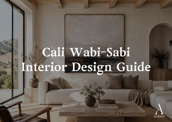
Cali Wabi-Sabi Interior Design Guide

What Is Cali Wabi-Sabi?

Cali wabi-sabi is a contemporary interior design interpretation that combines the Japanese aesthetic appreciation of natural imperfection with California’s relaxed, light-filled approach to living. When people ask what is cali wabi sabi, the simplest answer is that it blends wabi-sabi's appreciation of natural imperfection with California's relaxed, light-filled way of living.
It is not a traditional Japanese design category. Instead, it is a modern styling direction that became more visible in interior trends during the 2010s and 2020s, especially through social media, residential design publications, and the growing popularity of warm minimalist interiors.
The style typically combines: This mix is often described as warm minimalism, where restraint is softened by tactile materials, sun-washed tones, and an easy sense of comfort.
· natural materials
· warm neutral colors
· handmade textures
· indoor-outdoor influences
· relaxed, uncluttered spaces
Compared with darker, more rustic interpretations of wabi-sabi, Cali wabi-sabi usually feels brighter and more open, using sunlight, pale wood, linen, and mineral textures as its main visual language. That brighter mood is closely related to California casual decor, which favors pale woods, linen, natural light, and spaces that feel collected rather than overly styled.
Cali Wabi-Sabi vs Traditional Wabi-Sabi
While they share some ideas, they are not identical.
|
Design Element |
Traditional Wabi-Sabi Influence |
Cali Wabi-Sabi Interpretation |
|
Main idea |
Appreciation of imperfection, simplicity, and natural change |
A lighter contemporary expression using natural materials and relaxed comfort |
|
Color direction |
Earth, charcoal, muted clay, aged tones |
Sand, cream, beige, soft terracotta, pale wood |
|
Materials |
Aged wood, handmade ceramics, raw stone |
Linen, travertine, light oak, plaster, woven textures |
|
Atmosphere |
Quiet, contemplative, rustic |
Warm, open, casual, sun-filled |
|
Artwork style |
Organic texture and visible craftsmanship |
Large neutral textured pieces with softer warmth |
Cali wabi-sabi keeps the appreciation for authenticity but adapts it to brighter contemporary homes.
The Core Elements of Cali Wabi-Sabi Style

1. Natural Materials With Visible Texture
The style relies on materials that show their natural character. This material-first approach also connects with the broader earthy interior trend, where texture and honest finishes create visual warmth without adding clutter.
Common choices include:
· light oak
· travertine
· linen
· clay ceramics
· limewashed walls
· textured plaster
The goal is not perfect uniformity. Small variations in grain, surface, and tone help create a more natural appearance.
2. A Warm Neutral Color Palette
Cali wabi-sabi interiors usually avoid strong saturated colors.
Common tones include:
· warm ivory
· sand
· oat
· beige
· soft taupe
· muted terracotta
· pale sage
These colors work because they allow texture to become the main visual feature rather than relying on bold decoration.
3. Relaxed Forms Instead of Sharp Formality
Furniture and decoration often feel comfortable rather than rigid.
Typical characteristics include:
· low-profile seating
· rounded furniture edges
· soft textiles
· handmade accessories
· fewer but larger decorative elements
The room feels collected and natural rather than highly styled.
Choosing Wabi-Sabi Art for a Cali Interior

A suitable artwork should support the room’s balance between warmth and simplicity. For cali wabi sabi wall art, pieces with soft mineral tones, visible handwork, and subtle surface depth usually feel most at home.
Choose Large-Scale Texture
Large walls often benefit from one strong artwork rather than many small decorative pieces.
Textured plaster or mineral artwork can introduce: In this setting, textured wall art, works best when the surface adds quiet movement rather than becoming the loudest object in the room.
· handmade surface variation
· subtle shadow changes
· organic movement
Match the Room’s Material Language
For a Cali wabi-sabi home, artwork often works best when it connects visually with existing materials. This is especially useful when shaping a warm wabi sabi living room, where the artwork should echo the room's light, wood tones, plaster, and textiles without matching them exactly.
Examples:
Limewashed walls
· chalk white
· soft beige
· mineral grey textures
Travertine or stone surfaces
· sand
· clay
· warm ivory tones
Light wood interiors
· oat
· muted earth colors
· natural plaster textures
The artwork does not need to match exactly. It should feel like it belongs to the same material environment.
Cali Wabi-Sabi Room Checklist
|
Element |
Typical Direction |
|
Walls |
Limewash, plaster, warm matte neutrals |
|
Seating |
Linen, bouclé, relaxed silhouettes |
|
Tables |
Light oak, travertine, natural stone |
|
Artwork |
Large-scale neutral textured artwork |
|
Accessories |
Handmade ceramics, woven materials, natural branches |
How to Avoid Making Cali Wabi-Sabi Feel Artificial
Cali wabi-sabi works best when it avoids excessive decoration.
Avoid:
· filling every wall with artwork
· using too many matching beige objects
· adding artificial “aged” finishes everywhere
· mixing too many competing textures
Instead:
· choose fewer meaningful pieces
· allow empty space
· let natural materials provide variation
The style depends on restraint.
Frequently Asked Questions
Is Cali wabi-sabi a traditional Japanese style?
No. Cali wabi-sabi is a contemporary design interpretation that combines wabi-sabi influences with California-inspired interiors. Traditional wabi-sabi is a broader Japanese aesthetic sensibility rather than a specific room style.
What colors are used in Cali wabi-sabi interiors?
Common colors include warm white, cream, sand, beige, oat, soft taupe, and muted terracotta. The palette usually stays natural and low contrast.
What kind of wall art works with Cali wabi-sabi?
Large textured artwork with neutral mineral tones, organic shapes, and visible handmade qualities often complements this style.
How is Cali wabi-sabi different from Japandi?
Japandi combines Japanese and Scandinavian design influences, often emphasizing clean structure and functional simplicity. Cali wabi-sabi places more emphasis on warm sunlight, relaxed materials, and organic texture.
Discover Warm Textured Artwork

Cali wabi-sabi interiors rely on the relationship between light, material, and texture. In practice, cali wabi sabi works best when these elements feel relaxed, tactile, and connected rather than deliberately themed.
Explore neutral textured artwork collections designed for warm minimalist homes, or share your wall dimensions to find a piece suited to your space.
Share:
Wabi-Sabi vs Zen Design Explained
Can Wabi-Sabi Art Make a Room Feel Calm?