


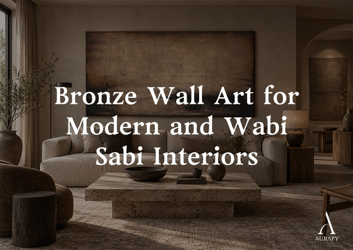
Bronze Wall Art for Modern and Wabi Sabi Interiors

Bronze wall art for modern interiors works because it sits between two effects that most metallics can't hold at once: it reads as warm and grounded like an earth tone, yet it catches light with the quiet shimmer of a true metallic. That dual nature is what lets a single bronze piece move between a pared-back modern living room and a textured, imperfect Wabi Sabi space without looking out of place in either. This guide walks through when bronze leans earthy versus luxurious, how to pair it with umber and charcoal, how light changes its texture, and how to choose scale and placement so the piece actually does the job you're hanging it for.
Why Bronze Sits Between Modern and Wabi Sabi

Most metallic wall art falls into one of two camps. Polished gold, chrome, and silver read as overtly decorative and often lean toward maximalism or glam styling. Matte black and unfinished raw materials read as industrial or rustic. Bronze occupies a narrower, more useful middle ground. Its base tone is brown, not yellow or gray, so it behaves visually more like a rich earth pigment than a shiny accent. At the same time, the metallic particles in a bronze finish still catch and bounce light, giving the surface a depth that flat brown paint cannot replicate.
This is exactly the tension that Wabi Sabi design is built on: imperfection paired with quiet richness, humble materials treated with care. A hand-applied textured bronze finish, like the kind used in burnished and patina-style pieces, has visible variation across the surface rather than a uniform sheen. That irregularity is what keeps bronze from tipping into "luxury metallic" territory and instead lets it feel earthy, tactile, and lived-in.
When Bronze Reads Earthy Versus Luxurious

The same bronze pigment can present very differently depending on three factors: finish texture, surrounding palette, and lighting.
Bronze reads earthy when:
- The finish is matte to low-sheen with visible brushwork or texture, rather than smooth and reflective.
- It is paired with warm neutrals such as umber, taupe, or espresso rather than crisp white or black.
- The room already has organic materials nearby, like raw wood, linen, or stone.
Bronze reads luxurious when:
- The finish has more polish or contrast, so the metallic flecks stand out against a darker ground.
- It is placed against cooler, more minimal backdrops like charcoal or graphite walls.
- It is the singular accent in an otherwise restrained room, rather than one of several textured elements.
Neither reading is better. The point is to know which effect a room calls for before choosing a piece, because bronze abstract wall art with heavy texture and umber undertones will not deliver the same mood as a smoother, higher-contrast bronze painting.
Pairing Bronze with Umber and Charcoal

Umber and charcoal are the two anchor tones that make bronze wall art for living rooms and bedrooms feel intentional rather than incidental.
Bronze and Umber
Umber, especially espresso-leaning umber, is bronze's most natural partner because the two sit close together on the warm end of the spectrum. This pairing softens the metallic quality of bronze and pushes it toward the earthy end of the scale. It works well in rooms with wood flooring, tan or camel upholstery, or existing brown and terracotta accents. This is the direction of pieces like Terra Meridian Painting-Burnished Bronze & Espresso Umber-AURA014, which combines burnished bronze with espresso umber in a Wabi Sabi abstract composition. In a room already built on warm neutrals, this kind of bronze and brown wall art doesn't introduce a new color story, it deepens the one already there.
Bronze and Charcoal
Charcoal does the opposite job. Because it's cool and dark, it creates contrast against bronze's warmth, which sharpens the metallic quality and pushes the piece toward a more modern, slightly more luxurious feel. This pairing suits rooms with darker furniture, matte black fixtures, or a monochrome palette that needs one warm break. Charcoal walls in particular make bronze textured art feel like a deliberate focal point rather than a blend-in accent, since the piece has nowhere to visually recede.
A useful rule of thumb: if the room's existing palette is mostly warm, use bronze to reinforce that warmth through umber tones. If the room is mostly cool or neutral-dark, use bronze as the contrast point against charcoal or graphite.
How Daylight and Warm Artificial Light Change Bronze's Texture

Bronze is more light-sensitive than flat-colored art, and this matters more for metallic pieces than for almost any other wall art category.
In daylight, especially indirect north-facing light, bronze tends to look cooler and more subdued. The metallic particles catch less direct light, so the surface reads closer to a deep brown or taupe with occasional glints. This makes daylight useful when judging whether a bronze piece will genuinely coordinate with your existing umber or charcoal furnishings.
Under warm artificial light, such as incandescent bulbs, dimmed halogen, or warm-white LEDs (warm-white lighting), bronze becomes noticeably richer. The warmth of the bulb amplifies the metallic's golden-brown undertones, and hand-applied texture becomes more visible because the raking light across an uneven surface creates small shadows and highlights. This is when a metallic bronze painting looks most dimensional, and it's why bronze wall art is particularly well suited to evening-use rooms like dining rooms, living rooms, and primary bedrooms where warm lighting is already the norm.
Under cool or fluorescent light, bronze can flatten out and lose some of its metallic character, sometimes reading as a dull gray-brown. If a room relies heavily on cool-toned overhead lighting, it's worth adding at least one warm accent lamp near the piece so the texture and metallic depth aren't lost.
Because the same piece can look meaningfully different across these conditions, it's worth viewing product photography in more than one lighting context before deciding on a specific bronze abstract wall art piece, and ideally checking how the piece is lit in its own listing photos.
Scale and Orientation for Bronze Wall Art

Bronze pieces, because of their textured surface, tend to read as more substantial than flat paintings of the same dimensions. This affects how you should think about scale.
Above a sofa or console: A horizontal orientation generally works best, filling roughly two-thirds of the furniture's width. For a standard sofa, this often lands in the 40 to 55 inch range, though larger rooms can support a full-width statement piece up to 110 inches. Terra Meridian Painting-Burnished Bronze & Espresso Umber-AURA014 is offered in a horizontal selector spanning 20x40 up to 55x110 inches, which allows the same burnished bronze and espresso umber composition to scale from a modest console piece to a full sofa-width statement.
As a square focal point: Square formats work well in more symmetrical layouts, such as centered above a fireplace or flanked by matching side tables. The same Terra Meridian piece is also available as a square selector from 28x28 up to 80x80 inches, giving flexibility for anything from a hallway accent to a large-scale living room anchor.
Vertical placement: Narrower walls, stairwells, and spaces beside doorways or windows benefit from vertical orientation, which draws the eye upward and works in tighter footprints. Earthline Depth Canvas-Bronze & Umber Textured Wall Art-AURA070, with its deep chocolate and taupe palette and subtle metallic accents, is offered as a vertical selector from 32x24 up to 90x60 inches, suited to exactly this kind of narrower wall situation.
As a general guideline, oversized bronze pieces suit rooms with restrained surrounding decor, since the texture and metallic depth become the room's main visual event. Smaller or midsize bronze pieces work better when layered among other textured elements, such as woven baskets, unglazed ceramics, or raw wood furniture, which is a common Wabi Sabi styling approach.
A Practical Selection Framework

When narrowing down bronze wall art for a specific room, work through these questions in order:
1. What does the room's existing palette lean toward, warm or cool? Warm rooms favor bronze paired with umber; cool or dark rooms favor bronze paired with charcoal for contrast.
2. What kind of light does the room get most often? Daylight-heavy rooms will show bronze's truer, more subdued undertone. Evening or warm-lit rooms will amplify richness and texture.
3. What wall shape and furniture width are you working with? Match orientation to the space: horizontal over furniture, square for symmetrical focal points, vertical for narrow walls.
4. Do you want bronze to blend or to anchor? Blending calls for a more muted, texture-forward piece like the umber and copper direction of Wabi-Sabi Patina Wall Art-Weathered Copper & Tobacco Umber-AURA017. Anchoring calls for a larger scale or higher-contrast placement, such as bronze against charcoal.
5. How much texture does the rest of the room already have? If the space is already rich in raw materials, a smoother bronze piece prevents visual overload. If the room is sparse, a heavily textured, hand-applied bronze finish adds welcome depth.
Common Mistakes to Avoid

Treating bronze like gold. Bronze is not a substitute for gold leaf or brass accents. Pairing it with cool silvers or high-shine gold hardware often creates a mismatched metallic mix rather than a cohesive palette.
Ignoring the room's dominant light source. Choosing a bronze piece based only on daytime photos, then hanging it in a room lit mostly by warm evening lamps, can lead to a surprisingly different final look. Always consider both conditions.
Undersizing above large furniture. A small bronze piece over a large sofa or sideboard tends to look like an afterthought. Bronze's texture needs enough surface area to actually register from normal viewing distance.
Overcrowding a Wabi Sabi space. Wabi Sabi design relies on restraint. Adding a heavily textured bronze piece to a wall that already has several other textured objects can tip a calm room into visual clutter. Let the bronze piece be one of a few, not one of many.
Mismatching undertones. Not all "bronze" reads the same. Some pieces lean more copper or reddish, like the weathered copper and tobacco umber direction of Wabi-Sabi Patina, while others lean deeper brown, like Earthline Depth's chocolate and taupe base. Check undertones against your existing wood and metal finishes before purchasing.
Conclusion

Bronze wall art earns its place in modern and Wabi Sabi interiors precisely because it refuses to commit fully to either category. Paired with umber, it settles into an earthy, grounded role. Paired with charcoal, it sharpens into something closer to understated luxury. Its appearance shifts further depending on whether it's viewed in daylight or under warm evening light, which makes lighting conditions as important as color palette when choosing a piece. Getting scale and orientation right, whether that's a horizontal statement above a sofa, a square anchor over a fireplace, or a vertical piece for a narrower wall, ensures the texture and metallic depth that make bronze distinctive actually have room to be seen.
Frequently Asked Questions
Does bronze wall art work in a small living room?
Yes, particularly in a vertical or smaller square format. A smaller bronze piece with visible texture can still read as substantial because the metallic finish adds depth without requiring large physical dimensions.
Is bronze wall art too dark for a room with little natural light?
Not necessarily. Rooms with limited daylight often rely on warm artificial lighting, which tends to enrich bronze tones and highlight texture. Bronze can actually perform better in these rooms than flatter, non-metallic art.
Can bronze wall art work with black and white color schemes?
Yes. Bronze paired with charcoal or black creates a strong contrast that reads as modern rather than earthy. In this context, treat bronze as the warm accent point in an otherwise monochrome room.
How is bronze wall art different from generic metallic art?
Generic metallic art often uses flat, uniform sheen. Bronze pieces with a hand-applied textured finish, such as burnished or patina-style techniques, have visible surface variation, which is what allows them to read as earthy and Wabi Sabi rather than purely decorative.
Share:
Rust and Copper Wall Art for Warm Earth-Tone Interiors
Taupe Wall Art for Layered Neutral Interiors