


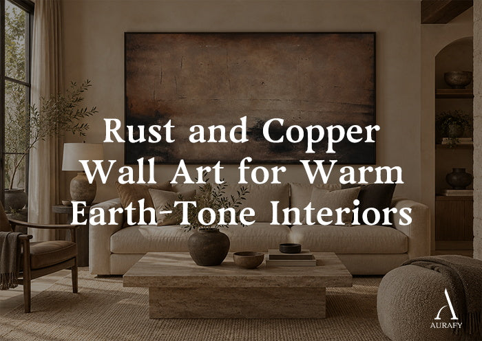
Rust and Copper Wall Art for Warm Earth-Tone Interiors

Rust colored wall art works because it sits between warm and neutral without tipping into either, it reads as earthy rather than bright, and grounded rather than dull. If you're building a warm earth-tone room, the fastest way to anchor it is a single large piece that carries rust, copper, or umber tones against a textured, matte surface, hung at a scale that matches your wall rather than your furniture.
This guide narrows in on one decision: how to choose between rust, terracotta, copper, and umber wall art, and how to place it so it actually reads as intentional in a real room, not just "brown art."
Rust, Terracotta, Copper, and Umber Aren't Interchangeable

These four tones get lumped together constantly, but they behave differently on a wall, and mixing them up is the single most common styling mistake in earth-tone rooms.
Rust
Rust sits closer to burnt orange with a dusty, oxidized edge. It has enough saturation to act as a focal color rather than a background one, which makes it the right choice when you want the art to be the room's warm accent, not just a supporting texture. Rust abstract art in particular tends to work well because the color carries the composition even when the brushwork is loose or gestural.
Terracotta
Terracotta is rust's softer, more muted cousin, closer to clay than to metal. It reads as calmer and more diffused, which suits rooms that already have a lot of visual activity (patterned textiles, mixed wood tones) and don't need another strong color statement.
Copper
Copper introduces a metallic, slightly cooler undertone even within a warm palette. It has a weathered, patina-like quality rather than a flat pigment quality, which makes it feel more like a material than a color. This is the tone to reach for when you want the art to feel aged or industrial rather than purely decorative.
Umber
Umber is the deepest and least saturated of the four, a brown with warm undertones rather than an orange or red one. It works as a grounding color rather than a focal one, often appearing alongside rust or copper in the same piece to add depth and shadow.
Understanding which of these four your room actually needs, a focal color, a soft accent, a material-like texture, or a grounding shadow, is the first real decision in choosing rust wall art, and it matters more than matching swatches.
Pairing Rust and Copper with Common Earth-Tone Backdrops

Beige and Cream Walls
Beige and cream are the most forgiving backdrops for rust and copper because they share the same warm undertone without competing for attention. Rust and beige wall art pairings work particularly well in living rooms and entryways because the wall color recedes and lets the rust tones in the piece carry the visual weight. The risk here is flatness, if the room is entirely beige and cream with no other contrast, the art can look isolated rather than integrated. Bringing in one darker element (a wood console, a black-framed mirror) elsewhere in the room gives the rust tones something to bridge.
Dark Wood Tones
Dark wood, walnut consoles, espresso-stained floors, black-brown shelving, pairs naturally with rust and copper because both sit on the warm side of the color wheel. The contrast in value (dark wood, lighter rust) keeps the pairing from feeling monotone. This combination tends to work especially well in dining rooms and studies, where the wood is already doing a lot of the room's visual work and the art needs to complement rather than compete.
Charcoal and Black Accents
Charcoal and black are where rust and copper get their sharpest contrast. A piece with black or charcoal woven into the composition, rather than pure rust on a white ground, tends to hold up better next to black hardware, black-framed windows, or charcoal upholstery, because the art already contains the darker note the room is built around.
Texture and Light: Why Flat Rust Art Can Fall Short

Rust and copper are colors that were originally observed on weathered, oxidized surfaces, metal, clay, stone, not on flat, printed material. Art that mimics that origin with visible texture (impasto, layered brushwork, distressed surface treatment) tends to read as more authentic than a flat print in the same color family, because the texture catches and scatters light rather than reflecting it evenly.
This matters most in rooms with directional light, a window at an angle, a picture light, warm-toned lamps in the evening. Textured, mixed-media rust art shifts subtly as the light moves across it, which is part of what makes it feel like a material object rather than a decoration. A flat rust print in the same room will look static by comparison, even if the color is correct.
If you're shopping specifically for this quality, look for language like "textured," "mixed-media," or "distressed layering" in a piece's description, it's a reasonably reliable signal that the work will hold up under changing light rather than looking one-dimensional.
Room Placement and Scale

Living Rooms
The living room is usually where rust wall art for living room spaces does the most work, because it's the room where you want a single warm anchor visible from multiple seating angles. A large-format piece above a sofa, sized to roughly two-thirds the width of the sofa, keeps the proportions balanced. In an open-plan living space, a wider, more horizontal composition can help visually separate the living zone from an adjoining dining or kitchen area.
Entryways and Hallways
Entryways benefit from a vertical orientation, since most entry walls are taller than they are wide. A vertical rust piece here sets the tone for the rest of the home's palette before a visitor even reaches the main living space.
Bedrooms and Studies
Rust and umber tones work well in bedrooms because they're warm without being stimulating, closer to a sunset than a bright accent wall. In a study or home office, a copper-toned piece with visible texture tends to add depth without pulling focus from a desk setup.
Getting Scale Right
The most common scale mistake is choosing art sized to the furniture below it rather than the wall itself. A piece meant to anchor a room should generally span 60-75% of the width of the furniture grouping beneath it, and should be large enough to read clearly from the room's main seating or entry point, not just up close.
A Decision Framework: Matching Product to Room

Rather than starting from "I want rust art" and working backward, it helps to start from what the room already has and needs.
If your room has: neutral walls (off-white, warm beige) and you want a soft, layered focal point with rust and terracotta tones plus a touch of charcoal —
Consider: Urban Erosion Painting-Rust & Neutral Tones-AURA027, a textured acrylic and mixed-media abstract in a Wabi Sabi, minimalist style. It combines off-white, warm beige, muted terracotta, and charcoal black with visible impasto and distressed layering, and a broad horizontal seam running through the composition. It's available in a vertical selector from 32x24 to 90x60 inches and a horizontal selector from 20x40 to 55x110 inches, which gives it flexibility for both a tall entryway wall and a wide living room or dining wall.
If your room leans toward: darker, more grounded tones, black, brown, and neutral, and you want the art to feel more like an aged material than a painted color —
Consider: Wabi-Sabi Patina Wall Art-Weathered Copper & Tobacco Umber-AURA017, which uses a weathered copper and tobacco umber direction with abstract geometric brushwork in black, brown, and neutral textured tones. It suits rooms already built around dark wood or charcoal, where you want the art to deepen the palette rather than lighten it.
In short: choose the rust-and-terracotta piece when the room needs a warm focal point against a light backdrop, and choose the copper-and-umber piece when the room needs to feel more weathered and grounded against darker surroundings.
Common Mistakes to Avoid

Treating rust, terracotta, copper, and umber as one color. They carry different undertones and different visual weight, mismatching them against your wall color is the fastest way to make a room feel "off" without knowing why.
Sizing art to furniture instead of the wall. A piece that's technically "big enough" for the sofa can still look small on a tall or wide wall. Measure the wall space first, furniture second.
Choosing flat color over texture in rooms with strong natural or lamp light. Flat rust prints can look muddy or one-note under warm, directional lighting; textured pieces tend to hold their depth.
Pairing warm rust tones with a cool-toned room. Rust and copper are unambiguously warm. In a room with cool grays or blue-based neutrals, they can clash rather than complement, warm beige, cream, dark wood, or charcoal are safer backdrops.
Overloading the room with multiple strong accent colors. Rust and copper are already visually rich. Pairing them with additional bold, competing colors (rather than neutrals) tends to make a room feel busy instead of layered.
Bringing It Together

Rust and copper wall art earns its place in a warm earth-tone room when the tone, texture, and scale are chosen deliberately rather than by eye alone. Start by identifying whether your room needs a focal color (rust), a softer accent (terracotta), a material-like texture (copper), or a grounding shadow (umber). Match that against your existing backdrop, beige and cream ask for contrast elsewhere in the room, dark wood pairs naturally, and charcoal calls for a piece that already contains darker tones. From there, scale the piece to your wall rather than your furniture, and lean toward texture if your room gets strong directional light.
Frequently Asked Questions
What's the difference between rust and terracotta wall art?
Rust is closer to burnt orange with an oxidized, saturated quality, making it a strong focal color. Terracotta is softer and more muted, closer to clay, and works better as a gentle accent in rooms that already have visual activity elsewhere.
Does copper wall art work in a warm, non-industrial room?
Yes. Copper has a metallic, weathered undertone, but when it's paired with warm neutrals like beige or cream rather than steel or concrete, it reads as earthy and warm rather than industrial.
What wall colors pair best with rust wall art?
Warm beige, cream, and off-white are the most forgiving backdrops because they share rust's warm undertone. Dark wood tones and charcoal also pair well, offering contrast in value rather than competing in color.
How large should rust abstract art be above a sofa?
As a general guide, aim for roughly 60-75% of the sofa's width, and make sure the piece is large enough to read clearly from across the room, not just up close.
Share:
Ivory Textured Wall Art for Japandi Interiors
Bronze Wall Art for Modern and Wabi Sabi Interiors