


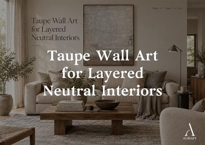
Taupe Wall Art for Layered Neutral Interiors

Taupe wall art solves a problem that flat neutral rooms often run into: everything reads as "neutral" but nothing reads as intentional. Because taupe sits between beige, gray and brown, taupe abstract painting gives a wall enough color shift to separate itself from the sofa, the rug and the wall paint, while still staying quiet enough to let the room breathe. The result is a layered look rather than a matched one, which is the actual goal in most neutral interiors.
This guide focuses specifically on taupe: what the color is doing undertone by undertone, how it behaves next to beige and gray furnishings, and how to choose a piece that adds depth instead of disappearing into the wall.
What Makes Taupe Different From Beige and Gray

Taupe is not a single shade. It's a family of grayish-browns, and where a specific taupe falls on that spectrum determines whether it reads warm or cool in your space.
- Warm taupe leans toward brown and sand, with pink or amber undertones. It pairs naturally with wood tones, linen, and warm white walls.
- Cool taupe leans toward gray, sometimes with a faint green or blue undertone. It suits rooms with cooler light, gray-toned floors, or steel and black hardware.
This is the core distinction that separates taupe wall art from generic beige wall art or broad earth-tone pieces: taupe is defined by its undertone shift, not just its lightness. A canvas described as beige with warm taupe tones, like Urban Patina Canvas-Off-White & Warm Taupe Tones-AURA025, will sit differently on a wall than one described around a cream and smoky taupe direction, like Weathered Horizon Wall Art-Cream & Smoky Taupe Tones-AURA015. Neither is "more neutral" than the other; they're calibrated to different underlying color temperatures.
Knowing your own undertone matters before you buy. Hold a warm-white paint chip and a cool-gray one against your wall in daylight, whichever one the wall leans toward tells you which taupe direction to shop.
Why Taupe Art Creates Depth Between Beige, Gray and Cream

A neutral room built entirely from one tone, say, beige walls, a beige sofa, and beige curtains, tends to flatten visually. There's no anchor point for the eye. Taupe wall art works as a bridge color: it contains enough gray to relate to a cool sofa, enough brown to relate to a warm floor, and enough softness to avoid competing with either.
This bridging effect is why taupe abstract painting is particularly effective in rooms that mix undertones without meaning to, a common outcome when furniture, flooring and wall paint are purchased at different times. Rather than repainting or reupholstering, a taupe piece with both beige and gray in its palette can visually reconcile the mismatch. Distressed Texture Wall Art-Taupe & Soft Gray Tones-AURA026, which combines beige, soft gray and neutral earth tones in a layered composition, is built for exactly this kind of in-between wall.
Depth also comes from texture, not just color. Hand-applied brushstrokes, layered surface marks, or a crackle finish catch light differently than a flat-printed piece would, so the artwork changes subtly as the light in the room changes through the day. That's a second, quieter layer of depth beyond the color palette itself.
Warm Taupe vs. Cool Taupe: Choosing a Direction

Before choosing a specific piece, decide which temperature direction the room needs. This decision affects the art more than size or composition style.
When to Choose Warm Taupe
Warm taupe wall art suits rooms with:
- Wood flooring in oak, walnut, or honey tones
- Linen, jute, or rattan textures in furniture and accessories
- Warm-white or cream wall paint
- Brass, gold, or matte bronze fixtures
In these rooms, a piece like Urban Patina, described around off-white and warm taupe tones with a hand-painted brushstroke direction, reinforces the existing warmth without adding a competing color.
When to Choose Cool Taupe
Cool taupe wall art suits rooms with:
- Gray or whitewashed flooring
- Cooler wall paint (greige or true gray)
- Chrome, nickel, or black matte hardware
- Velvet or cotton upholstery in cooler grays
Weathered Horizon, with its cream and smoky taupe direction alongside gray and soft neutrals, and its crackle-effect texture, tends to sit better in these cooler-toned rooms than a piece built entirely around brown undertones.
When the Room Genuinely Mixes Both
Some rooms don't lean clearly warm or cool, they mix a gray sofa with a warm wood coffee table, for instance. This is where a piece with a broader, blended neutral palette earns its place. Distressed Texture, described with beige, soft gray and neutral earth tones together, is designed to read comfortably in either direction rather than pulling the room one way.
Room Scenarios: Where Taupe Wall Art Works Hardest

Taupe Wall Art in the Living Room
The living room is usually where undertone mixing is most visible, because it collects the most furniture types, sofa, rug, coffee table, curtains, each potentially in a slightly different neutral. Taupe wall art living room placement typically works best above the sofa or on the largest uninterrupted wall, where the piece can be seen at a distance and its undertone can visually connect the seating to the flooring.
For a large sofa wall, scale matters as much as color. A single taupe piece sized for the wall, starting at 32x24 on the vertical selector for pieces like Urban Patina, Distressed Texture and Weathered Horizon, reads as a considered focal point rather than a filler item. Distressed Texture and Weathered Horizon both scale up to 90x60 on their vertical selectors, which suits longer sofa walls where a smaller canvas would look undersized.
Cream Taupe Wall Art in Bedrooms
Bedrooms benefit from the softer end of the taupe spectrum, cream taupe wall art with minimal contrast, since the goal is calm rather than visual interest. A cream and misty taupe palette, as seen in Dreamy Seascape Painting-Misty Taupe & Cream-AURA043, works well above a headboard or on a wall opposite the bed, where it's viewed at rest rather than in passing. Its impasto-textured brushstrokes add tactile interest without introducing a strong color statement, which keeps the room feeling settled.
Entryways and Hallways
Narrower spaces benefit from vertical taupe pieces, since the format matches the proportions of the wall and avoids overwhelming a tight sightline. A vertical taupe textured wall art piece near an entry also tends to catch changing daylight from a front door or hallway window, which brings out the texture in a way a flatter piece wouldn't.
Texture, Lighting and Subtle Contrast

Because taupe is a low-contrast color family to begin with, texture is what keeps a piece from reading as flat or forgettable. Hand-applied brushstrokes, layered surface passes, and crackle finishes all create micro-shadows across the canvas surface. Under warm lamp light, these shadows deepen and add richness; under daylight, they soften and the piece reads more uniformly.
This means the same taupe textured wall art can shift mood over the course of a day, a useful trait in rooms used at different times, like a living room that transitions from daytime reading to evening entertaining.
A few practical notes on lighting and contrast:
- Directional lighting (a picture light or angled lamp) will exaggerate brushstroke texture; flat overhead lighting will minimize it.
- Low-contrast rooms, where walls, furniture and floor are all similar in value, benefit from a taupe piece with a slightly wider tonal range (light cream to deeper gray) to avoid the art disappearing into the wall.
- Higher-contrast rooms, where a dark floor meets a light wall, for example, can handle a more subtly toned taupe piece, since the room itself is already providing visual separation.
Subtle contrast, not bold contrast, is the operating principle for taupe wall art. The goal isn't for the art to jump off the wall; it's for the art to be the thing that makes the rest of the room's neutrals make sense together.
Scale and Placement: A Simple Selection Framework

1. Measure the wall, not just the furniture below it. A taupe abstract painting should generally span roughly two-thirds the width of the furniture beneath it, a sofa, console, or headboard, to feel proportionate.
2. Match undertone to the dominant material in the room. Wood-heavy rooms lean warm taupe; gray-floored or steel-accented rooms lean cool taupe; mixed rooms lean toward a blended palette piece.
3. Consider vertical versus horizontal format based on wall shape. Narrow walls and stairwells suit vertical orientation; long sofa or console walls suit horizontal or square formats where available.
4. Check how the room is lit at the times it's most used. A piece with heavier surface texture rewards rooms with some directional or lamp lighting; a smoother, lower-texture piece is more forgiving under flat overhead light.
5. Decide how much contrast the room already has. Rooms with little tonal variation benefit from a taupe piece with a wider internal range; rooms with existing contrast can use a quieter, more tonal piece.
Common Mistakes to Avoid

- Choosing taupe art without checking undertone against the room. A warm taupe piece on a cool-gray wall can read muddy rather than harmonious, and vice versa.
- Undersizing the piece for the wall. A canvas that's too small for a large sofa or headboard wall reads as an afterthought rather than a focal point.
- Assuming all taupe is interchangeable. Cream-leaning taupe, smoky taupe, and warm brushstroke taupe each behave differently in a room; the palette description matters more than the single word "taupe."
- Ignoring texture in flat-lit rooms. A heavily textured piece loses much of its visual interest under uniform overhead lighting with no lamps or accent lighting nearby.
- Matching the art too closely to the sofa or rug. The point of taupe wall art is to bridge tones, not to blend in completely, some tonal separation from the furniture below it keeps the piece visible as art rather than as an extension of the upholstery.
Bringing It Together

Taupe wall art earns its place in a neutral room by doing something beige and gray on their own can't: connecting the two. Whether the room leans warm, wood floors, linen textures, brass fixtures, or cool, gray flooring, chrome hardware, cooler paint, there's a taupe direction built for it, and pieces like Urban Patina, Distressed Texture, Weathered Horizon and Dreamy Seascape each lean into a slightly different point on that spectrum. Choosing the right one comes down to undertone, scale, texture and how the room is actually lit, rather than treating "taupe" as a single interchangeable shade.
Frequently Asked Questions
Is taupe wall art too plain for a living room focal point?
Not when it's textured and appropriately scaled. Hand-applied brushstrokes and layered surface marks give taupe pieces visual depth that a flat neutral print lacks, and a properly sized canvas above a sofa reads as a deliberate focal point rather than filler.
How do I know if my room needs warm or cool taupe wall art?
Look at your flooring and hardware first. Wood floors, brass or gold fixtures, and linen textures point toward warm taupe. Gray or whitewashed floors, chrome or black hardware, and cooler wall paint point toward cool taupe.
Can taupe wall art work in a room with both warm and cool neutrals?
Yes. A piece with a broader blended palette, combining beige, soft gray and neutral earth tones, as in Distressed Texture, is designed to sit comfortably in rooms that mix warm and cool elements rather than committing fully to one direction.
What size taupe wall art should I choose for above a sofa?
As a general guideline, aim for the artwork to span roughly two-thirds the width of the sofa. Several taupe pieces offer a vertical selector starting at 32x24 and scaling up to 90x60, which allows sizing to match different sofa and wall widths.
Share:
Bronze Wall Art for Modern and Wabi Sabi Interiors
Emerald Green Wall Art: How to Use It as a Statement Piece