


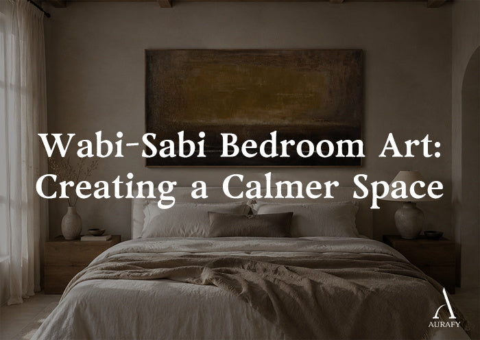
Wabi-Sabi Bedroom Art: Creating a Calmer Space

What Makes Bedroom Artwork Feel Restful?

To choose wabi-sabi bedroom wall art, focus on three qualities: quiet color, natural texture, and a composition that does not overwhelm the room.
A bedroom is usually a place where visual simplicity matters. Artwork with soft neutral tones, matte surfaces, and organic textures can complement the relaxed atmosphere of a sleeping space without becoming the dominant element.
The goal is not to create a perfectly styled room. Instead, wabi-sabi bedroom art should feel connected to the materials already present, such as linen bedding, natural wood, plaster walls, or handmade ceramics.
Wabi-sabi design is not defined by a specific color palette or decoration style. It is an aesthetic sensibility that values imperfection, simplicity, and the natural character of materials.
Choosing Art Placement for a Wabi-Sabi Bedroom

Above the Headboard: Creating Balance With the Bed

Artwork above the headboard is often the main visual focus in a bedroom.
A useful starting point is to choose artwork that spans around 60% to 70% of the headboard width. This proportion helps the artwork feel connected to the bed while maintaining enough surrounding space.
A single large piece often works especially well in a wabi-sabi bedroom because it allows the texture and material quality of the artwork to remain the focus.
Multiple small frames can work in some interiors, but they may introduce more visual divisions and compete with the calm, simple character that many people seek in a bedroom.
Opposite the Bed: Creating a Quiet Visual Anchor

The wall facing the bed is often viewed at the beginning and end of the day, making it an important part of the room's overall atmosphere.
This area usually benefits from artwork with:
subtle tonal variation
soft contrast
natural textures
restrained composition
A piece with gentle mineral tones or organic surface variation can create visual interest without relying on strong patterns or bright colors.
Reading Nook or Side Wall: Adding Subtle Texture

Smaller areas, such as a reading corner or wall beside a bedside table, can support smaller-scale artwork.
These spaces usually work better with quieter pieces that complement the main bedroom artwork rather than competing with it.
A smaller textured canvas, minimal abstract composition, or natural-toned artwork can add character while preserving the room's sense of openness.
Bedroom Palette and Artwork Compatibility Guide

|
Bedroom Materials |
Headboard Style |
Recommended Artwork Direction |
Overall Effect |
|
Warm linen or pale cream walls |
Natural oak or upholstered fabric |
Soft oat, sandstone, warm grey textures |
Creates a gentle connection between textiles and artwork |
|
Soft sage or earth-green tones |
Cane, woven materials, or raw wood |
Pale clay, mineral grey, muted earth colors |
Adds organic contrast without feeling harsh |
|
Deep charcoal or lime-wash walls |
Dark walnut or textured upholstery |
Slate, weathered grey, charcoal compositions |
Creates a deeper, more grounded atmosphere |
|
Raw plaster or warm grey surfaces |
Linen, unfinished wood, natural materials |
Chalk white, stone tones, subtle mineral textures |
Reinforces the room's material character |
Reducing Visual Noise in the Bedroom

A wabi-sabi bedroom benefits from restraint.
Consider these principles when selecting artwork:
Choose matte or low-reflectance finishes rather than highly glossy surfaces.
Prefer organic forms and natural variation over overly busy patterns.
Maintain balance between artwork size and furniture proportions.
Allow empty wall space around the artwork so the piece can breathe.
The purpose is not to remove all personality from the room. It is to create enough visual calm that individual materials and textures can be appreciated.
Matching Artwork With Bedroom Materials

Linen and Natural Fabrics
Linen, cotton, and woven textiles already contain subtle irregularities. Artwork with handmade texture or mineral variation can complement these materials because both rely on natural surface character.
Wood Furniture
Warm wood tones often pair well with artwork featuring:
clay colors
warm grey
charcoal
soft earth tones
The artwork does not need to match the wood exactly. A related material feeling is usually more effective than exact color matching.
Stone and Plaster Surfaces
Rooms with plaster, lime-wash, or stone elements often benefit from artwork that continues the same tactile language.
A textured surface can create a relationship between the wall finish and the artwork without making the room feel overly decorated.
Three Wabi-Sabi Bedroom Examples

A Modern Japandi Bedroom
A bedroom with light wood furniture, linen bedding, and pale walls benefits from restrained artwork.
A warm sandstone or soft grey textured piece can add depth while maintaining the clean structure associated with Japandi interiors.
The artwork should support the room rather than become a competing focal point.
A Raw Natural Bedroom Retreat
A space featuring plaster walls, aged wood, stone, and natural fibers provides an ideal setting for wabi-sabi artwork.
Choose pieces with:
visible handmade character
organic texture
earthy tones
understated composition
The artwork should feel connected to the same material world as the surrounding furniture and finishes.
A Contemporary Bedroom With Wabi-Sabi Elements
Many modern bedrooms combine clean furniture with natural materials.
In these spaces, one textured artwork can introduce warmth and individuality without requiring the entire room to follow a traditional wabi-sabi direction.
A carefully selected piece can bridge modern structure and organic material expression.
Frequently Asked Questions
Is wabi-sabi bedroom art only beige or neutral?
No. While many wabi-sabi interiors use earthy neutrals, the concept is not limited to beige. Wabi-sabi can include darker tones, muted colors, and natural variations as long as the materials and composition support a sense of simplicity and authenticity.
What size art should go above a bed?
A common guideline is to choose artwork that spans around 60% to 70% of the headboard width. The exact size depends on the bed frame, wall dimensions, ceiling height, and artwork style.
Should bedroom artwork be centered above the bed?
Centering artwork above the bed is a common approach because it creates visual balance. However, asymmetrical placement can also work when it supports the room's overall composition.
Should wabi-sabi bedroom art be framed?
Both framed and unframed approaches can work. Raw-edge or minimal framing often emphasizes natural materials, while a simple frame can help the artwork integrate into a more structured interior.
Creating a More Personal Bedroom With Wabi-Sabi Art

The best bedroom artwork does not simply fill an empty wall. It should connect with the room's existing materials, lighting, and atmosphere.
If you are choosing wabi-sabi bedroom wall art, share your wall dimensions, headboard style, and interior materials. A tailored recommendation can help determine the right artwork scale, texture, and composition for your space.
【BEST SELLER】【CUSTOM ART】
Share:
How Big Should Wall Art Be Above a Sofa? Size & Placement Guide
Wabi-Sabi Art for Small Apartments: Calm Without Clutter