

Vertical Minimalist Wall Art: Working with Narrow Walls and Clean Lines

Many narrow wall areas are bordered by straight features such as door trim, corners or wall edges. Vertical minimalist wall art enters that setting with an upright canvas, but the marks inside it may move in an entirely different way. This guide separates the shape of the canvas from the movement within it, then offers a three-part test for judging how a flowing, textured piece sits beside straight architecture: Frame, Flow, and Line Dialogue.
For a broader comparison of canvas orientation, see our guide to horizontal, vertical and square abstract art.
Vertical Canvas Format Is Not the Same as Vertical Lines
Does vertical minimalist wall art require vertical internal lines? No. Vertical describes the canvas orientation. The ridges, strokes, or passages inside it can follow other movements, so you should not infer a direction from the format alone.
An upright canvas can hold oblique sweeps, gentle waves, or soft undulations. That distinction matters when you shop. A listing that calls a piece “vertical” tells you about its outer proportions. To learn how the surface moves, you need to look at the image itself and at how the description characterizes the composition.

How Does Flowing Art Relate to a Wall’s Straight Lines?
Should a textured canvas echo or contrast with straight architectural lines? Either relationship may work. What matters is the balance you want between the canvas’s flowing marks and the straight boundaries nearby.
Picture a narrow wall bordered by a doorframe and a strip of trim. Three relationships are possible, and all of them are conditional on your taste and your wall:
- Echo: The composition feels visually compatible with the architectural order around it, perhaps because its movement is restrained and its tones are quiet. Echo describes this perceived compatibility, not ridges running parallel to the trim.
- Counterpoint: The undulating marks offer a visible contrast to the straight edges without crowding them, so the curves read as a deliberate foil.
- Competition: The surface feels too active beside the trim and frame, and the wall starts to look busy.
These are visual judgments, not outcomes anyone can guarantee. A useful exercise is to imagine the canvas next to the actual lines you can see from where you stand.

Read the Rhythm of Undulating Ridges
How can undulating ridges create rhythm without a grid? Their perceived sequence, variation, and the less active areas between them can establish a readable flow, without equal spacing or identical marks.
Grids often use repeated units and relatively regular spacing; flowing ridges may establish rhythm through variation instead. One ridge may swell, another may thin out, and a third may drift away from its neighbors. The eye can follow a pace, speeding up where ridges gather and slowing where they separate.
If you like, try tracing one ridge with your eye as a visual exercise. Does it seem to lead into the next passage? Do the variations feel related, like waves from the same source, or do they seem to interrupt one another?
Not every ridge will be continuous, and neither answer is wrong. You are simply deciding which kind of pace you want to live with.

Why Open Areas Matter Around Flowing Texture
How do open areas affect flowing minimalist texture? They can separate textured passages and make movement easier to distinguish. Negative space need not be physically untreated canvas.
In a textured composition, an open area is a visually less active stretch, and it may still carry subtle surface. Depending on the composition, ridges without such areas may read as one continuous mass, while quieter passages may give individual movements room to register. How this plays out also depends on contrast, distribution and viewing conditions.
There is no universal amount that works. Judge whether you can tell where one movement ends and another begins, and whether the quieter areas make the active ones easier to appreciate.

When Warm Cream and Ivory Let Surface Movement Lead
An almost monochrome palette gives the eye fewer color boundaries to follow. In warm cream and ivory tones, attention may shift toward how the ridges are organized, since there is little strong color separation to compete with them. Light and shadow may also influence how defined the ridges appear, though the effect will vary with your room.
This is a perceptual tendency, not a rule. Some viewers find a near-monochrome surface restful to read, while others want more contrast before a texture registers. If you prefer clear tonal separation, a very low-contrast piece may feel too subtle.

What Should You Check in Product Photographs?
Start with the full-canvas view, then move to any detail shots. Three things are worth noting:
- Ridge continuity: Do the marks flow as connected movements or break into fragments?
- Tonal contrast: Is the surface mostly defined by light and shadow, or by distinct color shifts?
- Open areas: Can you find quieter passages that give the ridges room?
Photographs and display settings may not accurately represent physical texture or color, and a single angle can hide the direction of a surface. If the direction or relief remains unclear, ask the seller for additional detail images or clarification before deciding.
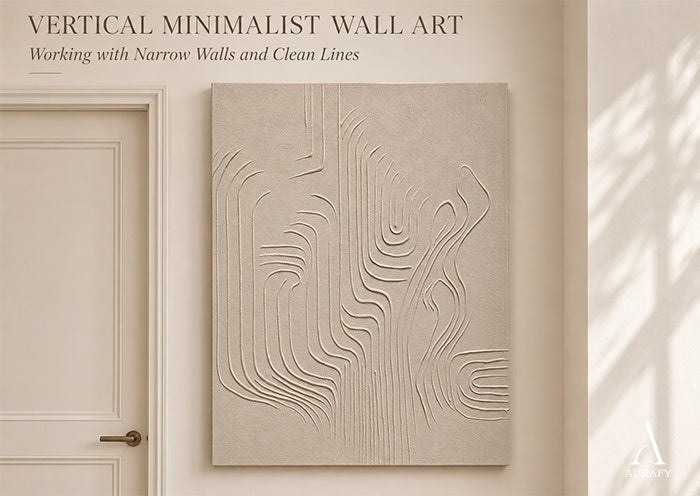
AURA046: An Upright Canvas with Flowing Impasto Ridges
The AURA046 flowing vertical texture canvas, titled Flowing Vertical Texture Canvas-Warm Cream Tones, serves as one example for the test.
- Frame: The canvas orientation is vertical. That tells you about its outer shape, not about the path of its marks.
- Flow: The listing describes sculptural impasto ridges, layered and refined with a palette knife, in an almost monochrome field of warm cream and linen ivory, with undulating movement and generous negative space.
- Line Dialogue: Whether those undulating ridges echo or contrast with your trim and doorframes depends on your wall and your preference.
One caution: the source descriptions disagree on direction, with some wording pointing to vertical ridges and other wording to a diagonal flow. So it is safest to think of the ridges as undulating rather than perfectly vertical or running in one uniform direction, and to examine the photographs yourself. The listing describes the canvas as hand-painted and made to order; that production has not been independently witnessed.
The AURA046 Flowing Vertical Texture Canvas Flowing Vertical Texture Canvas-Warm Cream Tones-AURA046 is the product example discussed in this guide.

Choose Between Echo, Counterpoint and Compare Further
Use the three-part test to make a practical decision:
- Echo if the composition appears compatible with the straight lines around it.
- Counterpoint if the flowing marks offer a contrast you want, without excessive competition.
- Compare further if the relationship looks crowded, or the photographs cannot establish the surface movement you prefer.
The right answer depends on the actual wall, the surrounding trim, the artwork’s surface and your own preference. You are not looking for a universal rule about curves and straight lines; you are deciding which relationship you want to see every day.

Explore Flowing Minimalist Canvas Art
If a flowing, low-color surface suits your narrow wall, take a closer look at the AURA046 flowing vertical texture canvas. To compare other restrained compositions, browse the minimalist wall art collection.
Frequently Asked Questions
Can a vertical minimalist canvas work beside several trim edges?
It can, depending on how active the surface is. When a wall has a doorframe, baseboard and corner close together, a low-contrast, softly flowing piece may feel less crowded than one with strong marks. Imagine the canvas against each edge and note where your eye stalls.
Can flowing textured art work beside a straight doorframe?
It can, depending on your taste. The curves may read as a gentle counterpoint to the frame, or they may feel too active nearby. Imagine the piece beside the actual trim and judge the balance.
What if the flowing texture feels too busy on my narrow wall?
First check whether nearby objects or trim are adding to the competition. If the canvas itself seems too active, compare pieces with softer transitions, lower contrast, or more visually quiet passages between ridges.
How can I verify the surface direction of AURA046?
Because the source descriptions differ, study the full-canvas and any detail photographs, and ask for additional images or clarification if the ridge direction is not clear. Photographs and displays may not represent texture exactly.
Share:
Earth-Tone Minimalist Wall Art: Brown Tones Without a Rustic Look
Minimalist Office Wall Art: A Calm Backdrop for a Focused Workspace