

Minimalist Office Wall Art: A Calm Backdrop for a Focused Workspace

In a home office, "calm" is best treated as a look you prefer, not a documented work outcome. Minimalist office wall art can support that look, but only if it sits in the view that actually matters. Two backgrounds are often in play: the wall you see from your chair, and the wall other people see behind you on camera. This guide uses a Two-View Desk Background Test to decide which one your artwork should serve and how much visual detail surrounds it.
Which Wall Is Actually Your Desk Background?
Is the wall behind my desk the same as my video-call background? Not necessarily. The wall you face while working depends on how you sit, and the video background depends on where the camera points.
Picture two common setups. In the first, the desk faces a wall, so the artwork you see beyond your monitor is not visible to callers at all. Your camera, if it faces you, captures whatever is behind your chair. In the second, the desk floats or sits sideways, and the wall behind you may be both the camera backdrop and a surface you rarely look at.
That is why "the wall behind my desk" is an unreliable phrase. Before choosing art, sit down in your normal position and name the two surfaces separately: the one in your line of sight, and the one a camera would capture. Everything below treats them as different decisions.

Assess the Wall You See While Working
Call this the worker view. It includes the artwork plus everything near it: the monitor edge, shelves, cables, a lamp, a stack of papers. The question is which detail is most prominent, not whether the wall is bare.
What makes minimalist office wall art visually restrained? Its apparent contrast, surface detail and relationship to nearby objects. A piece with low contrast and subtle texture may support a simpler-looking arrangement. No measurable focus benefit is implied; this is a matter of what you prefer to look at.
Try a quick check from your chair. Which element draws your eye first? If it is a tangle of cables or a crowded shelf, a new painting will not remove those competing objects, and tidying may do more than buying. If the artwork itself is the first thing you notice and you would rather it were not, it may be too active for this position.

Assess the Background Other People See on Camera
How should I judge artwork in my video-call background? Check the actual camera preview for cropping, visual prominence and competing details.
Open your camera preview and look at it as a stranger would. You are checking four things: how much of the artwork is actually in frame, whether it is cropped awkwardly at an edge, whether it competes with a doorway, shelf or window, and whether strong contrast or repeating graphics appear more prominent than you intend.
Preview framing varies by camera, lens and seat position, so use your real setup rather than assuming a typical one. A piece that looks balanced on the wall may appear partly cut off or oddly isolated on screen. Conversely, a canvas you barely notice in person may become a central element if the frame is tight. Small adjustments to your seat or camera angle can change the result, which is worth testing before you spend anything.

Can the Same Artwork Serve Both Viewpoints?
Can one artwork serve both the worker and camera views? Sometimes, but only if the artwork is actually visible in both viewpoints. Consider two hypothetical arrangements.
In the first, your desk faces a wall and your camera captures a different wall behind you. One artwork cannot serve both. You may choose to place one piece in the worker view and keep the camera wall simple, or the reverse.
In the second, you sit with a wall behind you and a camera facing toward that wall, so the artwork appears behind you on camera. You see it only when you turn around. Here the artwork serves the camera view, and the worker view is a separate question about what you face.
Overlap is setup-dependent. In some layouts your sightline and the camera's frame may include the same surface, but confirm that by checking both viewpoints rather than assuming it. Decide which viewpoint matters more to you first. That choice often narrows the options more than color does.
Manage Visual Detail Without Making the Background Empty
A restrained backdrop does not have to be blank. The aim is to decide which element should lead. Compare the combined effect of the artwork's surface variation, nearby accessories and contrast against the wall.
Restrained surface variation, such as soft tonal shifts or understated texture, tends to read differently from prominent repeating graphics, bold lines or high-contrast shapes. In the viewpoint you chose, ask how prominent each treatment appears. Subtle variation may recede, while bolder graphics may draw the eye. Which suits you depends on the backdrop you want.
If the artwork is restrained but a patterned poster, bright object and open shelving sit beside it, the artwork may not be the problem. Simplify the nearest competing detail first. Even a restrained canvas may appear visually crowded when several prominent objects surround it.

AURA149: Gray Tonal Texture as an Office Artwork Candidate
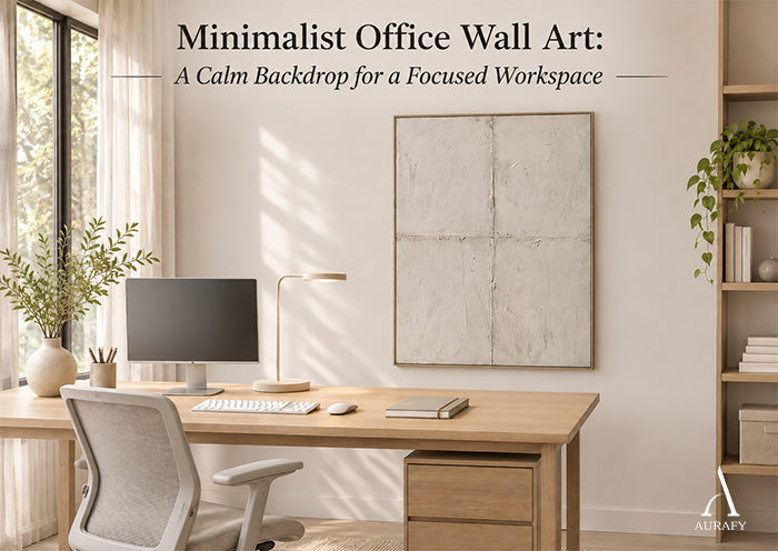
The Quiet Grid gray abstract canvas, listed as Quiet Grid-Gray Abstract Field (AURA149), is a vertical piece with a gray-centered tonal palette. The listing describes understated surface texture and continuity within a restrained minimalist abstraction, with subtle texture shifts defining its visual rhythm and no strong expressive gesture documented.
Applied to the two views:
- Worker view: Understated texture and continuity may suit a position where you want the artwork present but not insistent. Whether it does depends on the monitor, shelves and objects around it.
- Camera view: A gray-centered palette with subtle shifts may sit quietly in frame. Check the preview, since a gray wall behind a gray canvas can reduce the artwork's visibility.
Two cautions. Despite the word "Grid" in the title, the listing does not establish measured regular spacing or a rigid line system, so do not assume evenly spaced rows. Also, treat any beige wording you might encounter elsewhere on generic product text as unreliable; the current listing is gray. The listing describes the canvas as hand-painted and made to order, though that production has not been independently witnessed. Photographs cannot guarantee how color or texture will appear in your room.
The vertical AURA149 Quiet Grid Gray Abstract Canvas Quiet Grid-Gray Abstract Field-AURA149 is the product example discussed in this guide.

Make the Final Desk-Background Decision
Confirm which viewpoint the artwork serves, name the most prominent competing detail in that view, and compare it with the artwork's contrast and surface variation. Then choose one outcome:
- Keep when the artwork has the visual role you intended in its actual viewpoint.
- Adjust the view when the artwork suits you but nearby objects or camera framing create unwanted competition. Simplify the nearest item or reposition the camera first.
- Compare further when the composition looks too active or the product evidence is not enough to judge.

Explore Minimalist Office Wall Art
If a gray, low-contrast surface fits your desk background, take a closer look at the Quiet Grid gray abstract canvas. To compare other restrained pieces, browse the minimalist wall art collection.
For another perspective on textured artwork in workspaces, read our 3D Office Wall Art: Upgrade Your Workspace guide.
Frequently Asked Questions
Will artwork above my desk appear behind me on video calls?
Only if your camera faces that wall. If your desk faces the artwork, the camera likely captures a different surface behind you. Check your actual camera preview to see what is in frame.
Will gray minimalist art disappear against a gray office wall?
It can, if the tones and finish are very close. Subtle texture may still register, but check how it looks in your own light and on camera. If it fades more than you want, compare a piece with more tonal contrast.
Does AURA149 have an evenly spaced geometric grid?
The listing does not establish that. The title includes "Grid," but the documented features are understated surface texture, continuity and subtle texture shifts defining its rhythm. Do not expect measured, regular rows.
Should I adjust my camera framing before replacing office artwork?
Often, it is worth trying first. A small change to seat position, camera angle or the nearest cluttered object may improve the background without a new piece. If the artwork still feels wrong afterward, then compare alternatives.
Share:
Vertical Minimalist Wall Art: Working with Narrow Walls and Clean Lines
Hand-Painted Wall Art Gift Ideas for Christmas and New Homeowners