


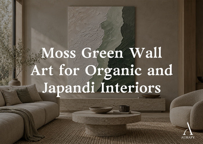
Moss Green Wall Art for Organic and Japandi Interiors

Moss green wall art works in organic and Japandi interiors because it reads as a material rather than a color, closer to lichen, bark, or aged stone than to a paint chip. If you're building a room around oak, linen, raw plaster, or warm stone, moss green sits quietly inside that palette instead of competing with it, which is exactly why it has become a default choice for people moving away from brighter, more decorative greens.
This piece looks specifically at moss green: how it differs from olive, forest, and emerald green, why it pairs so naturally with natural materials, and how to actually choose a piece for your space rather than just liking it on a screen.
What Makes Moss Green Different From Other Greens

Moss green is a low-saturation, grey-leaning green. It has none of the brightness of emerald, none of the yellow punch of olive, and none of the depth or formality of forest green. That muted quality is what makes it behave more like a neutral than an accent color.
Moss vs. Olive Green
Olive green leans warmer and more yellow, and it often carries a slightly military or utilitarian feel. It works well in mid-century or eclectic spaces where you want a green with some presence. Moss green is quieter, it has more grey in it, which softens the yellow and keeps it from feeling like a "statement" color. In a room full of natural wood tones, olive can occasionally clash with pink or orange undertones in oak; moss tends to sit more comfortably beside them.
Moss vs. Forest Green
Forest green is deep, saturated, and closer to true green. It reads as bold and traditional, think tartan, hunting lodges, dark academia. Moss green is the opposite in weight: it's pale-to-mid tone, dusty, and recedes into a room rather than anchoring it. If you want green to feel like part of the architecture, moss is the better fit; if you want green to feel like a deliberate design statement, forest does that job instead.
Moss vs. Emerald Green
Emerald is saturated, cool, and jewel-toned. It's dramatic and works best as an intentional pop against light or neutral backgrounds. Moss green has almost no shine or intensity to it, it's matte in feeling even before you consider surface finish. Where emerald says "look here," moss says "this has always belonged here."
Why Moss Green Works With Natural Materials

The reason moss green wall art suits organic and Japandi interiors specifically is undertone matching. Moss carries grey and brown undercurrents, which are the same undertones present in the natural materials that define these styles.
Oak and light wood. Oak has warm yellow-brown undertones with occasional pink or grey depending on the finish. Moss green's greyed-down base doesn't fight these undertones the way a cooler or brighter green might. The pairing feels grounded rather than accented.
Linen and natural textiles. Linen in its undyed or lightly bleached state has warm, slightly grey-beige tones. Moss green and linen share enough undertone overlap that a piece of moss green abstract art on a linen-upholstered wall or near linen curtains reads as coordinated rather than matched.
Stone and plaster. Raw plaster, limewash, and natural stone often carry cool grey or warm sand tones. Moss green's muted quality means it can sit against either without looking like it was chosen to contrast. It behaves the way moss actually behaves in nature, as something that grows on stone, not something placed next to it.
Warm neutrals. Beige, sand, and taupe are the backbone of most organic and Japandi color schemes. This is where the idea of green beige wall art becomes relevant: moss green pieces that include ivory, sand, or taupe within the artwork itself extend the room's neutral palette instead of introducing a separate color story.
Undertones and Contrast: Getting the Pairing Right

Not every moss green is the same moss green, and getting this wrong is one of the more common mistakes in this category.
- Cooler, grey-leaning moss pairs best with cooler stone, concrete, or ash-toned wood.
- Warmer, khaki-leaning moss pairs best with oak, rattan, and warmer linen.
Before choosing a piece, look at the undertone of your largest natural material surface, usually the floor or the primary furniture wood, and try to match the temperature of the moss rather than just the general hue. A warm oak floor next to a cool, blue-leaning moss green artwork can create a subtle disconnect that's hard to name but easy to feel.
Contrast matters just as much as undertone. Because moss green is muted, it needs some value contrast against the wall to register as art rather than disappear into it. A moss green piece on a pale sand or off-white wall reads clearly. The same piece on a mid-toned taupe wall may need a lighter element within the artwork, ivory, cream, or pale beige, to keep it legible from across the room.
Texture, Light, and How Moss Green Reads on the Wall

Moss green is a color that changes noticeably with texture and light in a way that brighter greens don't.
Textured surfaces amplify moss green's organic quality. A dimensional or textured piece catches light differently across its surface, creating natural shadow and highlight that mimics the way real moss looks on bark or stone, uneven, layered, alive in a subtle way. This is part of why textured moss green pieces read as more "natural" than flat, printed versions of the same color.
Light quality changes the color itself. In warm, low evening light, moss green can shift toward olive. In cool, north-facing daylight, it can shift toward grey-green or sage. This isn't a flaw, it's part of why moss green feels so at home in rooms with varied natural light throughout the day, since it never looks static.
Scale affects mood. A small moss green piece in a large room can look like an afterthought, since the color's muted nature needs enough surface area to register. Larger or bolder-scaled moss pieces hold their own in open living areas, while smaller pieces work best in more intimate spaces, a reading nook, a hallway, a bathroom vanity wall, where they're viewed up close.
Two Directions in Moss Green Wall Art

Rather than treating every moss green piece the same way, it helps to think in terms of visual direction. Two pieces from AurafyArt illustrate this well.
AURA061 Moss Serenity Canvas is a moss green and ivory textured piece, part of AurafyArt's 3D Textured Painting collection. Its dimensional surface and ivory-and-moss pairing make it a strong example of moss wall art built around texture and light rather than pattern. This is the piece to lean on when the goal is a calm, tactile focal point, a piece that changes subtly as the light in the room shifts through the day. It's well suited to spaces where you want the wall art to feel like a natural material extension of the room: above a linen sofa, in a reading corner with oak furniture, or in a bedroom where the goal is stillness rather than visual activity.
AURA079 Still Divide takes a different approach. It's an earth and moss abstract geometric piece, part of AurafyArt's Best Sellers collection, also listed in Minimalist Art, with a horizontal version available. Where the Moss Serenity Canvas leans on texture, Still Divide leans on structure, geometric abstraction with earth tones. This makes it a good fit for moss green Japandi wall art applications where you want a hint of visual definition and moss and beige abstract art qualities without introducing anything busy or decorative. It suits entryways, dining walls, and home offices where you want the eye to land somewhere specific.
Neither piece is "better", they represent two different jobs. Texture and tone for atmosphere, or geometry and earth tones for quiet structure.
A Simple Selection Framework

When narrowing down moss green abstract art for a specific room, work through these questions in order:
1. What's the undertone of my dominant material? Match warm moss to warm wood, cool moss to cool stone or concrete.
2. How much contrast does my wall provide? Pale walls can carry deeper or more textured moss; mid-toned walls need a lighter element within the piece itself.
3. Do I want atmosphere or structure? Texture-driven pieces (like Moss Serenity) build mood; geometric pieces (like Still Divide) build focus.
4. What's the viewing distance? Close-up spaces suit detail and texture; larger, open rooms suit scale and simpler shapes read from across the room.
5. Is this a coordinating piece or a focal piece? If the room already has strong natural materials doing the work, a quieter, more textural moss piece will coordinate. If the wall is bare and needs a visual anchor, a more structured piece earns its place better.
Common Mistakes to Avoid

- Treating all greens as interchangeable. Swapping in an olive or emerald piece "because it's green" ignores the undertone work moss green is specifically doing in the room.
- Ignoring wall contrast. A muted, low-texture moss piece on a similarly muted wall can vanish rather than read as intentional art.
- Oversizing or undersizing without checking the room. Moss green's subtlety means scale mistakes are more noticeable than they would be with a bolder color.
- Mixing warm and cool moss tones in the same room. Two "moss green" pieces with different underlying temperatures can create an unintentional clash even though they're technically the same color family.
- Choosing based on a screen only. Moss green shifts with light more than most colors, so what looks right in a product photo may read differently under your room's actual lighting.
Bringing It Together

Moss green wall art earns its place in organic and Japandi interiors because it behaves like a natural material rather than a decorative accent. It doesn't compete with oak, linen, or stone, it extends them. The real work is in matching undertone and temperature, considering how texture and light will change the color throughout the day, and choosing between a piece built for atmosphere and one built for structure. Get those decisions right, and moss green stops being "a green wall art choice" and starts feeling like it was always part of the room.
Frequently Asked Questions
Is moss green considered a neutral color?
Not technically, but it behaves like one in practice. Its low saturation and grey undertone let it sit alongside beige, oak, and stone without introducing strong contrast, which is why it's often used the way a neutral would be.
Does moss green wall art work in a room with warm oak floors?
Yes, generally well, especially if the moss tone leans warm or khaki rather than cool or blue-grey. Matching the undertone of the artwork to the undertone of the flooring or dominant wood is the most reliable way to avoid a mismatch.
What's the difference between moss green and sage green?
Sage green tends to be lighter and slightly cooler, often with more grey and less depth. Moss green is generally a bit deeper and can lean warmer, closer to the color of actual moss on bark or stone.
Share:
Emerald Green Wall Art: How to Use It as a Statement Piece
How to Use Green Wall Art in a Japandi Interior