


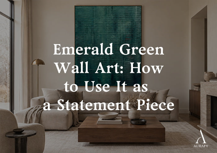
Emerald Green Wall Art: How to Use It as a Statement Piece

If you want one piece of art to anchor a room without shouting for attention, emerald green wall art is one of the most reliable choices available. Deep green reads as confident rather than loud, it pairs easily with the neutral furniture most people already own, and it holds up in both traditional and modern interiors. The key is treating it as a single focal statement, not as one color note among many. This guide covers where emerald works best, how to build the rest of the room around it, and the mistakes that undercut an otherwise good piece of dark green wall art.
Where a Single Emerald Piece Works Best

Living Rooms and Main Sightlines
The most effective placement for large emerald green wall art is a wall your eye lands on naturally: above a sofa, opposite the main entry point to the room, or on the wall you see first when walking in from a hallway. Because emerald has enough visual weight to act as a focal point on its own, it doesn't need a gallery wall or supporting pieces around it. In fact, giving it open wall space on either side usually makes it read as more deliberate.
Entryways and Hallways
A narrow entry or hallway is often under-decorated because there isn't a lot of wall space to work with, but that's exactly where one confident piece does the most good. A vertical-format emerald piece in a hallway gives the space a sense of arrival without requiring furniture changes.
Building the Room Around One Green Piece

Keep the Furniture Neutral
The easiest way to let emerald wall art do its job is to keep sofas, chairs, and larger upholstered furniture in neutral tones: warm white, oatmeal, greige, charcoal, or soft taupe. Neutral furniture doesn't try to match the green, it gives it room to stand out as the room's one strong color statement.
Bring in Wood Tones
Warm or mid-toned wood, walnut, oak, or a warm-stained console table, sits comfortably next to emerald without competing with it. Wood grounds the coolness of the green and keeps the room from feeling too monochromatic or too cold. This pairing is one of the most dependable combinations in rooms built around a dark green wall art piece.
Use Metal Accents to Add Contrast
Brass, aged gold, and warm bronze hardware or lighting fixtures pick up on the depth in emerald without pulling attention away from the art itself. Cooler metals like chrome or brushed nickel also work, but they create a more minimal, contemporary feel, while warm metals lean traditional and layered. Either direction works, the important thing is picking one metal tone and staying consistent with it across light fixtures, hardware, and frames in the room.
Let the Rest of the Room Go Quiet
Once the emerald piece and its supporting neutral and wood/metal elements are in place, resist adding more accent color. Textiles, rugs, and smaller decor objects are more effective in neutral or muted tones, think ivory, sand, charcoal, or soft gray, so the wall art remains the single point of visual intensity in the room.
How Light and Wall Color Change the Way Emerald Reads

Emerald is sensitive to lighting in a way that lighter colors aren't. In a room with strong natural light, an emerald abstract painting will look vivid and true to its actual tone. In dimmer rooms or under warm artificial light, the same piece can shift toward near-black in its shadowed areas, which is a large part of its appeal for texture-based work: it changes character throughout the day rather than looking flat.
Wall color matters just as much as light:
- On white or off-white walls, emerald stands out with maximum contrast and reads as a clear focal point.
- On warm neutral walls (greige, warm gray, soft taupe), the green softens slightly and blends more into a layered, collected look rather than a bold contrast.
- On dark walls, a deep emerald piece can lose definition unless the room has strong, direct lighting on the art, this is the one wall condition where emerald needs the most planning around lighting placement.
If your room has limited natural light, it's worth confirming how a piece is lit before committing to the darkest end of the emerald spectrum, since low light and a very dark green can start to blend into the wall rather than stand apart from it.
Scale and Placement: Getting the Proportions Right

Statement wall art only functions as a statement if it's sized to actually anchor the wall it's on. A piece that's too small on a large wall reads as an afterthought no matter how strong the color is.
As a general guide:
- Above a sofa or bed: the art should span roughly two-thirds of the furniture's width below it.
- On an open wall with no furniture beneath it: you can go larger, since there's nothing to visually balance against.
- In a hallway or narrow entry: a vertical orientation almost always reads better than horizontal, since it works with the shape of the space rather than against it.
The Whisper of Depth Emerald Abstract Texture (AURA099) is a useful reference point for this kind of scaling decision. It's a minimalist abstract composition in deep emerald green with tonal gradients and textured acrylic, impasto brushwork, and it's available in a vertical format from 32x24 up to 90x60 inches, or a horizontal format from 20x40 up to 55x110 inches. That range covers both of the situations above, a large vertical size for a sofa or bed wall, and an elongated horizontal size for a wide wall or a space above a long console. You can view the sizing options directly on Whisper of Depth Emerald Abstract Texture-AURA099 Whisper of Depth Emerald Abstract Texture-AURA099.
A Simple Decision Framework

Before choosing and placing an emerald piece, it helps to answer four questions in order:
1. What wall is the true focal point of the room? Place the piece there, not on a secondary wall.
2. Is the furniture in that room neutral enough to let the piece stand out? If not, the art will be competing rather than anchoring.
3. How much natural or fixed lighting hits that wall? This determines whether you can go with a darker, more saturated piece or should lean toward a lighter emerald tone.
4. What size does the wall actually call for? Measure the furniture below it and choose a size that fills roughly two-thirds of that width, sizing up if the wall is open.
Working through these in order avoids the most common failure mode: buying a piece based on the image alone, then discovering it's undersized for the wall or fighting with the room's existing color scheme.
Mistakes to Avoid

- Treating the art as one of several green accents. Emerald wall art works best as the single strongest color note in the room, not as part of a matched set with green textiles or accessories.
- Under-sizing the piece. A small statement piece on a large wall loses its impact regardless of how strong the color is.
- Ignoring the room's light levels. A piece that looks rich and detailed in a bright showroom photo can lose definition in a dim room. Consider how much light actually hits the wall before choosing the darkest, most saturated option.
- Pairing it with cool, matte gray furniture and stopping there. Without a warm wood or metal element somewhere in the room, an all-cool palette can feel flat rather than rich.
- Placing it on a wall that's already visually busy. Bookshelves, gallery walls, or heavily patterned wallpaper compete with a statement piece instead of supporting it.
Conclusion

Emerald green wall art earns its place as a design centerpiece by doing more with less: one well-placed, well-sized piece can set the tone for an entire room. The formula is straightforward, pick your focal wall, keep the furniture and textiles neutral, bring in warm wood or metal for contrast, and size the piece to genuinely command the space rather than fill it. Once that foundation is in place, resist the urge to add more green. The strength of an emerald abstract painting comes from being the one bold move in an otherwise calm room, not one voice in a crowd.
Frequently Asked Questions
Does emerald green wall art work in small rooms?
Yes, but it works best as a single large-scale piece rather than a small one paired with other green accents. In a small room, one confident statement piece with strong, direct lighting will do more for the space than trying to spread the color across furniture and decor.
What wall color pairs best with emerald green art?
White and off-white walls give emerald the most contrast and make it read clearly as a focal point. Warm neutral walls like greige or soft taupe create a softer, more blended look. Dark walls are the trickiest pairing and generally need strong lighting on the art to keep it from losing definition.
Should I match my furniture color to the artwork?
No. Emerald wall art is most effective when the furniture around it is neutral, think warm white, taupe, or charcoal, so the art remains the room's one strong color statement instead of competing with matching upholstery.
Share:
Taupe Wall Art for Layered Neutral Interiors
Moss Green Wall Art for Organic and Japandi Interiors