


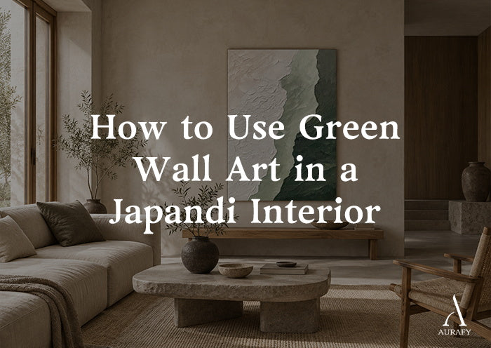
How to Use Green Wall Art in a Japandi Interior

If you're choosing green wall art for Japandi interiors, the decision isn't really about the color, it's about restraint. Japandi design succeeds when every element, including a piece of wall art, supports a calm, uncluttered composition rather than competing for attention. Green works beautifully in this style, but only when its saturation, texture, and placement are chosen the way a Japandi room chooses everything else: deliberately, with negative space left to breathe.
This guide is written specifically for people furnishing (or refining) a Japandi space, not for anyone looking for a general overview of green decor or moss-wall trends. We'll walk through how to evaluate a piece of green art against the logic of Japandi design, when green should recede into the background versus when it should anchor a wall, and how scale and room hierarchy change the right choice from room to room.
Why Green Fits Japandi Design Logic

Japandi blends Japanese wabi-sabi minimalism with Scandinavian hygge warmth. Both traditions lean on natural materials, muted palettes, and a preference for a few well-chosen objects over many decorative ones. Green sits naturally inside this palette because it's the color most directly borrowed from the natural world, moss, sage, olive, forest canopy, and Japandi rooms already lean on wood, linen, stone, and clay to bring the outdoors in.
But not every green belongs. Japandi is unforgiving toward anything that reads as loud, glossy, or synthetic. A bright kelly green or a high-gloss emerald will fight the room's quiet materials instead of joining them. The greens that work are desaturated: sage, moss, olive, forest with grey or brown undertones. These are the same greens you'd find in a dried eucalyptus branch or a weathered ceramic glaze, and that visual kinship is exactly why they integrate rather than intrude.
This is the first decision point in choosing green wall art for a Japandi room: is the green muted enough to sit alongside raw oak, linen, and stone without becoming the loudest thing in the space?
The Japandi Decision Framework for Green Wall Art

Rather than shopping by color alone, use this sequence to evaluate any piece before it goes on the wall.
Step 1: Check the Saturation First
Hold the piece (or its listing image) against the room's existing palette. If the green is more saturated than your wood tones, your linen, or your ceramics, it will pull focus in a way Japandi rooms generally avoid. Desaturated, earthy greens, sage, moss, olive-grey, are the safer default. A piece like the AURA077 Shadow Reverie canvas, built around soft sand and deep olive-grey with hints of golden warmth, sits at exactly this level of restraint: it reads as a neutral with a green cast rather than as "a green painting."
Step 2: Evaluate the Material and Texture
Japandi rewards tactility. Flat, glossy surfaces can feel visually disconnected from raw-edged wood furniture and hand-thrown pottery. Textured or sculpted surfaces read closer to natural materials and hold their own against a room's other tactile elements. This is where green textured wall art for Japandi living rooms earns its place, the texture does the work of connecting the piece to the room's material language, not just its color palette.
Step 3: Decide the Piece's Job, Blend or Anchor
Every piece of art in a Japandi room is either quiet support or a deliberate focal point. Decide this before you decide on size or exact shade. We cover this distinction in detail below, but as a rule: if the wall already has visual interest (a wood credenza, a window with a view, an asymmetrical shelf), let the art blend. If the wall is empty and needs a reason to hold the eye, let one piece anchor it.
Step 4: Size the Art to the Room's Hierarchy
Japandi rooms have a hierarchy, usually one or two "hero" elements (a dining table, a low platform bed, a reading chair) and everything else supporting quietly. Wall art should match its rank in that hierarchy. Oversized art on a secondary wall creates visual competition; undersized art on a primary wall reads as an afterthought. Vertical formats often suit Japandi's clean lines better than wide horizontal pieces, particularly in living rooms and hallways where ceiling height can be emphasized rather than wall width.
Step 5: Protect the Negative Space Around It
Negative space isn't empty space in Japandi design, it's a design element in its own right. Before hanging, ask whether the wall has room to breathe on either side of the piece. A single well-scaled canvas with generous surrounding wall space will almost always read as more considered than a gallery wall of several smaller green pieces, even if the total square footage of art is the same.
Blend vs. Anchor: A Practical Comparison

Understanding when green should recede versus when it should command attention is the difference between a Japandi room that feels curated and one that feels random.
Green as a blending tone works when:
- The room already has a clear focal point (a fireplace, a large window, a statement piece of furniture)
- You want the art to reinforce the room's natural material palette rather than introduce a new visual event
- The wall is in a transitional space, a hallway, a reading nook, behind a low console, where art supports mood rather than commands the room
A piece like the AURA061 Moss Serenity Canvas, done in moss green and ivory with a textured surface, functions well in this role. Its tonal range is close enough to typical Japandi neutrals that it reads as part of the room's material story rather than a separate statement.
Green as an anchor works when:
- The wall is otherwise plain and needs a single point of visual interest
- The room's other elements (furniture, textiles, flooring) are neutral enough that they won't compete
- You want a deliberate contrast, a moment of richer color against an otherwise restrained space
The AURA078 Verdant Haze canvas, which combines sage green and deep forest green with metallic gold accents in a minimalist abstract brushwork, is closer to an anchor piece. The added gold gives it more visual weight than a purely tonal piece, which makes it better suited to a wall that's meant to hold the eye rather than recede into it.
Neither role is "better", the room dictates which one you need. A common mistake is choosing an anchor-strength piece for a wall that needed something quieter, which is often why a Japandi room with genuinely good individual pieces can still feel busy.
Room-by-Room Examples

Living Room
Living rooms usually have the most competing focal points, a sofa, a coffee table, sometimes a media unit, so green minimalist wall art tends to work best above a low console or on a wall adjacent to, not directly behind, the main seating sightline. A vertical, textured piece in the sage-to-olive range gives the room a natural anchor without duplicating the color of a nearby plant or wood shelf. If the sofa and rug are already neutral, an anchor-strength piece with more contrast, like one built around forest green with metallic accents, can carry the wall on its own.
Bedroom
Bedrooms in Japandi design favor calm over statement. Olive green Japandi wall art with soft, sand-adjacent undertones, rather than high-contrast forest greens, tends to support rest rather than stimulate the eye. Above a low platform bed, a single vertical piece placed with generous space on either side reinforces the room's quiet hierarchy: the bed is the hero, the art is support.
Entryway and Hallway
These transitional spaces benefit from smaller-scale, tonal green pieces that greet without demanding a long look. Nature inspired wall art with muted, earthy greens works particularly well here, since it echoes the outdoors without requiring the negative space that a larger living room piece needs.
Home Office
A single piece of textured green art behind a desk can double as a focal point during video calls and a calming visual anchor during solo work. Because office walls are often smaller in scale, a mid-sized vertical format keeps the piece proportionate without overwhelming the room's other, more functional elements.
Choosing the Right Piece: What to Compare

When comparing specific green wall art options for a Japandi space, look at:
1. Undertone, does the green lean grey, brown, or gold, or is it a cleaner, more saturated hue?
2. Texture, is the surface flat or dimensional, and does that match the room's other materials?
3. Secondary colors, ivory, sand, and gold undertones tend to integrate more easily than stark white or black accents
4. Size range, vertical formats that scale from smaller to larger (for example, the 32x24 to 90x60 inch range available for pieces like Verdant Haze and Shadow Reverie) give you flexibility to match the piece to the specific wall's hierarchy rather than forcing a fixed size
You can browse a range of textured, nature-toned options directly in AurafyArt's 3D Textured Painting and vertical collections, where pieces like Verdant Haze Canvas Forest Green & Mist Gold Textured Wall Art-AURA078 and Shadow Reverie Canvas-Olive Grey & Sand Textured Wall Art-AURA077 sit at different points on the blend-to-anchor spectrum described above.
Common Mistakes to Avoid

Choosing green in isolation from the room's other tones. A piece that looks calm and earthy in a product photo can still clash if the room's existing wood or textile tones sit at a different temperature. Always compare undertones side by side, not from memory.
Oversizing or undersizing relative to the wall's rank. A large anchor piece on a minor wall creates competition; a small tonal piece on a primary wall reads as under-considered. Match scale to hierarchy, not just to the available wall space.
Crowding the surrounding space. Japandi's negative space is part of the design, not a gap to be filled. Resist the urge to add a second piece "to balance" a wall that already has enough visual weight.
Treating every green the same. Sage, moss, olive, and forest green all behave differently in a room. A moss-and-ivory tonal piece and a forest-green-with-gold piece are not interchangeable choices, one blends, one anchors, and using them in the wrong role undermines the room's balance.
Ignoring texture in favor of color alone. In a style built on tactile natural materials, a flat, glossy green print can feel out of place even if the color itself is right. Texture is often what makes green wall art feel Japandi rather than just green.
Bringing It Together

Green wall art can be one of the most natural additions to a Japandi interior, precisely because green already belongs to the same visual family as the wood, stone, and linen the style is built on. The work is in matching saturation to the room's existing palette, choosing texture that echoes the room's other materials, deciding deliberately whether the piece should blend or anchor, and sizing and placing it in a way that respects the room's hierarchy and its negative space. Get those decisions right, and green stops being "a color choice" and becomes part of the room's underlying logic, which is the whole point of designing in Japandi in the first place.
Frequently Asked Questions
Is green a traditional Japandi color?
Green isn't one of the "core" neutral tones most associated with Japandi (which leans toward beige, oatmeal, charcoal, and wood tones), but muted, earthy greens integrate easily because they echo natural materials already common in the style. The key is choosing desaturated shades like sage, moss, or olive rather than bright or saturated greens.
Should green wall art match my furniture exactly?
No, it should coordinate rather than match. Look at undertones (grey, brown, or gold) rather than trying to find an exact color match. A close tonal relationship between the art and the room's wood or textile tones will feel more intentional than a literal color match.
How large should green wall art be in a small Japandi room?
Size to the wall's role in the room's hierarchy, not just the available space. A smaller, tonal piece suits a secondary wall, while a primary wall, one without another strong focal point, can support a larger, vertical piece. Ranges like 32x24 up to 90x60 inches allow the same design to scale to different wall sizes.
Share:
Moss Green Wall Art for Organic and Japandi Interiors
Metallic Wall Art for Modern Interiors Without Looking Flashy