


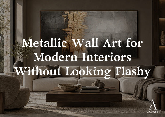
Metallic Wall Art for Modern Interiors Without Looking Flashy

Metallic wall art for modern interiors walks a narrow line. Done well, it reads as architectural — a surface that catches light the way a brushed-steel handle or a polished stone counter does. Done poorly, it turns a room into a showroom, all glare and no calm. The difference almost never comes down to the metal itself. It comes down to finish, palette, scale and what sits around the piece.
This guide breaks metallic art down by material and surface behavior, not by trend, so you can choose gold, bronze or silver with the same confidence you'd bring to choosing a light fixture.
Why Metallic Art Can Look Refined or Flashy

Does metallic wall art automatically look glam or over-the-top? No — the effect depends on how much of the surface reflects light and how that reflectivity is balanced by the rest of the piece and the room. A small amount of controlled shine against a matte, neutral ground reads as considered. A large, uniformly glossy surface with no matte counterweight reads as decorative in the wrong sense — closer to a mirror than to a painting.
The other variable is context. A metallic piece hung against busy wallpaper, bright accent walls or a room already full of shiny surfaces (glass tables, chrome lighting, glossy floors) competes for attention. The same piece against a matte wall, natural wood and soft textiles becomes the single reflective note in the room — which is exactly what makes it feel intentional rather than loud.
Gold, Bronze and Silver: Different Metals, Different Moods

Are gold, bronze and silver interchangeable in a modern room? Not really — each metal shifts color temperature and formality differently, so the choice should follow your existing palette rather than personal metal preference alone.
- Gold carries warmth and tends to sit at the more formal end of the spectrum. In small, restrained amounts — a vein running through an abstract composition, a cluster of accents rather than a solid field — it adds richness without pulling the room toward traditional glam.
- Bronze is the quietest of the three. It has a warm, slightly matte undertone even when it reflects light, which makes it easier to integrate into everyday living rooms without announcing itself. Bronze reads more like a material detail — closer to hardware or furniture trim — than a decorative flourish.
- Silver runs cooler and pairs naturally with contemporary, minimalist, or industrial-leaning interiors. It has less inherent warmth than gold or bronze, so it tends to look sharper and more architectural, particularly against charcoal or concrete-toned neutrals.
None of these metals needs to dominate a piece to register. In fact, the pieces that hold up best over time in a living room are usually the ones where the metallic element is a supporting color, not the whole story.
Matte, Brushed and High-Reflective: Reading the Finish

Why does the same metallic color look different in two paintings? Because finish, not hue, is what controls how much light a surface bounces back, and that's the real driver of whether art feels subtle or showy.
- Matte metallic finishes absorb more light than they throw back. They give you the color association of gold, bronze or silver without the glare, which makes them the safest choice for rooms with a lot of natural light or reflective furniture already in play.
- Brushed or textured metallic surfaces — often built up with dimensional texture, drips, or layered strokes — scatter light unevenly. This is why textured metallic pieces tend to look different throughout the day: the texture catches and breaks up reflection rather than bouncing it back in one uniform sheet.
- High-reflective or high-gloss metallic finishes behave closer to a mirror. They're the most dramatic option and the one most likely to look flashy if overused, but in small doses — a narrow accent, a single highlight — they can sharpen an otherwise flat composition.
A piece like the Metallic Drip Abstract Painting in charcoal, silver and gold tones demonstrates this well: the drip technique naturally varies the surface, so silver and gold read as textured highlights within a dark charcoal field rather than as one flat reflective plane. That variation is what keeps a multi-metallic piece from tipping into busy or blingy — the eye moves across texture, not glare.
How Daylight and Evening Light Change Metallic Art

Will a metallic painting look the same at 2 p.m. and 9 p.m.? No, and that's part of the appeal if you plan for it — metallic surfaces are the most light-responsive category of wall art, shifting from muted to bright depending on the angle and color temperature of the light hitting them.
In daylight, especially direct or side light from a window, metallic accents tend to sparkle and separate from the rest of the composition. In the evening, under warmer artificial light — particularly incandescent or warm LED — gold and bronze tones deepen and glow rather than glint, while silver can look more subdued and steely.
Practically, this means you should view a metallic piece (or a close photo of it) under both conditions before committing, especially if it's going above a sofa where you'll see it lit differently every day and night. A piece that only looks good under gallery-bright light may go flat once evening lamps take over, and vice versa.
Pairing Metallics With Charcoal, Ivory, Stone, Wood and Textiles

What backdrop makes metallic art look intentional instead of decorative? Matte, low-contrast neutrals — charcoal, ivory, warm stone, unlacquered wood — because they absorb light rather than compete for it, letting the metallic surface do the only "talking" in the room.
- Charcoal and deep neutrals are the most reliable partner for any metallic tone. Dark, matte backgrounds make gold, bronze and silver accents look like deliberate highlights rather than shine competing with a busy wall.
- Ivory and warm white soften metallic art, particularly bronze and gold, and work well in rooms that want warmth without going dark.
- Natural stone and unpolished wood ground metallic pieces in material honesty — the contrast between an organic, matte texture and a reflective accent is what makes the piece feel architectural rather than ornamental.
- Glass and chrome should be used sparingly near metallic art. Two reflective materials in close proximity tend to amplify each other's shine past the point of calm.
- Soft textiles — a linen sofa, a wool throw, an unstructured rug — are the easiest way to counterbalance a metallic piece. Texture that absorbs light does more to "quiet" a shiny painting than any amount of color-matching.
The Bronze Axis Canvas, built on a charcoal and ivory textured abstract with a subtle bronze direction, is a useful reference for this principle: the bronze isn't the dominant color, it's a warm detail layered into a neutral, textured structure — which is why it reads as refined rather than metallic-forward.
Scale and Placement Above a Sofa or Console

How big should a metallic piece be above a sofa, and does size affect how flashy it looks? Scale matters more than color choice — a metallic painting sized correctly to its wall reads as furniture-grade art, while an undersized piece with heavy shine reads as an accessory.
A common guideline is to size art to roughly two-thirds of the sofa's width, leaving breathing room on either side rather than crowding the wall edge to edge. For metallic pieces specifically, err toward the larger end of what a room can support: a bigger surface disperses reflective moments across more space, so no single glint dominates the eye. A very small metallic piece concentrates its shine into a tight area, which is part of why small, shiny pieces can look more decorative than a large, textured one.
Vertical formats work well above consoles, narrow hallway walls, or beside a taller sofa arm, while horizontal formats suit the classic above-sofa placement. A piece such as the horizontal drip abstract, available from 20x40 through 55x110, gives enough size range to match a low sectional or a longer traditional sofa without cropping the composition awkwardly. Similarly, vertical-format pieces sized from 32x24 through 90x60 — a range that also applies to bronze-toned vertical work — offer flexibility for taller, narrower walls where a horizontal piece wouldn't fit the proportions.
When One Metallic Note Is Enough
Do you need matching metallic accents throughout the room to make the art work? No — one well-placed metallic painting is usually enough, and forcing metallic hardware, lighting and frames to match it can tip a calm room into overdone.
A single piece of metallic wall art can act as the room's one reflective statement, similar to how a single sculptural light fixture anchors a space without every other object needing to match its finish. If your lighting, hardware or furniture already has some warmth (brass handles, a wood-and-brass side table), a bronze or gold painting will feel coordinated without being redundant. If your space leans cooler and more architectural (steel, glass, concrete), silver-toned metallic art will integrate more naturally than gold.
The goal isn't matching metals throughout the room — it's making sure the painting's metallic tone doesn't clash with the room's existing temperature.
Common Mistakes With Metallic Wall Art
- Choosing an all-over metallic surface for a small room. Large reflective fields in tight spaces amplify light unevenly and can make a room feel busier rather than more polished.
- Hanging metallic art directly across from another highly reflective surface, like a large mirror or glossy console, which doubles the glare instead of balancing it.
- Sizing down to save money. An undersized metallic piece concentrates shine into a small area, which reads as an accessory rather than an anchor piece.
- Ignoring evening lighting. A painting chosen only under bright daytime light can look muddy or flat once warm lamps take over after dark.
- Assuming more metal tones mean more richness. A painting that layers gold, silver and bronze without a dominant neutral to ground them can look scattered rather than intentional. A grounding tone — like the black and gold 3D textured abstract with a wave-like, topographic direction — shows how restraint around a single metallic accent, rather than multiple competing metals, keeps a piece feeling architectural.
A Concise Selection Checklist
Before buying, walk through:
1. Metal temperature — does gold, bronze or silver match the warmth or coolness of your existing hardware and lighting?
2. Finish — matte for glare-sensitive rooms, brushed/textured for variation, high-reflective only in small doses.
3. Backdrop — is the wall and surrounding furniture matte enough to let the metallic accent stand out without competition?
4. Scale — is the piece sized to roughly two-thirds of the sofa or console width, avoiding an undersized, over-concentrated shine?
5. Light check — have you seen it (or a close photo) under both daylight and evening lighting?
6. Restraint — is there one dominant metallic note, or several competing for attention?
FAQ
Is metallic wall art too trendy for a long-term living room investment?
Metallic finishes themselves aren't trend-dependent — metal leaf and reflective pigment have been used in art for centuries. What ages less gracefully is an all-over, high-gloss surface with no neutral grounding. Choosing a piece where the metallic tone is a textured accent within a charcoal, ivory or stone-based composition keeps the art closer to a material choice than a passing decorative trend.
Can metallic wall art work in a small living room?
Yes, but scale and finish matter more than in a large room. A matte or lightly brushed metallic piece, kept to a moderate size rather than an oversized reflective field, avoids amplifying light in a way that makes a small space feel busier. Vertical formats are often easier to fit into smaller walls without overwhelming the room's proportions.
Should metallic wall art match my existing metal hardware and lighting finishes?
It doesn't need to match exactly, but it should align in warmth. Gold and bronze paintings sit comfortably in rooms with brass or warm wood hardware, while silver-toned pieces integrate more naturally with chrome, steel or cooler-toned fixtures. The goal is temperature harmony, not an exact metal-for-metal match.
What wall color best supports metallic abstract art without competing with the shine?
Matte, low-contrast neutrals work best — charcoal, warm greige, soft ivory or stone tones. These absorb ambient light rather than reflecting it, which lets the metallic elements in the painting remain the only light-catching surface in the sightline. Glossy paint finishes or bright, saturated wall colors tend to compete with metallic accents rather than frame them.
Share:
How to Use Green Wall Art in a Japandi Interior
Charcoal Wall Art for Sophisticated Neutral Interiors