


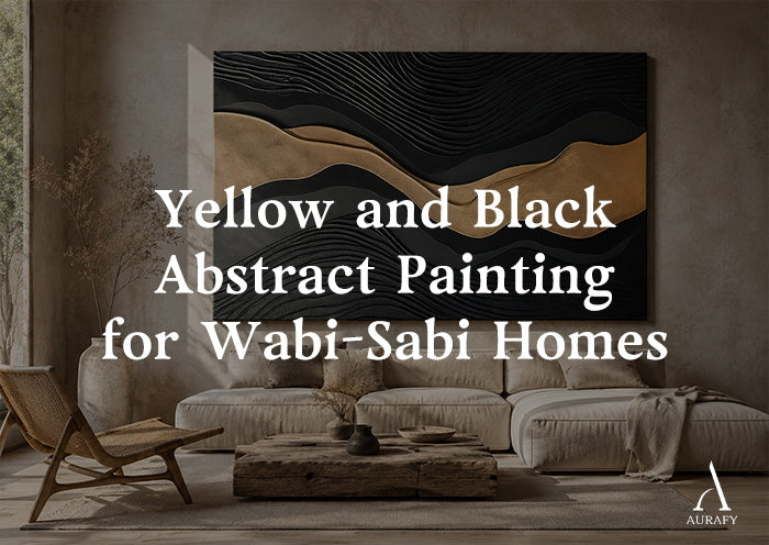
Why Perfect Wabi-Sabi Rooms Still Feel Empty

Many high-end Wabi-Sabi and Japandi homes share the same problem. The walls wear soft microcement. The floors show pale oak. The palette stays quiet and light.
Yet something feels off. The room looks calm on camera, but it feels cold in person. Nothing seems to hold the space down.
This happens because Wabi-Sabi design leans so heavily on light, airy materials that it loses its anchor. A room needs one element that feels heavy, rooted, and physically real. Without it, the eye keeps drifting and never settles.
This is where earth returns to the room. A black and yellow abstract painting, built from raw mineral paste instead of printed ink, gives a pale room the weight it has been missing. It works less like decor and more like a second skin of soil and stone on the wall.
Geological Color: Why This Yellow and Black Feel Different

Most people picture yellow and black together as bold, glossy, almost industrial. Think caution tape or gold foil. That version has no place in a Wabi-Sabi room.
The yellow in this style comes from a different source entirely. It draws from yellow ochre, raw clay, and terracotta earth. These pigments carry no shine. Light lands on them and simply stops, the way it does on a dry riverbed. Eyes read this kind of matte, low-saturation yellow as calming rather than stimulating.
The black works the same way. In a black abstract painting built with mineral base, the black comes from charcoal, not from paint. It mimics scorched cedar or hand-burned timber, a technique close to traditional shou sugi ban.
This charcoal black does not behave like a shadow or a void. It behaves like soil. It sits underneath the yellow ridges and quietly absorbs stray light and visual clutter from the room, without ever drawing attention to itself.
Tactile Interlocking: How Fiber and Mineral Read as One Material

Wabi-Sabi rooms lean on rough, natural fiber: raw linen curtains, rattan chairs, sisal rugs. Each of these materials shares one trait. Up close, none of them are smooth. Linen shows slubs. Rattan shows woven gaps. Sisal shows coarse, uneven loops.
A flat, printed canvas cannot speak this same visual language. It sits on the wall like a sticker, disconnected from everything around it.
A 3D mineral painting solves this by matching texture, not just color. Artists apply the paste with a palette knife, building ridges 15 to 20 millimeters deep. The paste cracks and splits as it dries, leaving edges that are rough and irregular, never straight.
Stand this painting next to a linen curtain and the connection becomes obvious. The knotted linen thread and the cracked mineral ridge share the same rhythm. The painting stops looking like an object hung on the wall. It starts looking like the wall's texture continuing upward, the same way a rug continues a floor.
Material Ratios: Matching Painting Texture to Room Type

Different Wabi-Sabi rooms call for different balances of yellow, black, and gold. Below are three common material environments and a texture ratio that fits each one.
Room 1: The Japandi Retreat Pale microcement walls, raw oatmeal linen, and light ash wood define this space. Use a ratio near 70% ochre and terracotta texture, 20% grey-white transitional clay, and 10% charcoal crack lines. The generous yellow warms the cool palette, while the thin black lines act as a visual anchor point so the eye has somewhere to land.
Room 2: The Rustic Wabi-Sabi Hub Aged elm wood, sisal rugs, and rattan furniture bring deep, weathered tone. Here, flip the ratio: 60% matte charcoal base, 30% crystallized ochre, and 10% dull antique bronze fragments. The dark base blends into dark wood tones almost seamlessly, while patches of yellow read like moss on aged stone.
Room 3: The Eclectic Earth Room Raw diatom mud walls and exposed brick call for a rougher, more even split: 50% charcoal mixed with deep tea brown, 50% desaturated ochre powder. Let the knife-cut splitting texture stay visible and uneven. This rawness softens the hard lines of brick and plaster, tying the whole room back to unfiltered earth.
Letting the Painting Age Instead of Styling It

A Wabi-Sabi room resists anything that looks manufactured. Avoid pairing this painting with plastic florals or shiny, high-gloss metal accents. These objects break the natural mood the painting works to build, almost instantly.
Mineral paste also needs 10 to 14 days to air-cure fully. During this time, it develops fine surface cracks, known as crazing, along with small, natural variations in how the pigment settles.
These marks are not flaws to hide. They are the same quality that gives old wood, linen, and rattan their character. A wall that shows this kind of imperfection starts to feel like it is recording time, not just holding paint.
Frequently Asked Questions (FAQ)
Does a yellow and black wall art piece suit Japandi interiors?
Yes, provided the colors are derived from natural earth sources. Industrial or high-gloss yellows will disrupt a Japandi palette, but desaturated ochres and matte charcoal blacks act as organic extensions of ash wood and linen textiles.
Can abstract paintings work in Wabi-Sabi homes?
Absolutely. Wabi-Sabi focuses on non-repetition, organic forms, and material honesty. A handmade abstract painting built with raw mineral paste captures these philosophies perfectly, avoiding the manufactured grid lines of traditional structured art.
What colors pair best with microcement or clay plaster walls?
Cool grey microcement pairs exceptionally well with warm mineral yellows, yellow ochre, and raw terracotta. These earth tones inject vital warmth into compressed grey registers, while a charcoal black element provides a necessary visual anchor.
Why does textured art fit Wabi-Sabi better than canvas prints?
Textured art interacts with real-world physics. Its ridges create natural shadows, and its drying cracks reflect authentic imperfection. Canvas prints utilize synthetic inks and smooth fabrics, which look foreign and artificial alongside materials like unfinished wood or linen.
Calibrate Your Minimalist Anchor
Every Wabi-Sabi room ages differently. Share a photo of your space or your design plan with us, and AurafyArt will recommend a custom yellow and black abstract painting calibrated precisely to your wall material, natural light exposure, and furniture palette.
Share:
Black White and Blue Abstract Art for Tech Desks and Studios
Green Abstract Painting for Eclectic Plant-Filled Rooms