


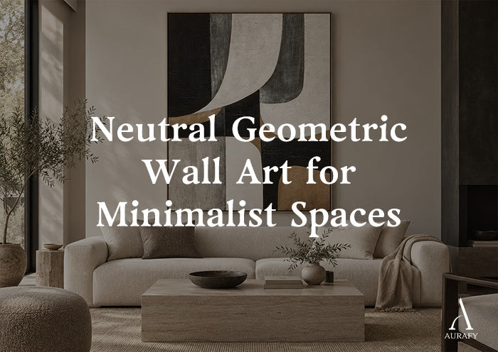
Neutral Geometric Wall Art for Minimalist Spaces

Geometric wall art has a reputation for feeling cold or overly graphic, but that's usually a color problem, not a shape problem. Sharp lines and structured grids don't have to feel clinical — when the palette shifts toward beige, ivory, and charcoal instead of black and white, the same order and clarity come through without the harshness. This is the version of geometric art that works in a minimalist living room, a quiet home office, or a hallway that needs structure without visual noise.
Why Neutral Tones Change How Geometric Art Reads

Black-and-white geometric pieces rely on hard contrast to create energy. That works, but it also demands a lot from the room — stark walls, crisp trim, minimal clutter. Neutral geometric art asks less of the space around it.
Warm beige, cream, and charcoal in the same composition still give you structure — grids, blocks, repeated lines — but the contrast between elements is softer. The eye reads the order in the piece without feeling pulled toward a hard edge. A piece like Minimalist Grid Texture Wall Art-Warm Beige Tones-AURA060 shows this clearly: it uses a centered grid structure, but because the palette moves through warm beige, creamy white, soft taupe, and touches of dusty rose or muted ochre, the geometry feels grounded rather than graphic.
Does neutral geometric art still look "minimalist," or does it need to be black and white to read that way?
Minimalism is about restraint and clarity, not color temperature. A neutral palette with clean structure and generous negative space reads just as minimalist as black and white — often more so, because it avoids the visual tension that high contrast introduces.
Choosing Between Grid, Block, and Relief Compositions

Not all geometric art behaves the same way on a wall, and the format matters as much as the palette.
- Grid compositions, like AURA060, repeat a structured pattern across the canvas. These work well when you want rhythm and order — think entryways, stairwells, or a wall you pass frequently rather than sit facing for long periods.
- Block compositions, such as Silence Geometry-Ivory & Charcoal Minimal Abstraction-AURA112, use fewer, larger shapes in ivory, charcoal, and beige. These read as calmer and more architectural, better suited to a focal wall behind a sofa or bed.
- Relief and textured compositions, like Grid Relief Painting-Cream & Beige Tones-AURA011, add raised, tactile dimension to the grid itself. The physical texture catches light differently than a flat print, which keeps a neutral piece from going flat under low or indirect lighting.
Which format suits a small room best?
Block compositions with generous negative space, like AURA112, tend to suit small rooms better than dense grids — fewer visual elements mean the piece doesn't compete with limited floor space.
Building the Room Around Neutral Geometry

Geometric art in neutral tones works best when the room supports its sense of order rather than fighting it.
Furniture lines. Straight-edged furniture — a low platform bed, a rectangular console, a boxy sofa — echoes the structure in the art. Curved, ornate furniture can create a visual mismatch with sharp geometric compositions.
Wall color. A warm white or soft greige wall lets beige and cream geometric pieces blend rather than jump out, which is usually the goal in a minimalist room. A cooler white can make warm beige tones look slightly dull by comparison.
Negative space around the piece. Minimalist geometric art needs room to breathe. Crowding it with shelves, frames, or decor objects undercuts the calm the piece is meant to create.
Textiles. Boucle, linen, and raw cotton in cream or oatmeal tones complement the tactile quality of relief pieces like AURA011, since both rely on subtle texture rather than pattern for visual interest.
Scale: The Most Common Miscalculation
Geometric art, more than most other styles, needs to match the scale of the wall it's on. A grid or block pattern that's too small for its wall looks like a swatch rather than a composition; the repeating elements lose their rhythm when there isn't enough canvas for the pattern to develop.
- Above a sofa or bed: aim for a width that's roughly two-thirds the width of the furniture below it
- In a hallway or stairwell: vertical or elongated horizontal formats generally track better with the sightline than square pieces
- As a solo focal point: oversized works better than undersized — a large, quiet geometric piece with room around it reads as intentional in a way a small one rarely does
Both AURA060 and AURA011 are offered across a range of sizes — AURA060 in horizontal formats and AURA011 in square formats — which makes it easier to match the piece to the actual proportions of the wall rather than settling for whatever size happens to be available.
A Note on Earth-Toned Geometric Abstracts

Beyond beige and charcoal grids, there's a warmer branch of neutral geometric art built on earth tones — muted terracotta, sand, and soft brown blocked into geometric shapes. Pieces in this direction (sometimes labeled as neutral earth abstracts) work particularly well in rooms with warm wood floors or leather furniture, where a straight beige-and-charcoal piece might feel slightly cool by comparison. If your room leans warm already, look specifically for geometric art described as earth-toned or warm-neutral rather than defaulting to the beige-and-charcoal combination.
Common Mistakes
- Choosing a piece with too much contrast for a calm room. High-contrast neutral geometry can still feel busy, even without black and white.
- Undersizing for the wall. A small grid pattern loses its rhythm and reads as a swatch rather than a composition.
- Ignoring texture. Flat prints of grid or block patterns can look static under even lighting — relief and textured pieces hold up better.
- Pairing with ornate furniture. Sharp geometric lines look best against equally clean furniture silhouettes.
- Crowding the wall. Minimalist geometric art loses its effect when surrounded by too many other objects.
Quick Selection Checklist

- Confirm the palette leans warm (beige, cream) or cool (gray, charcoal) to match your existing furniture
- Choose grid for rhythm, block for calm focal points, or relief for added texture
- Size up rather than down, especially above furniture
- Leave enough negative space around the piece for it to read as intentional
- Match furniture lines — straight and simple works best with geometric structure
FAQ
Is neutral geometric wall art too plain for a statement wall?
Not if you choose the right composition. Block-style pieces with strong tonal contrast, like ivory paired with charcoal, carry enough visual weight to anchor a wall on their own. The key is scale — a large, well-proportioned neutral piece reads as a considered statement, while a small one can feel like an afterthought rather than a focal point.
Can I mix grid and block geometric pieces in the same room?
It's possible, but it works best when one style clearly leads. Choose a dominant piece — usually the larger block composition — for the main wall, and use a smaller grid piece in a secondary space like a hallway or reading nook. Placing both in the same sightline can dilute the sense of order that geometric art is meant to provide.
Does textured or relief geometric art need special care?
Follow the care guidance on the specific product page; raised texture is best handled gently so the surface detail remains intact.
What size grid pattern works for a narrow hallway?
Elongated horizontal or vertical formats generally suit narrow hallways better than square grids, since they follow the sightline instead of interrupting it. If you're considering a piece like AURA060, its horizontal size range makes it easier to select a width proportional to the hallway rather than a size that overwhelms the narrow wall.
Share:
Charcoal Wall Art for Sophisticated Neutral Interiors
How to Style Geometric Wall Art Without Visual Clutter