


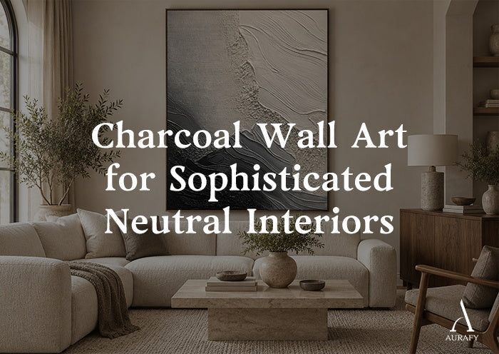
Charcoal Wall Art for Sophisticated Neutral Interiors

Black wall art can feel like a hard stop in a room. Charcoal does something different — it holds the same visual weight without the flatness, which is why so many neutral interiors are shifting toward it instead of true black or standard gray. If you're trying to anchor a living room, hallway, or bedroom with something dark but not severe, charcoal wall art is worth understanding before you buy.
This guide walks through what makes charcoal work as a neutral, how it behaves against different wall colors and materials, and where people go wrong when they bring it home.
Charcoal vs. Black vs. Gray: What's Actually Different

Charcoal sits in a narrow but important zone between black and gray, and the difference isn't just about how dark it reads.
Black is absolute. It absorbs light and gives almost nothing back, which is exactly why it can feel stark against pale walls or in rooms that already lean cool. Gray, on the other hand, can read as flat or even a little cold when it's used in large blocks, especially under artificial light.
Charcoal is gray pushed almost to black, but it usually retains a whisper of brown, blue, or green underneath. That undertone is what keeps it from going lifeless. In a piece like Silence Geometry-Ivory & Charcoal Minimal Abstraction-AURA112, the charcoal blocks sit near black in value but still feel warmer and more textured than a solid black panel would, because they're paired with ivory and beige rather than pure white.
Should I choose charcoal or black for a large piece?
Choose charcoal if your room already has warm wood tones, layered textiles, or soft lighting — it will integrate rather than compete. Choose true black only if you want a sharper, more graphic contrast and your palette is already cool-toned.
Reading Undertones Before You Buy

Every charcoal has a temperature, even if it looks neutral in a product photo. This matters more than most buyers expect.
- Warm charcoal leans slightly brown or taupe. It pairs naturally with oak, walnut, and terracotta accents.
- Cool charcoal leans slightly blue or green. It suits rooms with marble, chrome, or crisp white trim.
- True neutral charcoal is rare and tends to shift depending on the light source in the room.
The safest way to check undertone is to view the artwork next to a warm lamp and again near a north-facing window. A charcoal that looks neutral under warm bulbs can suddenly read cool and slightly clinical in daylight. If you're ordering online, look for pieces that already combine charcoal with a named warm or cool partner color — it tells you which direction the undertone leans. Earthen Silence — Textured Abstract in Clay & Charcoal (AURA108), for example, pairs charcoal with clay, beige, and muted taupe, which signals a warm-leaning charcoal from the start.
Wall Colors That Let Charcoal Do Its Job
Charcoal wall art doesn't need a stark backdrop to read well — in fact, it usually performs better against something softer.
Best pairings:
- Warm white or ivory walls, which let the charcoal read as rich rather than harsh
- Soft greige or oatmeal tones, which narrow the contrast just enough to feel calm
- Pale taupe, which shares an undertone with warm charcoal and creates a tonal, low-contrast wall
Pairings to approach carefully:
- Cool white walls with blue undertones can push a warm charcoal into looking muddy
- Very dark walls can swallow the piece entirely, flattening the contrast that made charcoal appealing in the first place
Does charcoal wall art work on a white wall?
Yes, but the shade of white matters — a warm or ivory white will let the charcoal look intentional, while a stark, cool white can make the contrast feel harder-edged than intended.
Cream, Ivory, and Taupe: The Pairing That Makes Charcoal Work

The single biggest style decision with charcoal wall art is what you put around it, not the piece itself.
Cream and ivory are the most forgiving partners because they soften charcoal's darkness without erasing it. This is the logic behind pieces like AURA112, which blocks bold ivory and charcoal geometry directly on the canvas — the ivory does the work of keeping the composition from feeling heavy, while the charcoal gives it structure. The same principle applies at the room level: cream drapery, an ivory sofa, or a bouclé chair near a charcoal painting keeps the space feeling composed rather than moody.
Taupe works a little differently. Because taupe already sits close to charcoal in tone, using it as a wall color or upholstery choice creates a tonal room — one where the art doesn't jump out so much as settle in. This is a quieter, more restrained look, well suited to bedrooms or reading nooks where you want depth without drama.
Avoid pairing charcoal with too many other dark neutrals at once. One charcoal anchor, surrounded by lighter creams and taupes, reads as intentional. Three or four dark elements in the same sightline start to compete.
Wood, Stone, and Textiles: Building the Room Around It

Charcoal wall art earns its keep when the room around it has some material variation. Flat paint and flat art together can feel one-note, no matter how good the color is.
Wood — warm-toned wood, like oak or walnut furniture, gives a charcoal piece something to play off. The wood's grain and warmth balance the flatness of a painted charcoal surface, especially in pieces with visible brushwork like Organic Swirl Painting-Cream, Gray & Charcoal Tones-AURA001, where the swirling texture already has organic movement that echoes wood grain.
Stone — honed or matte stone finishes (think soapstone counters or a stone side table) share charcoal's mineral quality without competing for attention. Polished, glossy stone can feel like a mismatch, since it reflects light in a way that fights the matte quality most charcoal art relies on.
Textiles — bouclé, linen, and wool in cream or oatmeal tones add the softness that a dark, matte painting doesn't provide on its own. A charcoal piece above a linen sofa with a wool throw does more visual work than the same piece above a leather sofa in a similar tone, simply because the textures separate more clearly.
Why Texture Keeps Charcoal From Looking Flat

This is the part that gets skipped most often. A smooth, flat charcoal surface — whether it's paint on a wall or a print with no visible texture — can look like a void rather than a considered dark neutral. Texture is what gives charcoal its dimension.
Textured abstract pieces solve this by letting light catch the surface unevenly. Bronze Axis Canvas-Charcoal & Ivory Textured Wall Art-AURA102 uses visible textured brushwork across the charcoal and ivory sections, so the surface shifts in tone depending on where the light hits it — lighter along raised ridges, deeper in the recesses. That variation is what keeps a large charcoal piece from reading as a single dark rectangle on the wall.
Why does my charcoal wall art look flat instead of rich?
It's usually a lighting or surface issue — a smooth, matte charcoal surface under flat, even lighting has nothing to catch, so add a picture light or angle a lamp toward it, and choose a textured piece if you're still shopping.
If you're working with directional lighting — a floor lamp, picture light, or afternoon sun — textured charcoal art will show more depth than a flat print in the same colorway. This is one of the more practical reasons to choose texture over a smooth finish when the piece is going in a room with limited or single-source lighting.
Scale and Placement

Charcoal, because it carries visual weight, is less forgiving of undersizing than lighter neutral art. A small charcoal piece on a large wall can look like an afterthought rather than an anchor.
- Above a sofa: aim for roughly two-thirds the width of the sofa itself, not the whole wall
- In a hallway: vertical orientations generally work better than square or wide horizontal formats, since most hallways are narrow and taller pieces make better use of the sightline
- As a focal point: if the piece is meant to be the main event in the room, don't crowd it — give it clear wall space rather than surrounding it with smaller frames
Many charcoal abstract pieces, including AURA112, AURA102, and AURA001, are available through vertical size selectors, which makes it easier to match the piece to a stairwell, hallway, or narrow accent wall without cropping the composition yourself.
Common Mistakes to Avoid
- Treating charcoal like black. They read differently in a room, and styling them identically often makes charcoal look muddy rather than rich.
- Ignoring undertone. A cool-leaning charcoal in a warm room (or vice versa) will always look slightly off, even if the value is right.
- Skipping texture in low-light rooms. Flat charcoal in a dim room can disappear into the wall rather than anchor it.
- Undersizing. Charcoal's weight means it needs enough real estate to read as intentional, not accidental.
- Stacking too many dark neutrals. One charcoal anchor works; several competing dark tones in the same room start to cancel each other out.
Quick Checklist Before You Buy
- Confirm the piece's undertone (warm, cool, or neutral) against your existing wood and wall tones
- Choose a wall color — ivory, warm white, or soft taupe — that lets the charcoal read as rich, not stark
- Look for visible texture or brushwork if the room has limited directional lighting
- Size up rather than down, especially above furniture
- Limit other dark neutrals in the same sightline so the piece stays the anchor
FAQ
Is charcoal wall art too dark for a small room?
Not necessarily — a small room with light walls and good natural light can absolutely support a charcoal piece, since the contrast actually helps define the space rather than shrink it. What matters more than room size is balance: pair the art with lighter furniture and keep other dark elements minimal so the charcoal reads as a deliberate anchor rather than added heaviness in a tight space.
What's the difference between charcoal abstract art and a gray charcoal painting?
Charcoal abstract art typically emphasizes bold shapes, geometric blocking, or expressive brushwork, with charcoal used as one of several tones in the composition. A gray charcoal painting usually leans more tonal, blending charcoal with lighter grays for a softer, more atmospheric effect. Both work as neutrals, but abstract pieces tend to suit rooms that want a stronger focal point, while tonal paintings suit quieter, more layered spaces.
Does charcoal textured wall art need special lighting?
It doesn't require anything elaborate, but directional light — a picture light, floor lamp, or afternoon sun angled across the piece — will show off the texture far better than flat overhead lighting. Textured surfaces rely on shadow and highlight to read as dimensional, so even a simple lamp placed to one side can noticeably improve how the piece looks after dark.
Can charcoal wall art work with warm wood tones, or does it need cooler materials?
Warm wood pairs very well with charcoal, particularly with warm-leaning charcoal tones that share undertones with oak or walnut. The combination feels grounded rather than mismatched, since both materials read as natural and matte rather than glossy or cold. This pairing is often more forgiving than charcoal with cool materials like chrome or glass, which can heighten contrast in a way that feels sharper than intended.
Share:
Metallic Wall Art for Modern Interiors Without Looking Flashy
Neutral Geometric Wall Art for Minimalist Spaces