


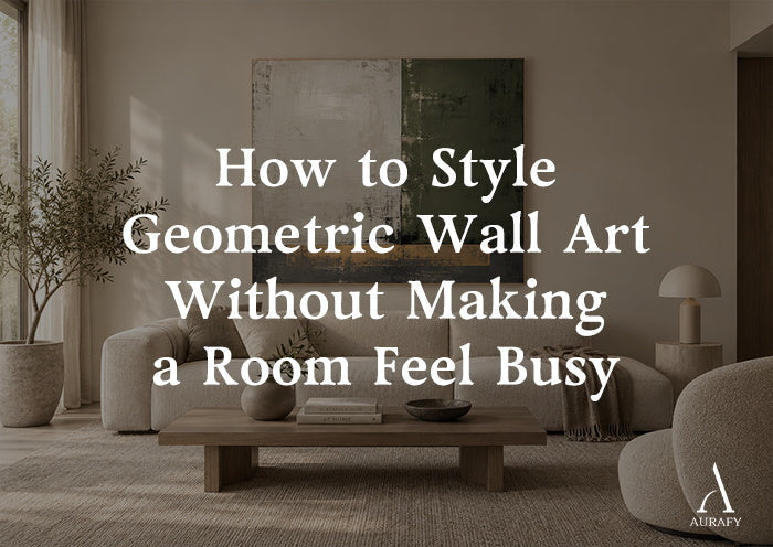
How to Style Geometric Wall Art Without Visual Clutter

Geometric wall art gets blamed for making rooms feel chaotic more often than it deserves. In most cases, the piece itself isn't the problem — it's how it's placed, sized, and surrounded. Shapes, grids, and repeated patterns can bring real structure to a room, but only if the rest of the space is styled to support that structure rather than compete with it.
This is a practical walk-through of the variables that actually control whether geometric art reads as organized or overwhelming.
Start With Pattern Intensity, Not Just Color

Busyness in geometric art comes from pattern density more than from color choice. A piece with many small, repeated shapes packed closely together will always read as more active than one with fewer, larger shapes — even if both use the same neutral palette.
Low-intensity patterns: large blocks, wide margins, minimal repetition — best for rooms that already have some visual activity (patterned rugs, layered textiles, collected objects)
High-intensity patterns: dense grids, tight repetition, multiple overlapping shapes — best reserved for rooms that are otherwise quiet, where the art can be the main visual event
How do I know if a geometric piece is "too busy" for my room?
Count the other patterns already in the room — rugs, upholstery, tile. If you have two or more active patterns already, choose a low-intensity geometric piece; if the room is otherwise calm, a denser pattern has room to work.
A piece like Abstract Geometric Texture Canvas — Noir & Sand Painting (AURA050) uses a noir and sand palette with a geometric textured direction, which gives it graphic presence without the pattern density of a tight grid — a useful middle ground for rooms that want structure without commitment to a busier composition.
Let Furniture Lines Do Some of the Work

Geometric art doesn't exist in isolation — it's read against the furniture beneath and around it. Straight, simple furniture lines echo the order in the art and reduce the sense of visual competition.
- A low platform sofa or bed with clean edges supports a geometric piece far better than one with rolled arms or ornate carving
- Rectangular or square coffee tables and consoles reinforce the same geometry rather than introducing a conflicting shape language
- Curved furniture isn't off-limits, but it works better paired with a softer geometric piece — one with more organic transitions, like the raised texture in Grid Relief Painting-Cream & Beige Tones-AURA011 — rather than a sharp, high-contrast grid
Use Negative Space as a Design Tool
The most common styling mistake with geometric art is under-using negative space, both within the piece and around it.
Within the piece: compositions with generous margins, like the centered grid in Minimalist Grid Texture Wall Art-Warm Beige Tones-AURA060, give the eye somewhere to rest between shapes. Edge-to-edge pattern with no breathing room reads as busier, regardless of palette.
Around the piece: avoid flanking a geometric piece with shelves, sconces, or smaller frames. A single, well-sized piece with clear wall space on either side does more to keep a room calm than the same piece crowded with accessories.
Should I hang other art near a geometric piece, or leave it alone?
Leave it alone if the piece is meant to be a focal point. Geometric compositions rely on clear surrounding space to read as ordered; competing frames or shelving nearby undercut that effect.
Repeat One or Two Colors From the Art, Not All of Them

A geometric piece with four or five colors doesn't need four or five colors echoed throughout the room — that's often what tips a space from cohesive into busy. Pull one or two dominant tones from the piece and repeat them in textiles or furniture, and let the rest of the room stay neutral.
For a piece with ivory, charcoal, and beige — like Silence Geometry-Ivory & Charcoal Minimal Abstraction-AURA112 — that might mean an ivory throw and a charcoal accent chair, with everything else in the room left plain. Trying to match every tone in the piece across the room usually results in a space that feels over-coordinated rather than calm.
Scale Correctly the First Time

Undersized geometric art is one of the fastest ways to make a wall feel cluttered, because a small pattern surrounded by empty wall space draws the eye to the mismatch rather than the composition itself.
- Above furniture, aim for roughly two-thirds the width of the piece below it
- On an open wall, err toward larger rather than smaller — a single oversized geometric piece reads as calmer than two or three smaller ones grouped together
- In tight spaces like hallways, elongated vertical or horizontal formats track better than square pieces, since they follow the sightline instead of interrupting it
Common Mistakes
- Choosing a dense pattern for an already busy room. Two active patterns in the same sightline compete rather than complement.
- Pairing sharp geometry with ornate furniture. The shape languages clash and neither one reads clearly.
- Crowding the piece with other wall decor. Geometric art needs clear space to read as organized.
- Matching every color in the piece throughout the room. This often over-coordinates a space rather than calming it.
- Undersizing for the wall. A small geometric piece on a large wall looks like an afterthought, not a focal point.
Quick Selection Checklist

- Match pattern intensity to how busy the rest of the room already is
- Choose furniture with clean, simple lines to support the geometry
- Leave generous negative space around the piece — don't flank it with other decor
- Pull just one or two colors from the art into your textiles, not all of them
- Size up rather than down, especially above furniture
FAQ
Can geometric wall art work in a room with a patterned rug?
Yes, but choose a lower-intensity geometric piece — larger shapes, more negative space — so the two patterns don't compete for attention. Keep the rug and the art in a shared color family, and avoid adding a third strong pattern through curtains or upholstery, which is usually where a two-pattern room tips into feeling cluttered.
How many pieces of geometric art can I hang in one room?
One dominant piece per sightline is the safer rule. If you want geometric art in two spots in the same room, vary the intensity — one denser or bolder piece as the anchor, and one quieter, more minimal piece elsewhere — rather than repeating the same visual weight twice.
Does the frame or lack of frame affect how busy geometric art looks?
An unframed or minimally bordered canvas generally reads as calmer than a heavily framed piece, since the eye isn't stopped by an additional strong edge. Beyond that, presentation specifics vary by piece and retailer, so confirm framing details on the product listing rather than assuming.
What wall color best supports geometric art without adding busyness?
Soft, warm neutrals — greige, warm white, oatmeal — tend to work best, since they let the geometry stand out without introducing a competing tone. Avoid strongly saturated or patterned walls behind geometric art; the wall itself should function as a quiet backdrop, not a second pattern in the room.
Share:
Neutral Geometric Wall Art for Minimalist Spaces
Abstract Seascape Wall Art for Calm Modern Living Rooms