


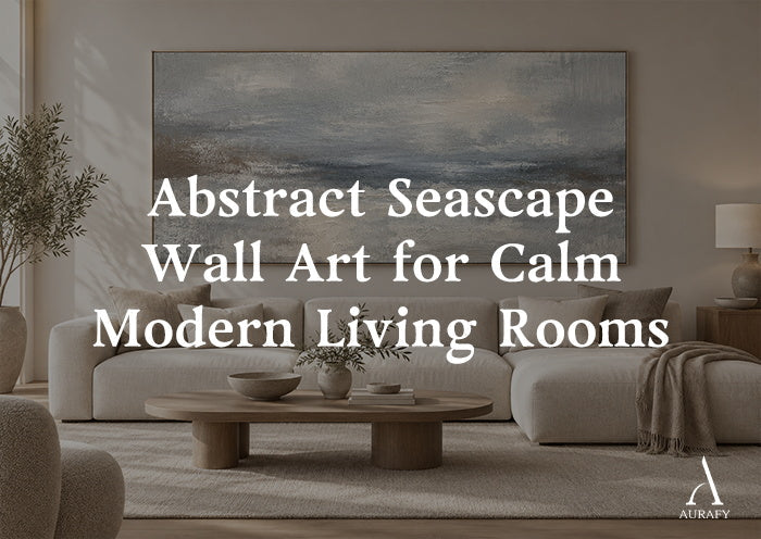
Abstract Seascape Wall Art for Calm Modern Living Rooms

Seascape art has a literal-décor problem — shell motifs, anchor prints, and nautical stripes that read more like a beach rental than a considered living room. Abstract seascape wall art solves this by keeping the feeling of water and horizon without the literal imagery. It's a way to bring calm, movement, and depth into a modern space through color and texture alone, rather than through recognizable coastal objects.
What Makes Seascape Art "Abstract" Rather Than Literal

The difference comes down to what the piece asks you to recognize. Literal seascape art shows you a wave, a boat, a horizon line you can point to. Abstract seascape art suggests the same feeling — movement, distance, mist — through color transitions, brushwork, and texture, without depicting a specific scene.
This distinction matters for modern living rooms because literal coastal imagery tends to date a space or pull it toward a specific theme. Abstract seascape work, by contrast, functions more like a mood: cool blues fading into taupe, or soft gray blending into cream, evoke water and sky without locking the room into a beach aesthetic.
Is abstract seascape art too coastal-looking for a non-beach-themed living room?
Not if the palette stays neutral. Abstract pieces built on blue-gray, taupe, and cream — rather than bright turquoise or nautical navy — read as calm modern art first and only suggest water on closer look.
Reading the Palette: Blue-Gray, Taupe, and Mist

Most abstract seascape work draws from a fairly narrow, muted palette, and understanding it helps you choose a piece that fits your room rather than dominates it.
- Cool blue-gray tones, as in a piece described as a Minimalist Seascape Texture Canvas-Cool Blue & Taupe Painting-AURA035, lean toward the water and sky end of the spectrum, suiting rooms with cooler neutrals or stone surfaces.
- Misty, taupe-forward pieces, such as Dreamy Seascape Painting-Misty Taupe & Cream-AURA043, sit further into warm neutral territory, using beige, cream, and soft gray in a minimalist, hand-painted, textured composition. These integrate more easily into rooms with warm wood and layered cream textiles.
- Blue-and-taupe blends, like an Abstract Seascape Texture Painting-Misty Blue & Taupe Canvas-AURA034, sit between the two, offering a compromise for rooms that mix warm and cool elements already.
How do I choose between a blue-leaning and a taupe-leaning seascape piece?
Match the undertone of your existing neutrals — cooler grays and whites call for blue-leaning pieces, while warm creams and wood tones call for taupe-leaning ones. If your room mixes both, a blue-and-taupe blend avoids favoring either side too strongly.
Why Texture Matters More in Seascape Abstracts Than in Most Other Styles

Water, mist, and horizon are inherently about movement and depth — qualities that are hard to convey in a perfectly flat, smooth surface. This is part of why textured, hand-painted seascape abstracts tend to hold visual interest better than flat prints of the same subject.
Dreamy Seascape Painting — Misty Taupe & Cream (AURA043) uses hand-painted impasto brushstrokes on acrylic canvas, which means the surface itself has ridges and variation that catch light unevenly — much the way real water or mist does. That physical texture does real work in a room with shifting daylight, since the piece looks slightly different depending on the time of day and angle of light.
Does abstract seascape art need to be textured to feel calming, or does a flat print work just as well?
Texture isn't required, but it adds a layer of realism to the sense of movement — a flat print can still feel calming through color and composition alone, though it won't shift and catch light the way a textured, hand-painted surface does.
Building a Calm Living Room Around Seascape Abstracts

Wall color. Soft, warm white or pale greige backdrops let taupe-leaning seascape pieces feel integrated rather than isolated. For blue-leaning pieces, a cooler white or pale gray wall keeps the palette consistent.
Furniture and textiles. Linen, bouclé, and raw cotton in cream or soft gray echo the softness of an abstract seascape without competing with its color transitions. Avoid heavily patterned upholstery nearby — the piece itself is already doing quiet, subtle work, and a busy sofa fabric can drown that out.
Lighting. Indirect, warm lighting in the evening tends to bring out the mistier, taupe tones in these pieces, while daylight will emphasize any blue-gray undertones more strongly. If you want the piece to read consistently morning and night, choose a palette that leans clearly one direction rather than trying to split the difference.
Scale and Placement for Living Rooms

Seascape abstracts, because they rely on subtle color transition rather than sharp graphic contrast, generally benefit from more size than smaller decorative pieces would need. A small, muted seascape piece can get lost on a large wall, since there's no bold shape or contrast to anchor attention from a distance.
- Above a sofa: aim for two-thirds the sofa's width as a baseline, and size up if the room has high ceilings
- As a room's focal point: a single large piece communicates the calm, expansive quality of these compositions better than a grouping of smaller ones
- In a reading nook or smaller seating area: vertical formats, such as those available for AURA043, work well for narrower walls without cropping the sense of horizon within the piece
Common Mistakes
- Choosing overly saturated or bright blue tones, which push the piece toward literal coastal décor rather than abstract calm.
- Pairing a cool blue-leaning piece with an entirely warm room, creating a visible undertone mismatch.
- Skipping texture in low-light rooms, where a flat surface has nothing to catch and can look dull after dark.
- Undersizing for the wall, which weakens the sense of depth and horizon these pieces are meant to create.
- Surrounding the piece with busy patterns, which compete with its subtle color transitions.
Quick Selection Checklist
- Identify whether your room's neutrals lean warm or cool, and match the seascape palette accordingly
- Favor textured, hand-painted pieces if the room relies on indirect or shifting light
- Size up for living rooms, especially above sofas or as a sole focal point
- Keep surrounding textiles soft and largely solid, not patterned
- Choose vertical formats for narrower walls to preserve the sense of horizon
FAQ
Will abstract seascape art clash with a modern, minimalist living room?
No — abstract seascape pieces in muted blue-gray, taupe, and cream palettes tend to suit minimalist rooms particularly well, since they rely on color and texture rather than busy detail. The key is avoiding literal wave or shoreline imagery; a purely abstract, color-based composition reads as modern art first and coastal reference second.
How do I keep abstract seascape art from feeling too cold in a warm-toned room?
Choose a taupe or cream-leaning piece rather than a strongly blue one, and repeat its warmer tones in nearby textiles like a linen throw or cream pillow. Pieces built around misty taupe and cream, rather than cool blue-gray, tend to integrate more naturally into rooms with warm wood floors or furniture.
Can I hang abstract seascape art in a room without any other blue or gray tones?
Yes, as long as the piece's undertone doesn't sharply contrast with your existing neutrals. A taupe-forward seascape piece can work in an all-warm room without introducing blue elsewhere, since the taupe acts as a bridge rather than a competing cool tone.
Is a vertical or horizontal seascape piece better for a living room?
It depends on the wall, not a fixed rule. Wide, open walls above a sofa generally suit horizontal formats, which echo the sense of a horizon line, while narrower walls or accent spaces work better with vertical formats, which some seascape pieces, like AURA043, offer as an option.
Share:
How to Style Geometric Wall Art Without Visual Clutter