


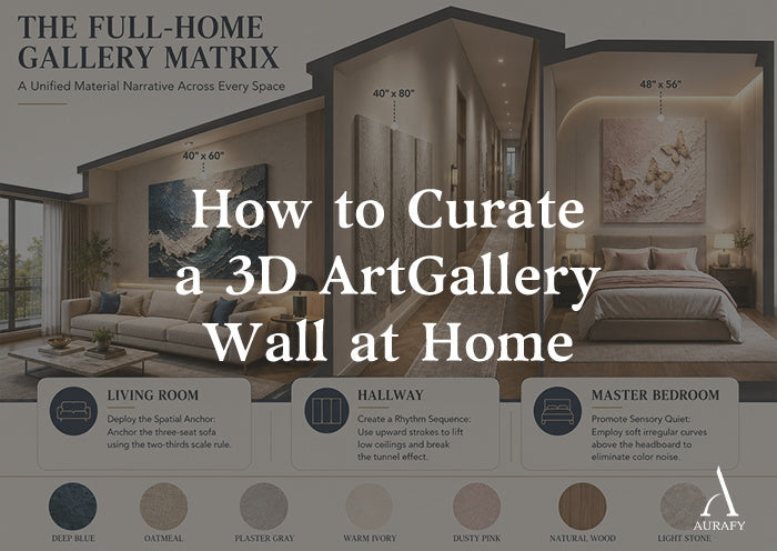
- Build a home gallery by combining different sizes of textured wall art under the two-thirds scale rule — one anchor piece per room, supported by coordinated pieces in adjacent spaces.
- Use 45-degree raking light across all pieces to unify different 3D motifs without creating color or spatial clutter.
- Choose a single large-format piece (40" × 60" minimum) as the visual anchor for the living room, then extend the material narrative into the hallway and bedroom with coordinated pieces.
- Keep the bedroom selection soft and organic — wabi-sabi butterfly or floral pieces in neutral tones with no sharp geometric lines.
- All pieces need two fixing points on rated wall anchors — never hang any canvas wider than 24 inches from a single hook.
Most people approach wall art one room at a time. They find a piece for the living room, hang it, and move on. The bedroom gets something different. The hallway gets whatever is left.
The result is a home where each room has art, but the rooms do not speak to each other. The pieces are fine in isolation. Together, they create no narrative.
A curated home gallery works differently. The pieces are chosen to relate — in material, in tone, in the way they respond to light. Walking through the home, the visual language stays consistent. The walls feel designed rather than decorated.
This guide shows you how to build that consistency using textured wall decor across multiple spaces — with specific guidance on sizing, placement, sequencing, and lighting.
The Curation Blueprint: Three Formulas That Work

Formula one: The anchor piece
Every gallery wall starts with one dominant piece — the largest, the most visually commanding, the one that establishes the visual standard for everything around it.
For a living room with a standard three-seat sofa, this anchor piece should be 40" × 60" or wider. Its total width should cover two-thirds to three-quarters of the sofa below it. For a 90-inch sofa, this means artwork between 60 and 68 inches wide.
This proportion creates a gravitational center for the room. The anchor piece defines the material register — the level of quality and physical presence — that every other piece in the home is chosen to match.
Formula two: The rhythm sequence
Once the anchor piece is established, adjacent spaces extend the visual narrative with coordinated formats.
The living room horizontal composition transitions into the hallway with a vertical format — a single 40" × 80" canvas or a triptych of three vertical panels hung in a horizontal row. The vertical orientation draws the eye upward and breaks the tunnel effect that long narrow corridors create. The upward movement of the palette knife strokes reinforces this direction.
Keep the palette consistent across the transition. If the living room piece uses warm sand and oat tones, the hallway pieces should draw from the same tonal family. The subject matter can change — from an abstract wave in the living room to a tree form in the hallway — but the material language stays connected.
Formula three: The bedroom proportion
The bedroom calls for a different approach. The pieces here should be softer in form — organic curves, botanical motifs, gentle butterfly compositions — and lighter in visual weight.
Choose artwork between 48 and 56 inches wide for a king bed, or between 40 and 48 inches wide for a queen. Position the bottom edge 8 to 10 inches above the headboard top. This gap connects the art to the bed without crowding it.
Avoid sharp geometric compositions in a bedroom. The goal is visual calm, not visual tension. A wabi-sabi textured piece in warm ivory, soft clay, or pale plaster white creates the psychological quietness that a sleep space requires.
The Full-Home Gallery Matrix
|
Room |
Recommended 3D Motif & Palette |
Complementary Materials |
Gallery Function |
|
Living room |
40" × 60" wave or geometric relief / deep cobalt, oat, warm sand |
Micro-cement floors / woven fabric sofa / glass coffee table |
Anchor piece: the physical depth of the surface absorbs harsh light and counters the hard geometry of electronics and angular furniture |
|
Master bedroom |
48" × 56" butterfly or floral / dusty blush, warm ivory, pale clay |
Raw linen curtains / white oak furniture / bouclé armchair |
Emotional calm: soft irregular curves project gentle micro-shadows under low warm light — no color noise, full sensory quiet |
|
Hallway |
Vertical 40" × 80" tree trunk or leaf triptych / weathered grey, clay greige |
Oak console / jute rug / flush-panel doors |
Vertical pull: upward texture strokes draw the eye toward the ceiling, relieving the compression of a narrow corridor |
|
Dining room |
Diptych or triptych abstract / charcoal, weathered brown, marble white |
Polished marble island / matte black metal shelving / brushed steel appliances |
Material warmth: the dry matte surface scatters overhead light softly, creating a rich atmosphere for evening dining |
|
Home office |
Single vertical / warm sand or muted sage |
Walnut desk / neutral upholstery / warm metal fixtures |
Focus point: provides a physical resting point for the eye between screen sessions without introducing color distraction |
|
Bathroom |
Small format wave or organic abstract (moisture-sealed) / white, oat |
Stone basin / brass fixtures / matte tile |
Spa atmosphere: white textured surface catches ambient light softly, elevating the space without overcrowding a small wall |
How to Sequence Pieces Across the Home

The gallery effect comes from continuity — the sense that the choices throughout the home were made by the same person with the same intention.
Start with tone, not subject
The easiest way to create visual continuity across multiple rooms is to commit to a shared tonal palette. Warm neutrals — oat, sand, ivory, pale clay — work across every room type and every 3D subject. If you commit to this palette for all pieces, the subject matter can vary freely: waves in the living room, leaves in the hallway, butterflies in the bedroom. The pieces will still feel related because they share the same light-responsive, neutral-toned surface language.
Use scale as a narrative tool
The largest piece belongs in the room with the most architectural weight — typically the living room. Pieces in transition spaces (hallways, entries) should be generous in scale but oriented vertically to work with the proportions of the space. Bedroom pieces should be slightly smaller and softer in form.
This sequencing creates a sense of progression as you move through the home. Each space has its own appropriate scale and character while remaining part of the same visual story.
Connect through light response
All 3D textured pieces respond to directional light with shadow and depth. This shared quality is what makes a multi-piece gallery feel unified even when the subject matter varies. A wave piece, a butterfly piece, and a geometric piece all produce the same essential visual effect under raking light — surface shadow that shifts through the day. That shared responsiveness is the thread that connects them.
Why the Gallery Demands Handmade Work

A home gallery built on machine-pressed panels fails the same way at every scale: the mechanical repetition in the surface becomes visible as the number of pieces increases.
One machine-pressed panel in a room might pass unnoticed. Three or four distributed across a home, all carrying the same uniform surface pattern, read as a collection of manufactured products. The effect is the opposite of the private gallery atmosphere you were trying to create.
At AurafyArt, every piece is made to order in our dedicated artist studio. No molds, no templates, no pre-set patterns.
Why this matters for a multi-piece gallery
When pieces are built by hand — each one by an individual artist making real-time decisions about stroke direction, pressure, and surface depth — no two pieces are identical. A wave piece and a botanical piece share a material language (the same paste, the same matte varnish, the same weight of surface variation) without sharing any specific pattern. The gallery feels curated rather than coordinated.
The production process for each piece follows the same multi-session approach: base layers applied and cured, detail layers built on top, final protective varnish coats applied by hand and cured between sessions. For a complex floral or animal piece, this process takes 10 to 14 days. For a large abstract piece, 7 to 10 days is typical.
The result is a set of pieces that relate to each other through material quality and visual language — not through mechanical repetition.
Lighting a Multi-Piece Gallery: The Unified Approach

When multiple 3D pieces are distributed across different rooms and wall positions, lighting consistency is what makes the gallery read as a single design intention.
Apply the same light position to every piece
Install spotlights or track heads for every piece at 12 to 15 inches from the wall surface. Use the same 30 to 45 degree beam angle throughout. This consistency means that wherever you are in the home, the light is activating the 3D surface in the same way — raking across the ridges, deepening the shadow channels, producing the same quality of dimensional shadow.
When pieces in different rooms are lit with different angles or different distances, each piece performs at a different level. Some look dimensional and alive. Others look flat. The gallery feels inconsistent rather than unified.
Use the same bulb specification throughout
Commit to 2700K to 3000K warm white bulbs in every spotlight that serves a 3D piece. This single decision unifies the visual character of every piece in the home. The shadows read the same warm, rich quality whether they are falling across a wave in the living room or a butterfly in the bedroom.
Mixing bulb temperatures between rooms — warm in one space, cool in another — creates a jarring inconsistency that undermines the gallery atmosphere. The pieces may be excellent. The light makes them look like they belong to different homes.
Avoid flat overhead light as the primary source for any piece
This applies across all rooms equally. Flat overhead ambient light eliminates shadow and flattens 3D surfaces. In a gallery context, it affects every piece simultaneously — reducing the entire collection to a series of textured canvases rather than a gallery of sculptural reliefs.
Wherever budget and architecture allow, install dedicated directional lighting for each piece. In rooms where ceiling fixtures cannot be repositioned, a picture light mounted above the canvas provides the angled illumination the piece needs without requiring changes to the ceiling layout.
Frequently Asked Questions

Is it difficult to maintain multiple 3D pieces throughout the home without glass covers?
Managing multiple pieces is simpler than most people expect. The gallery-grade matte varnish applied to every AurafyArt piece reduces static charge on the surface, which slows dust adhesion across all pieces simultaneously. Establish a simple routine: every two to three weeks, move through each piece with a wide soft-bristle brush, sweeping gently along the texture direction. Use compressed air for deep recesses. The full maintenance pass for five or six pieces takes under 15 minutes. Never use damp cloths, water, or any chemical cleaner on any of the pieces. Dry methods are all that is required.
How do I safely hang multiple large pieces on drywall throughout the home?
The installation approach is the same for every piece. For any canvas wider than 24 inches, use two D-ring fixing points on the back of the canvas, each fitted with a wall anchor rated for at least double the weight of the piece. On drywall, use rated expansion anchors. On masonry, use masonry fixings. Mark both points with a spirit level before drilling. AurafyArt canvases use a lightweight stretcher bar construction — a 40" × 60" piece weighs under 5 pounds — so the hardware requirements are well within the range of standard residential fittings. The key is consistency: two points, rated anchors, and a level check before every installation.
Can I mix different 3D subjects across the home or should I stick to one theme?
Mixing subjects is not only acceptable — it is what makes a gallery feel curated rather than repetitive. The connecting thread is not the subject matter but the material language: the same paste quality, the same matte surface, the same tonal palette, and the same light responsiveness across all pieces. A wave, a leaf form, and a butterfly can coexist in the same home and feel intentionally related when they share these material qualities. Diverge on subject. Maintain consistency on material, tone, and lighting.
The Home as a Gallery
The difference between a well-decorated home and a truly considered one often comes down to continuity. Single pieces can be excellent in isolation. A gallery — a sequence of pieces that relate to each other across multiple spaces, lit consistently, chosen from the same material language — creates something fundamentally different.
Textured wall decor at gallery scale is not about filling walls. It is about creating a visual narrative that extends through the entire home. Each piece is a chapter. The home is the book.
Build it with the same intention you would bring to any lasting collection: choose the anchor first, extend the language outward, maintain consistency in tone and light, and let the handmade quality of each piece do the work that manufactured alternatives cannot.
Share:
3D Wall Painting: Trends and Collector Value in 2026
Black and White Abstract Painting for Minimalist Walls