


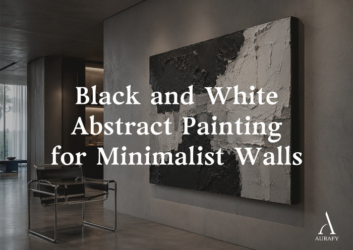
- Choose a handmade black and white abstract painting over a flat digital print — real physical depth creates organic edges that shift dynamically as the room's light changes.
- Use the two-thirds rule for living rooms: the artwork width should cover two-thirds to three-quarters of the sofa below it.
- Hang bedroom pieces so the bottom edge sits 8 to 10 inches above the headboard top — this connects the art to the furniture without crowding it.
- Install spotlights 12 to 15 inches from the wall at 30 to 45 degrees — this raking angle drives deep shadow into every ridge and channel.
- Use 2700K to 3000K warm white bulbs only — cool light above 4000K makes black surfaces look dirty and white surfaces look blue-grey.

You invest in a micro-cement floor. You choose a Bauhaus leather chair. You hang a large black and white poster on the wall.
And something is wrong.
The room looks expensive and empty at the same time. The poster, enlarged to fill the wall, reads exactly like what it is — ink on fabric, scaled up. Under a ceiling spotlight, the printed surface reflects a flat, plastic sheen. No amount of careful furnishing can disguise this.
The problem is not the color choice. Black and white is one of the most powerful palettes available in interior design. The problem is the surface.
A flat print has no depth. It adds contrast, but it adds no physical presence. In a room built on materials with genuine tactile quality — concrete, stone, leather, steel — a flat printed canvas is the weakest element in the composition.
A black and white abstract painting in three-dimensional relief solves this. The contrast is not printed. It is built physically into the surface. Black paste is raised above a white canvas base. You get real ridges, real recesses, and real shadows that shift through the day. The piece does not hang on the wall as decoration. It occupies the wall as an object.
3D Canvas vs. Flat Print: What the Surface Actually Does

The difference between a flat graphic print and a handmade 3D canvas is not a matter of style or visual preference. It is a matter of physics.
What a flat print does
A white and black abstract canvas print uses ink density to suggest depth. Dark areas look recessed. Light areas look raised. From a fixed position directly in front of the piece, the optical illusion can be convincing.
Move to the side — even slightly — and the surface reveals itself. The dark areas and light areas are at exactly the same physical height. There is no depth. The shading is a graphic trick, and it only works from one angle.
Under a ceiling spotlight, the situation is worse. The plastic coating or UV laminate on most printed canvases reflects light uniformly. Every section catches light at the same angle. The piece reads as flat and mechanical — because it is.
What a handmade 3D canvas does
A handmade black white abstract piece is built up in mineral modeling paste applied by hand to a heavy-duty canvas. The paste is layered over multiple sessions. Each layer cures fully before the next is added.
The final surface height difference between the raised ridges and the recessed channels ranges from 15 to 20 millimeters.
These are real physical dimensions:
· The ridges project directly from the canvas surface.
· They cast genuine shadows onto the recesses below them.
· From any angle — front, side, or across the room — the surface reads as three-dimensional because it is three-dimensional.
Under a spotlight, the piece transforms entirely. The lit face of each ridge glows bright. The shadow face drops into deep black. The channel between ridges becomes a clean shadow line extending across the surface.
The piece looks less like a painting and more like a carved architectural panel. This is the quality that a flat print cannot approach. The depth simply does not exist. You cannot print a shadow. You can only build one.
How Black and White Texture Solves the Coldness Problem

Contemporary minimalist interiors share a specific problem. The materials are excellent — polished stone, brushed steel, concrete floors, tempered glass — yet the room feels cold. The precision of the surfaces reads as clinical rather than considered.
Color is the obvious solution, but often the wrong one. Adding color to a cold minimalist room introduces new problems: which color, how much, and how does it relate to everything else? The room gains warmth but loses its coherence.
When learning how to style minimalist black and white abstract art, you quickly realize that a heavy impasto relief solves the coldness problem without touching the color balance.
The material character: Hand-applied black paste dries to a matte, slightly rough surface. It carries the same character as dried clay or compressed earth — organic, imperfect, tactile. This is precisely the quality that cold architectural materials lack. Stone and steel are perfect and uniform. The hand-applied paste is irregular and varied. It introduces the human quality that industrial materials cannot carry.
The white elements work differently. The raised white ridges catch light directly and read as bright. However, because the surface is matte, they catch it softly rather than reflectively. The light scatters across the surface rather than bouncing off it. This scatter is what warms a room without changing its palette.
Together, the black and white surfaces of a 3D abstract piece do something no flat monochrome print can: they make the room feel made rather than assembled.
Sizing and Placement: The Rules That Make It Work
Getting the placement wrong is the most common reason a good piece fails in a room. Two measurements determine almost everything.
The living room: the two-thirds rule
The total width of the artwork above a sofa must cover two-thirds to three-quarters of the sofa width.
· For a 90-inch three-seat sofa, choose a black and white abstract painting between 60 and 68 inches wide.
· A piece narrower than two-thirds of the sofa width looks undersized. It feels disconnected from the furniture below it. The art floats above the sofa rather than anchoring it.
At 60 to 68 inches wide, a black and white 3D piece above a 90-inch sofa creates the exact visual mass the wall needs. The physical depth adds a further dimension. The canvas projects slightly from the wall, giving the overall composition a commanding presence.
The Golden Gaps: Position the center of the artwork at 57 to 60 inches from the floor (standard eye level). Leave 6 to 8 inches between the top of the sofa back and the bottom edge of the canvas. This gap connects the art to the furniture without making them look crowded together.
The bedroom: the headboard rule
Above a headboard, position the bottom edge of the canvas 8 to 10 inches above the headboard top. This specific gap creates a visual connection between the furniture and the art — close enough to read as intentional, far enough to avoid visual compression.
· The center of the canvas should sit in the upper half of the wall above the bed.
· For a king bed (76 inches wide), choose an oversized white and black abstract between 48 and 56 inches wide.
· For a queen bed (60 inches wide), choose a width between 40 and 48 inches.
In a bedroom, a black white abstract piece in heavy impasto works best when the composition uses curved or organic lines rather than sharp geometric forms. The organic variation in the surface reads as calming under warm ambient light — which is exactly the quality a sleep environment needs.
Lighting Setup: Why Placement Determines Everything

Many buyers invest in a quality 3D piece and are disappointed when it goes up. The piece looks flat on the wall. The depth they saw in the product photograph is barely visible.
The cause is almost always the same: flat overhead light.
A ceiling fixture positioned directly above a 3D canvas fills the shadow channels with light from above. Every recess receives light from the top, eliminating the contrast between the lit and shadow faces of the ridges. The surface that was built in 15 to 20 millimeters of physical relief suddenly looks like a flat canvas with an uneven surface.
Fixing this requires one change: directional light at the right angle.
The raking light setup
1. The Offset: Install an adjustable track head or spotlight on the ceiling, 12 to 15 inches from the wall — further than most people position spotlights. At this distance, the beam entry angle is shallow enough to clear the top ridges and reach the full canvas surface.
2. The Angle: Set the beam angle at 30 to 45 degrees from the wall surface. At this angle, the light travels across the face of the canvas rather than down onto it.
The lit face of every ridge catches a bright highlight. The shadow face drops into deep contrast. Every channel between ridges becomes a distinct shadow line.
On a black and white abstract painting specifically, this raking light creates a dramatic effect. The black areas absorb light and deepen. The white areas reflect it and brighten. The contrast between the two zones is highly amplified by the physical depth of the surface. The piece reads as dramatically high-contrast without any color.
Bulb specification
Use 2700K to 3000K warm white bulbs without exception.
Cool white light above 4000K does specific damage to black and white monochrome work:
· The black areas take on a grey, dirty quality.
· The white areas shift toward a cold blue-grey.
· The clean, high-contrast character of the piece is reduced. The room feels colder.
Warm white light at 2700K to 3000K keeps the black areas rich and deep and the white areas warm and bright. The contrast reads as intentional and sophisticated rather than harsh.
Maintenance: Simple Care for a Long-Lived Piece

How do I clean a black and white abstract painting without damaging the texture?
Every AurafyArt piece ships with two hand-applied coats of UV-resistant, low-VOC matte varnish. This seal reduces the static charge on the surface, which significantly slows dust adhesion compared to an unsealed canvas.
· For routine cleaning: Use a wide soft-bristle brush — a large makeup brush or a clean natural-bristle brush — to sweep gently along the direction of the texture ridges every two to three weeks.
· For deep channels: Use short bursts from a can of compressed air to clear the narrow channels between ridges.
Important: Never use a damp cloth, water, alcohol, or any chemical cleaner on the surface. Moisture in the texture channels can affect the modeling paste structure over time. Dry cleaning methods are all the piece requires.
Will the white areas yellow near a large window?
The acid-free materials used as the base of every piece, combined with the UV-resistant varnish, prevent yellowing under normal indoor light conditions. This includes rooms with significant natural light exposure.
For pieces that receive several hours of intense direct sunlight daily, positioning the artwork on an adjacent wall rather than the sun-facing wall is good practice. Under indirect or diffused natural light, the UV protection is more than adequate for long-term color stability.
Contrast as a Design Statement
Minimalism is not about removing things. It is about removing the unnecessary — and keeping what is left with full attention.
Mastering how to style minimalist black and white abstract art provides one of the most resolved versions of this principle available in wall art. It introduces no color that needs to be balanced. It adds no pattern that creates new coordination demands. It simply gives the wall depth, shadow, and the organic quality of something made by hand.
The contrast between the black and white surfaces is not just a conventional stylistic choice. It is a decision about how much the wall itself can carry. A handmade 3D piece in monochrome relief answers that question definitively.
The room does not need another color. It needs a surface that earns the wall.
Share:
How to Curate a 3D Art Gallery Wall at Home
Why Thick Texture Painting Outlasts Any Canvas Print