


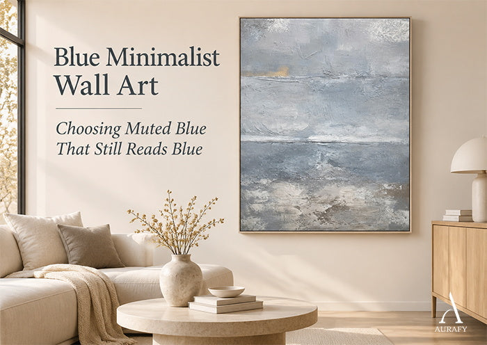
Blue Minimalist Wall Art: Choosing Muted Blue That Still Reads Blue

Two shoppers both search for blue minimalist wall art. One wants the blue to be unmistakable, even when it is quiet. The other would be happiest if the canvas barely registered as a color at all. Neither is wrong, but they need different artworks. This guide uses the Blue-Presence Acceptance Test to define how visibly blue you want a muted canvas to be, check the evidence, and decide whether to accept, compare or verify.
For a broader look at choosing blue abstract artwork for a room, see our Choosing a Blue Abstract Painting That Works in Your Space guide.
Set Your Minimum Acceptable Blue Presence
Muted blue is not one fixed appearance. A listing may call a canvas blue-gray, slate or cool, and those words can describe quite different impressions. Before you look at candidates, decide where your own floor sits.
Consider three possible preferences. Some buyers want blue to be unmistakable, even if it is subdued. Others want a subtle blue-gray that reads as blue on a second look. Others want something close to neutral, with only a trace of cool tone. These are hypothetical preferences, and none is the correct one.
Does blue minimalist wall art need to look clearly blue? No. Some buyers prefer an almost-neutral blue-gray, while others want blue to remain unmistakable. Choose according to your own minimum acceptable blue presence.
To find your minimum, ask one question: would an almost-gray canvas disappoint you, or is a faint blue impression enough? If you would feel you had bought a gray painting, your floor is higher than you might have assumed. If a faint cool cast satisfies you, you have more room to consider quieter candidates. Then ask the reverse question to find your ceiling: would a clearly stronger blue exceed the restrained color presence you want? Write both answers down. They become the range you test every candidate against.

Know When Blue-Gray Becomes Too Neutral for Your Goal
Blue-gray sits between two descriptions, and the balance between them varies from piece to piece.
Can blue-gray minimalist art look mostly gray? Yes. Muted blue-gray may appear predominantly neutral in some images or viewing conditions, so its suitability depends on how visible you want the blue to be.
Pay attention to the color words a listing uses, because they name different components rather than interchangeable promises. Slate blue describes a blue appearance with a grayish cast. Steel gray points toward a gray with a cool cast. A warm neutral such as taupe or cream points away from blue entirely. A canvas that combines all three has a blue component, a gray component and a warm component, and how much each one stands out is a matter of perception.

This is why the same description can satisfy one buyer and disappoint another. If your minimum is a clearly readable blue, a description dominated by gray and warm neutral terms deserves a closer look. If your minimum is a trace of coolness, the same wording may be exactly right. The goal is not to find the objectively correct amount of blue. It is to notice when a candidate is likely to fall below your floor.
Check Color Evidence Without Trusting One Product Image
A single photograph is a weak basis for judging how blue a canvas will look. Photography, displays and lighting conditions can affect perceived color, so treat every image as evidence rather than as a measurement.
Can a product photograph guarantee the exact blue tone? No. Photography, displays and viewing conditions affect perceived color. Use available images and descriptions as evidence, not a calibrated color guarantee.
A more reliable approach is to gather several kinds of evidence and see whether they agree. Start with the written color description and note which colors it names and in what order. Listing order does not establish color coverage, visual dominance or measured proportions, so do not read the first-named color as the largest. Then look at the overall image and any detail images the listing provides. Ask whether each one supports the impression the words create. If the text emphasizes blue and the images look mostly gray, or the reverse, that mismatch is information.
Try viewing the same image on more than one screen if you can. If the blue appears noticeably stronger on one display than another, hold your judgment more loosely. None of this produces a precise color reading, and you should not expect it to. What it can do is tell you whether the evidence points consistently in one direction or whether the candidate remains uncertain. When it remains uncertain, the sensible step is to ask for clarification before committing, not to assume the best case.

AURA035: Is Its Slate Blue Subtle Enough, Yet Blue Enough?
The AURA035 muted blue and taupe canvas is a useful candidate for applying the test. Its documented palette combines cool slate blue and soft steel gray with warm taupe and off-white or cream. The product selection reviewed here is the vertical one. The surface is built with palette-knife impasto, applied and scraped in multiple passes on canvas.
Is AURA035 an entirely blue canvas? No. Its documented palette combines cool slate blue and soft steel gray with warm taupe and off-white or cream.
That distinction is the heart of the evaluation. The documented colors are facts about the listing. How prominent the blue feels to you is a subjective impression, and it will depend on the images you see and the conditions you view them in. A buyer who wants unmistakable blue may find the gray and warm components pull the overall impression toward neutral. A buyer who wants a restrained, layered blue-gray may find the combination close to what they had in mind.
Use your written minimum and maximum as the yardstick. Compare the listed colors and the available images against them, then ask whether the apparent blue presence is acceptable, insufficient, excessive or still unclear. The seascape name does not establish how prominently blue will appear to you; compare the available color evidence against your preferred range. AURA035 is one example for testing your preference, not a benchmark for what muted blue should look like.
The AURA035 Minimalist Seascape Texture Canvas Minimalist Seascape Texture Canvas-Cool Blue & Taupe Painting-AURA035 is the vertical product selection discussed in this guide.

Make the Final Blue-Presence Buying Decision
The test ends in three outcomes. Accept means the available evidence supports your preferred muted-blue impression. Compare means the candidate seems too gray or too emphatically blue for your goal. Verify means images and descriptions conflict or stay ambiguous, so you need more information.
Three hypothetical buyers, with impressions invented for illustration rather than observed from AURA035, show the outcomes. A buyer who wants a subtle blue-gray, and whose images seem consistent with the listing's wording, can accept and consider the canvas further. A buyer who insists on unmistakable blue, and expects the gray and warm components to soften it below their floor, should compare alternatives with a stronger blue presence. A buyer who sees the blue vary noticeably between images should verify, asking for clarification before deciding.

If your preferred blue presence aligns with the first buyer, review AURA035 using your own minimum and maximum. If it does not, passing on it is a perfectly sound result, and the minimalist art collection offers other canvases to compare with the same four steps.

Frequently Asked Questions
What is the difference between muted blue and blue-gray wall art?
The terms overlap, and there is no fixed boundary between them. Muted blue usually suggests a blue with reduced intensity, while blue-gray suggests a visible gray component. Rely on the listing's specific color words and images rather than on the label alone.
Can taupe and cream appear in minimalist blue artwork?
Yes. A mixed palette does not have to remove the blue component. Not every painting that includes blue is blue-dominant, though, so check whether the blue still meets your minimum.
What if the blue looks different on two screens?
That can happen because displays may render colors differently. Treat the difference as a reason for caution. Compare the written description with the images, and ask for clarification about the product imagery or description before committing.
Should I choose a different artwork if AURA035 looks too gray to me?
Yes, if a stronger blue presence is essential to you. Looking too gray for your preference does not mean the product is defective. It means your minimum and the candidate do not match, so comparing other canvases is the reasonable next step.
Share:
Green Minimalist Wall Art: A Single Deep-Green Focal Point
How Textured Wall Art Is Made by Hand: Building, Scraping and Sculpting Texture