


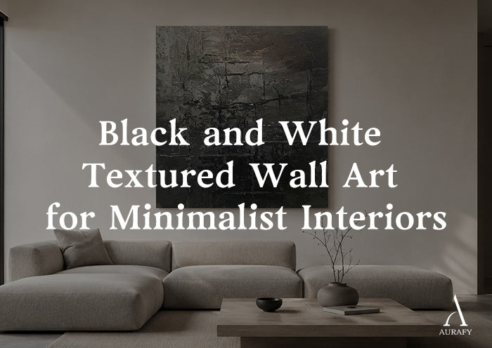
Black and White Textured Wall Art for Minimalist Rooms

A minimalist room doesn't need color to hold your attention. What it needs is contrast, weight, and a sense that something on the wall was made by hand rather than printed flat. Black and white textured wall art does this by leaning on relief, tonal proportion, and negative space instead of pigment. When those elements are handled with care, a piece can read as quiet from across the room and surprisingly complex up close, which is the kind of depth a pared-back space benefits from.
Why Texture Matters When Color Is Off the Table

Strip away color and a piece of art has fewer tools left to create visual interest. Texture becomes one of the main ones. Physical relief, raised ridges, incised lines, or trowel marks catch ambient light and cast micro-shadows that shift as the light in the room changes throughout the day. That shifting shadow is what keeps a monochrome piece from feeling static against a plain wall.
In a minimalist interior, where surfaces are often smooth and materials are kept simple, textured art gives the eye something to settle on without introducing pattern-on-pattern busyness. The texture does the work that color would do in a more maximalist room, adding dimension while staying within a restrained palette.
Black and White Proportion: What to Look For

Not all black and white art is balanced the same way, and that balance changes how a piece feels on the wall.
- Black-dominant compositions read as grounded and architectural. They anchor a wall and work well when the surrounding furniture is light.
- White-dominant compositions feel airier and can make a room seem to breathe, especially useful in smaller spaces or rooms with limited natural light.
- Near-even splits create tension and rhythm, often through a strong line, division, or fractured pattern that pulls the eye across the canvas rather than letting it rest in one spot.
Fracture Silence-Black & White Spatial Field-AURA091, a black-and-white spatial field piece, leans into this question directly. It's built around controlled depth and a vertical division that splits the composition, so the black and white aren't just present, they're organized into a deliberate structure. That structure is part of why proportion matters as much as texture: the ratio of dark to light tells the eye where to look first.
Relief and Depth: How Texture Reads on a Wall

Relief is what separates textured wall art from a printed image with a monochrome palette. When a surface has physical dimension, light doesn't just illuminate it, it interacts with it. A single overhead fixture can make the same piece look different at 9 a.m. versus 6 p.m., simply because the shadows cast by the raised surface shift with the angle of light.
Monochrome Grid Texture Wall Art-Onyx & Charcoal Tones-AURA032 is a useful reference here. It combines 3D impasto with trowel marks and incised lines to build a broken grid across an onyx and charcoal base, accented with gray and graphite tones. The relief isn't decorative flourish, it's structural to how the piece reads. From a distance, the eye picks up the overall tonal pattern; up close, the texture reveals itself as a separate layer of detail, part of what gives the piece depth without relying on color.
Negative Space: The Quiet Part That Does the Work

In minimalist design, what's left out often matters as much as what's included. The same is true for textured wall art. Negative space, the areas of a composition left calm or empty, gives the eye somewhere to rest between passages of texture or tonal contrast. Without it, even a well-executed black and white piece can feel crowded, working against the intent of a minimalist room.
An off-center composition with generous calm margins uses negative space deliberately. Rather than filling the canvas edge to edge, it leaves room around the focal area, which lets the textured section carry more visual weight precisely because it isn't competing with activity on every inch of the surface. This is worth checking regardless of which piece you choose: does the composition give itself room to breathe, or is it dense throughout?
Spatial-Field Restraint vs. Fractured-Grid Rhythm

Two distinct approaches show up often in monochrome textured art, and they create noticeably different moods.
Spatial-field restraint relies on a controlled, more open composition, often built around a single strong division or line rather than a repeating pattern. The vertical division and linear rhythm in Fracture Silence is an example: the piece uses textured interruption sparingly, so the overall effect is calm with one clear point of tension. This style tends to suit rooms where you want the art to feel like a considered gesture rather than a focal explosion, a reading nook, a bedroom wall, or a hallway where a busier composition might feel like too much.
Fractured-grid rhythm, by contrast, builds visual interest through a broken, incised pattern that repeats and shifts across the canvas. Monochrome Grid Texture Wall Art works this way, using its off-center composition to create movement across the surface. This approach tends to suit spaces where the wall itself is the main design statement of the room, above a console table, over a sofa, or in an entryway.
Neither approach is inherently better. The choice comes down to how much visual activity you want that wall to hold, and how the rest of the room is arranged around it.
Wall Color and Furniture

Black and white textured art tends to work best against walls that don't compete with its tonal range. A pure white wall lets a black-dominant piece stand out sharply, while a soft gray or greige wall can soften the contrast slightly, letting the texture itself take center stage rather than the tonal jump between wall and canvas.
Furniture matters too, though not in the way people sometimes assume. You don't need to match your sofa or rug to the art's exact tones. What matters more is whether the room's existing palette is warm or cool. A warm oak floor and linen upholstery will read differently next to a charcoal and graphite piece than a cool concrete floor with steel accents would. Neither is wrong, but it's worth noticing which direction your room already leans before choosing a piece, so the art feels integrated rather than dropped in.
Room Size, Scale, and Orientation

Scale is one of the more common places people miscalculate. A piece that looks proportionate in a photo can feel undersized once it's on an actual wall, particularly above furniture like a sofa or console table.
Vertical pieces suit narrower walls, spaces beside doorways, or areas where you want to draw the eye upward, which can make a room feel taller. Both Fracture Silence and Monochrome Grid Texture Wall Art are available in a vertical orientation with a size selector ranging from 32x24 up to 90x60, offering flexibility to match the piece to the actual wall rather than forcing a fixed size to fit.
For a smaller room, a mid-range size within that selector often works better than the largest option, since it leaves visible wall margin around the piece rather than pushing edge to edge. In a larger room or above a longer piece of furniture, sizing toward the upper end of the range helps the art hold its own rather than looking like an afterthought on an expansive wall.
Placement and Lighting

Placement affects how texture reads more than almost any other factor. A piece hung directly across from a window will pick up strong, directional light that emphasizes relief and shadow, sometimes dramatically depending on the time of day. A piece hung where it gets only indirect or artificial light will read more evenly, with less contrast between the raised and recessed areas of the texture.
If you're relying mainly on overhead or ambient lighting, consider the angle it hits the wall at. Light coming from almost directly above tends to flatten texture, casting shadows straight down rather than across the surface. A lamp positioned slightly to the side, even a floor lamp near the wall, can bring out the dimensional quality of impasto or incised marks far more effectively.
Placement height follows familiar guidance for most rooms: centering the piece around eye level, roughly 57 to 60 inches from the floor to the center of the artwork, works for most living rooms and hallways. Above furniture, leave 6 to 8 inches between the top of the furniture and the bottom of the frame, so the art relates to the piece below it rather than floating disconnected above it.
Common Mistakes to Avoid

- Choosing a piece too small for the wall. Undersized art on a large wall reads as an afterthought rather than a focal point.
- Ignoring how light hits the wall. A heavily textured piece placed somewhere with flat, even lighting loses much of what makes the relief interesting.
- Overcrowding the composition. Choosing a busy, edge-to-edge design in a room that's otherwise very spare can undercut the minimalist intent of the space.
- Assuming black and white means no proportion planning. The ratio of dark to light still needs to suit the wall color and room mood, just as it would with any palette.
- Skipping the orientation question. A horizontal piece forced onto a narrow wall, or a vertical piece stretched over a wide one, rarely looks intentional.
Comparing the Two Approaches

If you're deciding between a spatial-field piece and a fractured-grid piece, think about what role you want the art to play. Fracture Silence-Black & White Spatial Field-AURA091 offers a restrained, linear composition built around a single vertical division, textured interruption, and controlled depth, well suited to a wall that should feel calm rather than busy. Monochrome Grid Texture Wall Art-Onyx & Charcoal Tones-AURA032 brings more surface activity through its incised broken grid and 3D impasto, set against onyx and charcoal tones with gray and graphite accents, suited to a wall meant to carry more visual weight. Both are available as vertical pieces across the same 32x24 to 90x60 size range, so the decision often comes down to how much rhythm and texture that particular wall should hold.
Bringing It Together

Monochrome doesn't mean minimal effort. The best black and white textured wall art for a minimalist interior earns its place through proportion, relief, and the restraint of negative space, not through color choices. Whether you lean toward a calm spatial-field composition or a more rhythmic fractured-grid design, the same questions apply: how much contrast does the wall need, how will the light in the room interact with the texture, and does the scale actually suit the space you're placing it in. Answering those honestly, room by room, tends to matter more than any single stylistic rule.
Frequently Asked Questions
Does black-and-white textured wall art make a small room feel darker?
It depends on the proportion of black to white in the piece. A black-dominant composition can add visual weight to a small room, which may feel more enclosing if the walls are already dark. A white-dominant piece with lighter accents tends to feel airier and can suit a smaller space better. Considering the wall color and how much natural light the room gets will help you judge which balance works before committing to a size or placement.
Should monochrome wall art match a black sofa or black furniture?
Matching isn't necessary. What matters more is whether the room's overall palette is warm or cool, since that affects how charcoal, onyx, or graphite tones sit against your furniture. A black sofa won't clash with monochrome art, but it can create a heavier visual block if the art is also very dark and placed directly above it. Considering the balance of light and dark tones together often works better than trying to match exactly.
How does lighting change black-and-white texture?
Directional light, like a window or an angled lamp, brings out relief by casting shadows across raised or incised areas, making impasto and trowel marks more visible. Flat overhead lighting tends to minimize that effect, since it casts shadows straight down rather than across the surface. If the texture is a main reason you're drawn to a piece, placing it where it gets some side or angled light will let that detail come through more clearly.
What size and orientation suit a minimalist living room?
Vertical orientation suits narrower walls or spaces where you want to draw the eye upward, while a mid-range size within a selector, rather than the largest option, often leaves better margin on a smaller wall. For larger walls or above longer furniture, sizing toward the upper end of the available range helps the piece hold visual weight. Measuring the actual wall space before choosing, rather than relying on how a size looks in a photo, tends to produce better results.
Share:
Black and Gold Wall Art for Living Rooms: Refined Styling
Geometric Textured Wall Art: How to Style It in Modern Rooms