


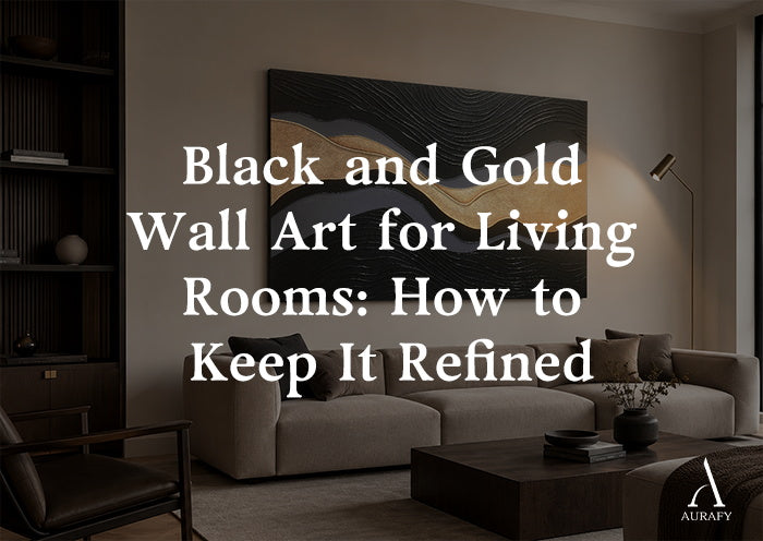
Black and Gold Wall Art for Living Rooms: Refined Styling

Black and gold wall art for a living room can look architectural and quietly luxurious, or it can tip into something closer to a hotel lobby. The difference almost never comes down to the art itself. It comes down to ratio, finish, lighting, and how much room you give the piece to breathe. This guide walks through the specific decisions that keep the pairing controlled: how much gold to allow, which finishes read as considered rather than shiny, where to place the piece relative to your sofa or console, and the sizing choices that make a single statement work harder than a wall full of smaller ones.
Start With the Ratio, Not the Piece

Before choosing artwork, decide how much gold your wall actually needs to carry. A useful starting point is treating gold as roughly 10 to 20 percent of the visual field within the artwork itself, with black or charcoal doing the majority of the work. This is close to how the gold appears in a piece like the Metallic Topography Painting in onyx and gold, where a continuous metallic channel moves through a mostly onyx and charcoal surface rather than covering it.
When gold stays under a quarter of the composition, it reads as a vein of light running through the piece — something the eye follows rather than something it lands on first. Once gold approaches or exceeds half the surface, the artwork starts to compete with lighting fixtures, hardware, and any other metallic in the room, and the whole wall starts to feel busy rather than composed.
This ratio matters even more once the art is on the wall, because the room adds its own gold: a lamp base, picture-frame trim, a console leg. If your living room already carries metal accents elsewhere, lean toward the lower end of that range in the artwork itself.
Choose a Finish That Reads as Considered, Not Shiny

Gold wall art can be flat, satin, high-gloss, or textured, and each behaves differently under household lighting. High-gloss gold catches every light source in the room and can flare under overhead fixtures, which is part of why it often reads as loud even in small doses. Matte gold sits quietly and is easy to control, but it can also look flat from a distance if the piece has no other texture to give it depth.
The more refined middle ground is a matte-and-satin contrast within the same piece, where the black or charcoal ground stays matte and the gold carries a slight sheen. This is the approach used in the Metallic Topography Painting-Onyx & Gold Accents-AURA033, which combines layered ridges and carved grooves in 3D textured acrylic with a matte and satin contrast between the dark ground and the metallic channel. Because the shine is isolated to the gold itself, the eye reads the piece as textured and dimensional rather than glossy.
A drip or cascade format handles the finish question differently. In the Metallic Drip Abstract Painting-Charcoal, Silver & Gold Tones-AURA030, the gold moves as a vertical cascade over textured charcoal and silvery gray fields, hand-painted in acrylic and metallic paint on linen canvas. Because the gold is concentrated into a single directional drip rather than spread evenly, the metallic feels intentional and gestural instead of ornamental, even though the piece uses three tones instead of two.
Let Negative Space and Scale Do the Restraining

The most reliable way to keep black-and-gold art from feeling flashy is negative space, both within the piece and around it on the wall — paired with generous, not modest, scale.
Within the piece, look for compositions where the dark ground clearly dominates and the gold occupies a defined channel, drip, or line rather than being scattered across the entire surface. A continuous gold channel moving diagonally through a mostly onyx field gives the eye a clear path to follow. A drip cascading down one section of an otherwise textured charcoal and silver canvas does the same thing from a different angle.
Around the piece, resist the instinct to fill the remaining wall. A single black-and-gold painting flanked by plain wall, rather than surrounded by smaller frames or shelf decor, keeps the gold as the only accent competing for attention. If you're using a horizontal format above a sofa, leave at least 6 to 8 inches of visible wall above the frame line before any ceiling detail, and avoid stacking a mirror or sconce directly beside it, since every additional reflective surface adds to the total metallic load in the room.
Scale is where restraint and impact actually meet. An oversized piece in a controlled palette almost always reads as more refined than several smaller pieces in the same tones, because a single large work has one clear focal point instead of several competing edges. Both the Metallic Topography Painting and the Metallic Drip Abstract Painting are available in a horizontal size selector ranging from 20x40 up to 55x110, which gives enough range to scale the piece to a standard three-seat sofa or a larger sectional wall without needing to resize or reformat the composition.
As a general sizing guide for a sofa wall, aim for the artwork to span roughly two-thirds to three-quarters of the sofa's width. A sofa that measures 84 inches wide, for example, pairs comfortably with a piece in the 55 to 65 inch range. Going narrower than that tends to leave the composition looking stranded above the cushions; going wider than the sofa usually looks correct only when the piece also extends toward flanking furniture, like a console or side table, that visually continues the horizontal line. For a console or credenza wall without a sofa beneath it, a smaller size within the same selector, closer to the 20x40 to 30x60 range, keeps the proportions correct relative to the furniture's height and depth.
Where to Place It: Above the Sofa vs. Above a Console

Above the sofa. This is the highest-impact placement for a black-and-gold piece because the horizontal wall and furniture line give the composition a stable base. Center the artwork on the sofa rather than on the wall itself if the two don't align, and hang it so the bottom edge sits 6 to 10 inches above the top of the sofa back. This keeps the gold channel or drip at a height that's visible from a seated position without hovering too close to the ceiling.
Above a console or credenza. This placement works well when the room is smaller or when the sofa wall is already carrying other art. Because consoles are lower and often narrower than sofas, this spot naturally calls for the smaller end of the horizontal size range. It's also a good location for a piece with a more vertical emphasis within a horizontal frame, like the drip cascade in the Metallic Drip Abstract Painting, since the downward gold movement echoes objects typically placed on a console below it, such as a lamp or a stack of books.
Avoid placing black-and-gold art directly across from a large mirror in either location. The reflection effectively doubles the amount of gold visible in the room at once, which undermines the restraint you've built into the ratio and finish choices.
Lighting: Temperature and Direction Matter More Than Wattage

Gold accents shift dramatically depending on the color temperature and direction of the light hitting them, more so than most other finishes in a room.
Color temperature. Warm light, generally in the 2700K to 3000K range, brings out the richness in metallic gold without making it glare. Cooler light above 4000K tends to flatten gold and can give it a slightly brassy or artificial cast, which works against the refined effect you're aiming for. If your living room currently uses cooler bulbs, swapping the fixtures nearest the artwork to a warmer temperature will do more for how sophisticated the piece looks than almost any other adjustment.
Direction. Raking light, meaning light that hits the artwork at an angle rather than straight on, is particularly effective on textured pieces like the Metallic Topography Painting, because it catches the layered ridges and carved grooves and creates natural shadow variation across the gold channel. Direct, straight-on light from a ceiling fixture tends to flatten that texture and can cause hot spots of glare on the metallic areas. A single well-placed picture light or an adjustable floor lamp positioned to one side of the piece is usually more effective than bright, even overhead lighting, which increases reflectivity uniformly across the whole surface.
Common Mistakes That Undermine the Look

Doubling the metallics in the room. Gold wall art paired with gold-framed mirrors, gold hardware on every piece of furniture, and gold light fixtures all in view at once adds up to more metallic surface than any single element was designed to carry. Pick one or two other gold touches in the room at most, and let the art carry the rest.
Undersizing the piece. A black-and-gold painting that's too small for its wall often looks like a decorative afterthought rather than a focal point, and the gold within it reads as decoration rather than structure. When in doubt, size up within the available range rather than down.
Ignoring the wall color behind it. Black-and-gold art holds its contrast best against a wall in the light-to-mid neutral range. Against a very dark wall, the black ground of the painting can lose its edge definition and the gold becomes the only visible shape, shifting the balance more than intended.
Skipping the raking-light test. Textured, dimensional pieces look noticeably different under angled light than under flat overhead light. It's worth testing where your strongest light source falls before committing to final placement, especially for a piece with carved or layered surface detail.
Choosing Between the Two: A Quick Comparison

Both pieces are available in the same horizontal size range, share a black-and-gold foundation, and are built to hold a restrained ratio rather than an even split of tones. Where they differ is in movement and material.
The Metallic Topography Painting-Onyx & Gold Accents-AURA033 is the stronger choice if your room favors clean, architectural lines. Its continuous gold channel moves diagonally through an onyx and charcoal ground, built from 3D textured acrylic and textured media with layered ridges and carved grooves. The matte-and-satin contrast within the piece makes it especially responsive to raking light, so it suits rooms where you can position a lamp or picture light at an angle.
The Metallic Drip Abstract Painting-Charcoal, Silver & Gold Tones-AURA030 works well if your room already carries some cooler, silvery tones alongside black, since it blends charcoal, silvery gray, and metallic gold on hand-painted linen canvas. The vertical gold drip cascading over textured charcoal and silver fields gives it a more gestural, painterly feel than the topography piece, which suits living rooms with softer furniture lines or a mix of textiles rather than strictly geometric decor.
If your room leans structured and minimal, the topography piece will likely feel more at home. If your palette already includes silver or gray alongside black, the drip piece will integrate more naturally without adding a third unrelated tone.
Bringing It Together
Refined black-and-gold wall art in a living room comes down to a handful of controllable decisions rather than a fixed formula: keep the gold to a defined channel or drip instead of an even wash, choose a finish where the shine is isolated rather than uniform, size the piece generously relative to the sofa or console, and light it warm and at an angle rather than flat and cool. None of these choices require the room to be minimalist or the palette to be strictly two colors. They just require the gold to have a clear role in the composition instead of an open-ended one. Get the ratio and the light right, and the metallic accent will read as considered — the kind of detail that looks like it was placed on purpose, because it was.
Frequently Asked Questions
How much gold is enough in a black-and-gold living room?
A reasonable guideline is keeping gold to roughly 10 to 20 percent of the artwork's visual field, with black or charcoal carrying the rest. This keeps the metallic functioning as an accent that draws the eye along a channel or drip rather than as a dominant surface. If your room already has other gold elements, like lamp bases or frame trim, lean toward the lower end of that range within the artwork itself so the total gold in the room doesn't compound and start competing with the furniture and lighting.
Does black-and-gold wall art work with beige or cream furniture?
Yes, and it's often an easier pairing than with furniture in bolder colors, since beige and cream give the black ground and gold accent room to stand out without additional competing tones. The neutral furniture acts as a quiet base, letting the contrast between dark ground and metallic channel carry the visual interest. Keep other accessories in the room fairly restrained in this case, since a light, neutral sofa will make any additional pattern or color read more prominently against it.
What lighting makes metallic gold wall art look refined?
Warm light in the 2700K to 3000K range brings out richness in metallic gold without making it look brassy or glaring, which cooler light above 4000K tends to do. Directional light, such as a picture light or an angled floor lamp, is generally more flattering than flat overhead lighting, especially on textured pieces, because it creates natural shadow across the surface rather than flattening it. Avoid bright, even overhead lighting directly on the piece, since it increases glare across the entire metallic area.
What size and orientation work above a sofa?
Horizontal orientation is typically the better fit above a sofa, since it echoes the horizontal lines of the sofa back and any console beneath it. As a general guide, aim for the artwork to span about two-thirds to three-quarters of the sofa's width, and hang it with the bottom edge 6 to 10 inches above the sofa back. A horizontal size selector in the 20x40 to 55x110 range typically covers standard three-seat sofas through larger sectional walls.
Share:
Green Textured Wall Art for Living Rooms
Black and White Textured Wall Art for Minimalist Rooms