


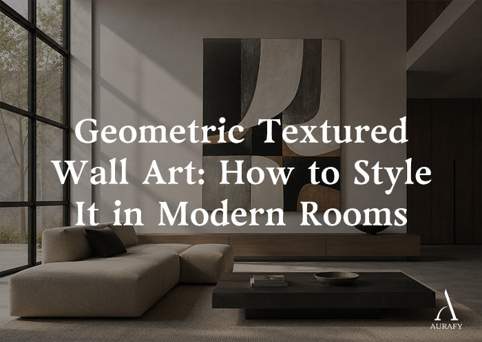
Geometric Textured Wall Art for Modern Rooms

Geometric textured wall art works when the shapes on the canvas talk to the shapes already in the room. Get that relationship right and a single piece can anchor a wall without any other decoration. Get it wrong, and even a well-made piece feels like an afterthought. This guide breaks down the variables that decide whether geometric textured wall art reads as intentional: shape, line, relief, visual rhythm, scale, furniture geometry, negative space, and how all of it interacts with the architecture of a modern room.
This is not a grid-layout guide. It's a framework for choosing and placing one strong textured piece, whether it leans high-contrast, neutral and curved, or somewhere between structure and organic form.
Why Texture Changes the Geometry Equation
Flat geometric prints and textured geometric art behave differently on a wall, even with similar underlying shapes. A flat print reads as pattern. A textured piece, where paint is knife-carved, layered, or built up in visible strokes, reads as relief. That relief catches ambient light and casts micro-shadows across the geometric divisions, so the same block of color looks slightly different at 9 a.m. than under a lamp at night.
This adds a second layer of visual information on top of shape. A flat piece only has to coordinate with your furniture's lines. A textured one also has to coordinate with your room's light sources, since texture is what makes it feel dimensional rather than printed. Before choosing scale or placement, it helps to know which pattern you're working with.
High-Contrast Structure

Pieces built on strong tonal opposition, dark against light, with visible brushwork or carved planes defining hard-edged sections. Abstract Geometric Texture Canvas-Noir & Sand Painting-AURA050 is a clear example: an asymmetric grid in beige, sand, and off-white set against black, built with hand-painted textured brushstrokes and knife-carved planes with thick impasto. The negative space in the composition does real work here, giving the eye somewhere to rest between the darker and lighter divisions.
Neutral, Curved Geometry

Pieces that keep a restrained, earthy palette but soften hard geometric lines with organic curves layered into the texture. Geometric Balance Neutral Earth Abstract Wall Art-AURA051 sits here, combining ivory, charcoal, warm taupe, and soft gray in a modern abstract composition where layered texture meets organic curves instead of pure hard angles.
Nature-Meets-Structure

Pieces that use geometric color blocking but pull their palette from natural materials rather than architectural neutrals. Still Divide-Earth & Moss Abstract Geometric Wall Art-AURA079 falls here: a horizontal composition in moss and deep green, warm beige, charcoal, and gold, built with broad palette-knife texture and a clear horizontal division running through the piece.
Knowing which category a piece belongs to before you buy tells you more about how it will behave on your wall than the subject matter alone.
Reading Your Room's Existing Geometry

Every room already has a geometric language before you add art to it. Coffee tables, sofa arms, window frames, and the negative space between furniture pieces all carry implied lines: horizontal, vertical, angular, or curved. Geometric textured wall art either continues that language or deliberately breaks it, and both are valid, but usually only one is right for a given wall.
Walk the room and note three things: the dominant furniture silhouette (boxy and angular, or soft and rounded), the strongest existing line in the space (a long console, a row of windows, a mantel), and how much negative space is already on the wall you're considering. A mostly empty wall over low furniture can support a bolder, more angular piece. A wall already busy with shelving needs a piece with more internal negative space so it doesn't compete.
Living Rooms: Anchoring the Largest Wall

The living room is usually where geometric textured wall art carries the most visual weight, since it's typically viewed from a distance and multiple seating angles. This changes how texture reads. Fine brushwork that looks intricate up close can flatten out from across a room, while broad palette-knife texture, like AURA079's, holds its presence even at a distance because the shadow lines it creates are larger and more pronounced.
For a sofa-facing wall, orientation should generally follow the furniture below it. A horizontal sofa with clean, low lines pairs naturally with a horizontal composition, one reason AURA079, available horizontally from 20x40 up to 55x110, works well above a sectional or a long console. Its horizontal division can echo the seating's line without mimicking it exactly.
On a narrower wall segment or beside a window, a vertical piece changes the read entirely. AURA050 and AURA051 are both available vertically from 32x24 up to 90x60, giving flexibility for narrow walls flanking a fireplace, where a horizontal piece would feel cramped.
Dining Rooms: Working With a Fixed Sightline

Dining room art is usually seen while seated, so eye level and scale need to account for a lower vantage point than in a living room. A large-format textured piece above a sideboard can work well here because diners view it at a slight upward angle, which flatters visible relief and knife-carved texture rather than making it feel heavy overhead.
Shape choice matters more in dining rooms than expected, since the table itself is a strong geometric anchor, round, rectangular, or oval. A rectangular table under a piece with hard angular divisions, like AURA050's asymmetric grid, reinforces the room's structure. A round or oval table pairs more naturally with something carrying curved elements within its geometry, where AURA051's organic curves soften the transition between a rounded table and a rectangular wall.
Bedrooms: Softer Contrast, Closer Viewing Distance

Bedroom walls are viewed at close range, often from the bed, which shifts the priority from dramatic scale to comfortable tonal contrast. A high-contrast noir and sand piece like AURA050 can still work, but it reads more dramatically up close than the same piece would in a living room. That's not automatically wrong, but it's worth knowing before committing to a wall above the headboard.
For a calmer mood, AURA051's neutral, curved geometry tends to sit more comfortably at close range. Ivory, charcoal, warm taupe, and soft gray stay within a narrow tonal band, so the geometric structure is present without high contrast pulling focus on every glance. Vertical orientation also works naturally above a headboard flanked by nightstands, since the vertical line continues upward past the furniture rather than competing with the horizontal headboard.
Entryways: Small Walls, First Impressions

Entryway walls are often narrow, sometimes just the width of a console table, making vertical geometric textured wall art a natural fit. A vertical piece in the 32x24 range from either AURA050 or AURA051 can fill an entryway wall without overwhelming it. Because entryways are typically seen briefly and at close range, texture is often the first thing a visitor notices, before there's time to study the shapes in detail, which is one reason light source deserves extra thought in this space, covered below.
Scale and Orientation: Beyond "Fill the Wall"

The common advice to size art to two-thirds the width of the furniture beneath it is a reasonable start, but geometric textured wall art has an added variable: the internal negative space of the composition. A piece with a lot of open, uncarved background, like AURA050's asymmetric grid, can sometimes work slightly larger than a two-thirds rule suggests, because that negative space keeps it from feeling dense even at a bigger size.
Decide orientation before size. Ask which direction the wall's strongest existing line runs. Above a long, low console or sectional, horizontal orientation, such as AURA079's 20x40 to 55x110 range, extends that line. Beside a window or in a stairwell, vertical orientation, available in AURA050 and AURA051 from 32x24 to 90x60, works with the wall's proportions instead of against them.
Furniture Relationships: Echo or Contrast

Geometric textured wall art can echo the shapes in your furniture or deliberately contrast with them, and both strategies work when applied on purpose.
Echoing suits a room that already has strong geometric furniture, angular tables, boxy sofas, rectilinear shelving, where you want the art to feel part of the same design vocabulary. A piece with hard-edged divisions like AURA050 reinforces what's already there.
Contrast suits a room with soft, curved furniture, rounded armchairs, a curved sectional, an oval table, where you want the art to introduce structure without feeling out of place. AURA051 bridges that gap: geometric enough to add definition but organic enough not to clash with rounded lines.
Nature-meets-structure pieces like AURA079 offer a third path. Their palette, moss, beige, charcoal, gold, references natural materials like wood or woven textiles, so they can sit comfortably whether the furniture is angular or curved, since the connection is tonal rather than purely geometric.
Lighting and Relief: Why Texture Isn't Static

Relief is the part of textured geometric art a photo can't fully convey. Knife-carved planes and thick impasto, as in AURA050, create physical ridges of paint that catch light at an angle and cast shadows. Under daylight from a window, those shadows shift throughout the day, so a piece can look noticeably different at noon than at dusk. Under a warm lamp positioned to one side, the same texture throws longer, softer shadows that emphasize the carved planes even more than daylight does.
Choose a wall with your primary light source in mind, not just wall color. A textured piece placed across from a window shows off its relief more dramatically than one under only overhead lighting, where shadows fall evenly and texture reads flatter. In rooms that rely mostly on ambient lighting, broader texture, like AURA079's palette-knife work, still registers as dimensional, since the strokes are large enough to create visible shadow even under flatter light.
Palette: Coordinating Without Matching

Geometric textured wall art doesn't need to match your wall paint or upholstery exactly. Trying to match it precisely often makes a room feel overcoordinated in a way that reads as flat rather than considered. Instead, look for one or two shared undertones.
AURA050's beige, sand, black, and off-white palette works in rooms with either warm or cool neutrals, since black and off-white both act as bridge tones. AURA051's ivory, charcoal, warm taupe, and soft gray leans toward rooms with warm wood furniture or layered neutral textiles, where the taupe can echo a wood tone without matching it directly. AURA079's moss, beige, charcoal, and gold suits rooms with existing green or warm metal accents, a brass lamp, a few plants, since the gold and moss give the piece something to connect to beyond the wall itself.
Negative Space: The Part People Forget to Style For

Negative space inside a piece of geometric textured wall art does two jobs. It gives the eye a resting point between denser, textured sections, and it determines how much breathing room the piece needs around it on the wall. A composition with generous negative space, like AURA050's asymmetric grid, can be hung with less surrounding wall space and still feel uncrowded, because that negative space is already built into the canvas.
A common mistake is treating negative space in the art as extra room to add more decor nearby, shelves, small frames, sconces, which then competes with space the piece is already using intentionally. If a piece has strong internal negative space, let the wall around it stay simpler than you might otherwise plan.
Common Mistakes to Avoid

Sizing too small for the wall is the most frequent issue, especially with vertical pieces placed above wide furniture, where the art ends up looking like an afterthought. Ignoring orientation relative to the furniture line beneath it is a close second; a vertical piece over a very wide, low sectional can leave awkward empty space on either side.
Choosing a high-contrast piece for a room with very little existing contrast elsewhere can make the art feel disconnected, while choosing a piece with subtle texture for a room lit mostly by flat overhead lighting won't give the relief much chance to show. Treating negative space as unused space to fill with more objects nearby undercuts the very quality that made the piece feel balanced in the first place.
Choosing Between the Three: A Practical Decision

If your room leans angular, with hard-edged furniture and a preference for strong contrast, Abstract Geometric Texture Canvas-Noir & Sand Painting-AURA050 offers an asymmetric grid with knife-carved planes and thick impasto in noir and sand, available vertically from 32x24 to 90x60, well suited to a fireplace flank or a narrow living room wall.
If your furniture is softer and more curved, or you want geometric structure without hard contrast, Geometric Balance Neutral Earth Abstract Wall Art-AURA051 blends layered texture with organic curves in ivory, charcoal, taupe, and soft gray, also vertical from 32x24 to 90x60, a natural fit for a bedroom or a dining room with a rounded table.
If your room already has natural materials, wood, brass, greenery, and you want art that bridges structure and organic warmth, Still Divide-Earth & Moss Abstract Geometric Wall Art-AURA079 delivers horizontal color blocking in moss, beige, charcoal, and gold with broad palette-knife texture, sized from 20x40 to 55x110, suited to a long sofa wall or a wide dining sideboard.
Bringing It Together

Geometric textured wall art rewards a bit of upfront thought about shape, orientation, light, and the furniture already in the room. There's no single formula, but there is a consistent process: read the room's existing lines, decide whether the art should echo or contrast that language, account for how your light source will interact with relief, and size the piece so its negative space has room to do its job. Applied consistently, that process works whether you're hanging a single statement piece in a living room or filling a narrow entryway wall.
Frequently Asked Questions
Does geometric textured wall art make a room feel busy?
Not inherently. Busyness usually comes from too many competing focal points, not from a single well-scaled piece. A geometric textured piece with built-in negative space, like an asymmetric grid, gives the eye a resting point even with bold contrast. The risk is pairing it with an already cluttered wall or nearby shelving. Keep the surrounding wall simpler and let the piece's own negative space do the balancing work.
Should geometric art repeat the shapes in the furniture?
It can, but it doesn't have to. Repeating angular lines from boxy furniture reinforces a room's existing structure and feels cohesive. Contrasting with curved furniture by choosing art that blends geometry with organic curves can add definition without clashing. Both are valid strategies. What matters is choosing on purpose rather than by accident, since an unplanned mismatch between sharp art and soft furniture, or the reverse, tends to look unintentional.
How does relief change geometric art in different light?
Relief, from knife-carved planes or thick impasto, catches light at an angle and casts shadows that shift with the light source. Under daylight from a window, shadows change throughout the day. Under a lamp positioned to one side, texture appears more pronounced with longer shadows. Under flat overhead lighting, texture reads more subtly. Broader palette-knife strokes tend to hold their dimensional presence across more lighting conditions than finer brushwork.
What scale and orientation work in a modern living room?
Orientation should follow the strongest line in the room. A horizontal piece suits a long, low sofa or console, extending that line. A vertical piece works better on narrower walls, beside windows, or flanking a fireplace, where it can use height instead of width. For sizing, the traditional two-thirds-of-furniture-width guideline is a reasonable start, though pieces with generous internal negative space can sometimes go slightly larger without feeling dense.
Share:
Black and White Textured Wall Art for Minimalist Rooms
Minimalist Grid Wall Art Without Visual Clutter