


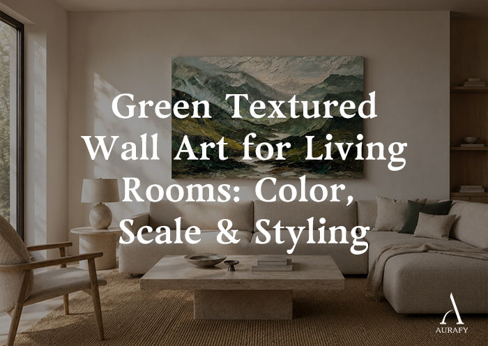
Green Textured Wall Art for Living Rooms

Green is the easiest color family to get wrong by overthinking and the easiest to get right by choosing deliberately. Unlike a single accent shade, "green" spans at least five distinct moods—moss, olive, forest, emerald, and teal—each pulling a living room in a different direction before you've even hung the piece. Add texture into the mix, and the decision gets more interesting: a flat green surface reads as color, but a textured one reads as material, catching light and shifting tone throughout the day. This guide walks through how to choose the right green, match it to scale and sofa color, and place it without the wall feeling heavy.
Which Green Actually Fits Your Room?

The fastest way to narrow five greens down to one is to look at your room's undertone first, not your favorite shade in isolation.
Moss is the most forgiving of the group. It sits low on saturation, closer to gray-green than true green, which is why it reads as neutral rather than as a color choice you have to build a scheme around. It pairs comfortably with ivory, oatmeal, and other warm neutrals, which is part of why a piece like the Moss Serenity Canvas—Moss Green & Ivory Textured Wall Art—works in rooms that already lean toward soft, low-contrast palettes rather than bold ones.
Olive carries more yellow and brown in it than moss, so it leans warm and earthy. It's the green most likely to already exist in your room without you noticing—in wood tones, in leather, in brass hardware—so it tends to unify a space rather than introduce a new note.
Forest green is deeper and more saturated than either moss or olive, with less gray mixed in. It reads as confident and a little formal, closer to traditional decorating than the softer earth tones. A piece that combines forest green with metallic gold accents, such as Verdant Haze, leans into that formality rather than away from it—the gold keeps the deep green from feeling somber.
Emerald is the most saturated and the most jewel-toned of the five. It's the green that behaves like a true accent color: high contrast, high visual weight, and best used when you want the art to be the obvious focal point rather than a supporting layer.
Teal sits at the boundary between green and blue, and where it lands depends on the piece and the light. It's the coolest option here, and it tends to pair more naturally with cooler grays and blues than with warm wood tones.
If you're unsure which family fits, look at your sofa and your floor before you look at swatches. Warm wood floors and warm-toned upholstery pull toward moss, olive, and forest. Cool grays and cooler wood tones pull toward emerald and teal.
Texture Changes How a Green Reads in Light

A textured green surface and a flat or visually smooth one are not the same visual experience, even at the identical color value. Texture creates its own micro-shadows across the surface, which means the color shifts slightly depending on the angle of light hitting it—morning light versus lamp light versus overhead can each pull a slightly different mood out of the same piece. This is part of why textured wall art tends to feel more alive on a wall than a flat or visually smooth surface in the same color: it's not static.
This matters more for some greens than others. Deep, saturated tones—forest, emerald—benefit the most from texture because surface variation keeps a large block of dark color from reading as flat or heavy. A flat or visually smooth forest-green piece at a large scale can feel like a slab of color; a textured one breaks that up naturally, so the eye reads dimension rather than density. Moss and olive, being lower-contrast to begin with, don't need texture to avoid heaviness, but texture still adds a tactile quality that a flat or visually smooth surface doesn't have.
Practically, this means you should think about where the wall sits relative to your windows before locking in a shade. A wall that gets strong, direct afternoon light will show off texture dramatically and can handle a deeper, more saturated green. A wall that only gets indirect or lamp light will show texture more subtly, and a lighter, higher-contrast piece—moss and ivory, for instance—will register more clearly than a very dark, low-contrast one.
Match the Sofa or Contrast It?

Both approaches work, but they solve different problems, and knowing which one you're solving for makes the decision easier.
Matching works when your sofa is already a neutral—cream, oatmeal, gray, greige—and you want the green art to feel like it was chosen for the room rather than dropped into it. In this case, a softer, lower-contrast green like moss or olive tends to blend more naturally with the existing palette, especially when the art also includes a neutral like ivory. The art becomes part of the room's tonal range rather than a departure from it.
Contrasting works when your sofa already has color or pattern, or when the room is otherwise fairly neutral and you want the art to be the one thing that draws the eye. Here, a more saturated green—emerald, or a deep forest green with metallic accents—reads as intentional rather than random, because it's clearly playing a different role than "match the cushions." The risk with contrast is picking a green that's close enough to the sofa color to look like an unintentional near-miss rather than a real contrast; if you're going to contrast, commit to a genuinely different depth or saturation, not just a slightly different shade of the same green.
A middle path, and often the easiest for a first piece of green art, is choosing a piece with two tones built in—like a moss-and-ivory or forest-and-gold combination—so the art itself bridges both instincts. It has enough neutral in it to sit calmly against most sofas, and enough color to still function as an accent.
Getting the Scale Right

Undersized art is the most common mistake in living rooms, and it's more forgiving with light colors than dark ones—a small pale piece just looks minimal, while a small dark green piece can look like an afterthought, because the eye expects a deep, saturated color to carry proportional visual weight.
As a general framework, wall art over a sofa should span roughly two-thirds to three-quarters of the sofa's width, not the full length and not a narrow strip in the center. Over a console or sideboard, the same ratio applies relative to the furniture beneath it. These aren't hard rules, but they're a reliable starting point before you adjust for the specific wall.
Orientation matters as much as size. A vertical, portrait-oriented piece works well on narrower walls, beside a doorway, or when you want to draw the eye upward in a room with lower ceilings. Verdant Haze, for example, is built vertical and offered across a wide size range—32x24 up to 90x60 inches—which gives it flexibility from a modest accent wall up to a genuine anchor piece over a large sofa or fireplace, with its sage-to-deep-forest palette and abstract brushstrokes carrying that range well. A horizontal piece, by contrast, tends to suit a low, wide wall—above a long sofa or a media console—where a vertical piece would leave awkward empty space on either side.
If you're choosing between a single large piece and a grouped arrangement of smaller ones, consider your green family. Deep, saturated greens like emerald or forest generally work better as one confident piece rather than several smaller ones, because breaking a bold color into fragments can make the wall feel busy rather than intentional. Softer greens like moss or olive can work either way, since their lower contrast makes a multi-piece arrangement feel calmer.
Green Wall Art with Wood, Linen, Stone, and Metal

Green is unusually easy to pair with natural materials, which is part of why it's become a default choice for living rooms built around a warm, textural palette rather than a strictly modern one.
Wood is the most natural partner for olive and moss. Both greens share enough undertone with mid-to-warm wood tones—oak, walnut, teak—that they read as part of the same family rather than as separate decisions. This is especially true when the art itself has visible brushstroke movement, which echoes the grain and texture already present in wood furniture.
Linen and other woven textiles—upholstery, throw pillows, drapery—soften the edges of a more saturated green. A deep forest or emerald piece next to smooth, polished surfaces can feel sharp; next to linen, the same green feels more relaxed, because the textile's own texture takes some of the visual intensity off the art.
Stone, particularly in cooler grays or warm travertine tones, pairs well with teal and emerald specifically. The mineral quality of stone complements the more jewel-toned greens in a way it doesn't always complement the earthier moss and olive, which can start to look slightly muddy against very cool stone.
Metal accents are where a piece's built-in details matter. A piece that already incorporates metallic elements—gold accents worked into a forest-green and sage palette, for instance—gives you a built-in bridge to brass, aged gold, or warm bronze hardware and lighting elsewhere in the room, without needing to introduce a separate metallic element just to tie things together.
Do You Need Plants Too?

No—green wall art and live plants are not a package deal, and pairing them poorly can actually work against both. If your room already has several plants, a green piece with a similar tone can start to blur into the greenery rather than stand apart from it, especially at a glance from across the room. In that case, either choose a green family that contrasts with your plants' foliage—teal or emerald against mostly mid-green leaves, for example—or lean on the art's other tones (ivory, gold, mist) to keep it visually distinct from the plants rather than blending into them. If your room has few or no plants, green art does a reasonable job of bringing in that same organic, grounding quality on its own, without the maintenance.
Where to Hang It Without Overloading the Wall

Over the sofa is the most common placement, and the safest for a first piece. Center the art on the sofa rather than the wall if the two don't align, and keep the bottom edge roughly 6 to 8 inches above the top of the sofa back so the two feel connected rather than floating separately.
Over a console or sideboard works well for narrower or vertical pieces, particularly in an entry-adjacent living room where the console does double duty. Leave a similar gap—a few inches—between the top of the furniture and the bottom of the frame.
Over a fireplace is the placement most likely to call for a larger or bolder piece, since the fireplace itself is already a focal point and a small or timid piece will get visually absorbed by the mantel and surround. This is where a deeper, more saturated green, or a large-format vertical piece, tends to hold its own better than a smaller, quieter one.
To avoid the wall feeling heavy—a common risk with deep greens at large scale—balance density with negative space. A single large, saturated piece with generous empty wall around it reads as curated; the same piece crowded by shelves, frames, or other art on the same wall reads as cluttered. If your green is on the darker, more saturated end, give it more breathing room than you would a lighter piece.
A Quick Pre-Purchase Checklist

- Identify your room's undertone (warm wood and neutrals vs. cool grays) before choosing a green family
- Decide whether you want the art to match your sofa or contrast against it
- Measure the wall and furniture width to land on scale before browsing sizes
- Confirm orientation (vertical vs. horizontal) fits the wall's proportions, not just the furniture below it
- Consider how much direct light the wall gets, since it affects how texture and saturation read
- Check whether you want a single anchor piece or a smaller accent, based on how saturated the green is
- Look at what materials are already in the room—wood, linen, stone, metal—and pick a green that echoes at least one
Frequently Asked Questions
What's the most versatile green for a living room with warm wood floors?
Moss and olive are the most versatile choices with warm wood floors, since both share undertones with mid-to-warm wood tones like oak and walnut. Moss leans more neutral and gray-green, making it easier to place without building a whole scheme around it, while olive leans warmer and blends even more directly with existing wood and brass tones already in the room.
Should textured green wall art match the wall color or contrast with it?
Contrast generally reads better than a near-match, because textured art relies partly on shadow and light play to show its dimension, and that effect is muted against a similarly colored wall. A neutral or lighter wall lets a deep green piece's texture and color both stand out, while a green wall paired with green art tends to flatten the visual effect.
How big should green wall art be over a standard sofa?
As a general guideline, the art should span roughly two-thirds to three-quarters of the sofa's width rather than the full length. For a sofa in the 80 to 90 inch range, that puts most pieces in a roughly 48 to 66 inch width, though a vertical piece changes this calculation since width matters less than proportion to the wall.
Can I mix two different greens in the same living room?
Yes, as long as they differ clearly in saturation or undertone rather than sitting close enough to look like a mismatch. A soft moss or olive base paired with a single more saturated emerald or forest accent tends to work better than two greens of similar intensity, which can compete rather than complement each other.
Choosing With Intent

The fastest path to a green that works is deciding your undertone and contrast strategy before you start browsing—not after. Warm wood and neutral upholstery point toward moss or olive; cooler grays and a desire for a clear focal point point toward emerald or teal; and forest green, especially with metallic detail, sits in between as a deeper, more formal option. From there, scale and orientation should follow your actual wall and furniture measurements rather than a general size guess, and texture should be treated as a real design variable, not an afterthought, since it changes how the same color behaves across a day of shifting light.
For pieces along these lines, the 3D Textured Painting collection and Best Sellers collection are worth a look, including the Moss Serenity Canvas-Moss Green & Ivory Textured Wall Art-AURA061, Verdant Haze Canvas Forest Green & Mist Gold Textured Wall Art-AURA078, which spans a wide size range for walls both modest and large.
Share:
Brown and Beige Abstract Wall Art for Warm Neutral Interiors
Black and Gold Wall Art for Living Rooms: Refined Styling