


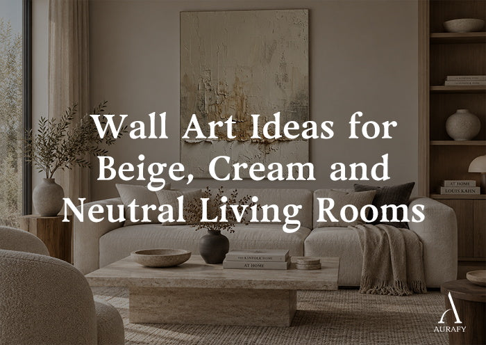
Wall Art Ideas for Beige Cream and Neutral Living Rooms

A neutral living room gives you more design freedom than it might seem, but it also means the wall art has to do real work — there's no bold accent color to lean on for visual interest. The good news is that neutral doesn't have to mean plain. Texture, structure, contrast, and undertone all give you ways to create a distinct mood without introducing color that clashes with a carefully built beige-and-cream palette.
This is a framework for choosing wall art based on the kind of neutral room you actually have, organized around four directions: organic texture, geometric structure, monochrome contrast, and earth tones.
Direction One: Organic Texture for Soft, Flowing Rooms

If your room already leans soft — curved furniture, layered textiles, a generally relaxed mood — organic textured art tends to fit more naturally than sharp geometric pieces.
Organic Swirl Painting-Cream, Gray & Charcoal Tones-AURA001 is a useful example of this direction: a swirling, textured composition in cream, gray, and charcoal that introduces movement without hard edges. In a room built on softness, this kind of piece extends the mood rather than interrupting it.
Does organic textured art work in a room that's mostly straight-lined furniture?
Yes — in fact, the contrast can be effective, since the movement in the art provides visual interest that a room of clean, simple furniture doesn't otherwise have. The key is keeping the art's palette restrained so it adds texture without adding visual noise.
Direction Two: Geometric Structure for Rooms That Want Order

If your neutral room already feels a little loose or under-defined, geometric wall art can introduce the sense of structure that's missing, without adding color.
Minimalist Grid Texture Wall Art-Warm Beige Tones-AURA060 demonstrates this well: a centered grid composition in warm beige, cream, taupe, and soft accent tones, with raised texture that keeps the structure from feeling flat. This works particularly well in rooms with simple, straight furniture lines, where the geometry in the art echoes the geometry already present in the space.
When should I choose geometric structure over organic texture in a neutral room?
Choose geometric structure if the room feels a little formless or you want a clear visual anchor; choose organic texture if the room already has enough structure and needs softening instead. Rooms with very plain, boxy furniture often benefit more from organic movement than from additional geometry.
Direction Three: Monochrome Contrast for Rooms That Need an Anchor

Some neutral rooms have plenty of texture and warmth already but lack a clear focal point. In these cases, a piece with stronger internal contrast — even while staying within a neutral palette — can provide the anchor the room is missing.
This doesn't require introducing black and white. Charcoal-and-ivory combinations, like those found in AURA001's darker passages, or dedicated ivory-and-charcoal block compositions, provide contrast within the neutral family rather than stepping outside it. This keeps the room cohesive while still giving the eye somewhere clear to land.
How do I add a focal point to a neutral room without introducing a new color?
Choose a piece with more internal tonal contrast — charcoal against cream or ivory, for instance — rather than a piece that stays close in value throughout. The contrast comes from value, not hue, so the room stays in its neutral family.
Direction Four: Earth Tones for Warmth and Grounding

Not every neutral room is built on cool beige and gray — many lean warmer, with terracotta, clay, or muted brown woven through the furniture and textiles. For these rooms, wall art drawing on similar earth tones tends to integrate more naturally than a cooler beige-and-charcoal piece.
Pieces built around clay, warm brown, and muted taupe — sometimes labeled as earth-toned abstracts — extend this warmth onto the wall rather than introducing a cooler counterpoint. This direction suits rooms with leather furniture, warm wood floors, or terracotta and rust-toned textiles.
Should a warm, earth-toned living room use cooler neutral art for contrast, or stay within the same warm family?
Staying within the same warm family generally reads as more cohesive, though a small amount of contrast — a slightly cooler charcoal accent within an otherwise warm piece — can add depth without breaking the room's overall warmth. Full cool-toned art in an all-warm room risks looking mismatched rather than intentionally contrasting.
Combining Directions Without Overcomplicating the Room
Most neutral living rooms don't need to commit to just one direction — but they do need one direction to lead. A common, effective approach is:
- Choose one piece as the clear focal point (often the monochrome-contrast or geometric-structure direction, since these carry more visual weight)
- Let secondary pieces or accents draw from a second direction — organic texture in a smaller nook, for instance — without competing for the same attention
- Avoid combining more than two of the four directions in the same sightline; three or four different textural languages in one view usually reads as unplanned rather than layered
Wall Color and Lighting Considerations Across All Four Directions
Regardless of which direction you choose, a few practical points apply broadly:
- Warm white or soft greige walls support nearly all four directions better than a stark, cool white, which can make even warm-toned art look slightly duller by contrast
- Textured pieces — whether organic, geometric-relief, or earth-toned — benefit from some angled or indirect light to show their surface variation
- Rooms with large windows and shifting daylight will show more tonal range in textured pieces throughout the day than rooms lit only by flat overhead lighting
Common Mistakes
- Choosing a piece based only on color, without considering texture or structure, which can leave a neutral room looking flat despite a "correct" palette.
- Combining too many textural directions in one room, creating visual competition instead of layered interest.
- Ignoring undertone mismatches, such as a cool beige piece in a warm terracotta-toned room.
- Underscaling the focal piece, especially in the monochrome-contrast or geometric-structure directions, which rely on scale to carry their visual weight.
- Skipping texture altogether in a room with flat, even lighting, missing an opportunity to add dimension where color alone won't do it.
Quick Selection Checklist
- Identify which of the four directions — organic, geometric, monochrome contrast, or earth tone — matches your room's existing mood
- Choose one direction to lead as the focal point; keep secondary accents restrained
- Match undertone (warm vs. cool) to your existing furniture and textiles
- Prioritize texture if your room relies on natural or angled lighting
- Size the focal piece generously; avoid undersizing pieces meant to anchor the room
FAQ
Can a neutral living room have more than one wall art focal point?
It's possible, but it works best when the two focal points are in separate sightlines — one above the sofa, one in a distinct reading nook, for example — rather than competing within the same view. Within a single sightline, one clear focal piece generally reads better than two pieces vying for attention.
How do I avoid a neutral living room looking boring with just beige and cream art?
Lean on texture and contrast rather than color to create interest — raised relief, visible brushwork, or a piece with stronger internal tonal range (like charcoal against cream) all add depth without introducing a new hue. A neutral room reads as "boring" often because the room lacks tonal or tactile variation.
What's the difference between choosing geometric and organic wall art for a neutral room?
Geometric art introduces order and structure, which helps a loosely styled or under-defined room feel more intentional. Organic textured art introduces movement and softness, which helps a room that already feels structured or formal loosen up. The right choice depends on which quality your room is currently missing.
Should earth-toned wall art match my furniture exactly, or just be in the same family?
Matching the same tonal family — warm browns, clay, muted taupe — works better than trying to match furniture exactly, since art that's too close to the furniture in tone can blend in rather than stand out. Aim for a shared undertone with enough contrast in value to still read clearly as art.
Share:
Vertical Wall Art for Entryways and Narrow Walls
Wall Art for Japandi Living Rooms