


The Problem With Tall, Empty Walls
Duplex apartments and split-level homes often come with one dramatic feature: a staircase wall rising 3 to 6 meters straight up. It is one of the most visually powerful surfaces in the whole house, and also one of the hardest to fill well.
A single small print looks lost on a wall this size. Even a large flat piece can end up reading as a thin sheet of color pinned onto raw concrete or plaster, doing almost nothing to fill the height. What these walls actually need is scale, weight, and enough physical depth to hold their own against several meters of open space.
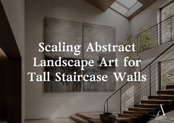
A 3D abstract landscape painting, built at true architectural scale, can fill that role. Rather than depicting a literal view, it compresses the structure of coastlines, mountain ridges, and rock faces into raised black, white, and grey relief, essentially turning a flat wall into a physical geological cross-section.
From Real Terrain to Abstract Relief

High-end duplex walls rarely need a literal picture of a landscape, complete with blue sky and green trees. What they benefit from instead is the underlying structure of a landscape, stripped down to its bones.
A skilled artist studies the way coastlines erode, or the way rock strata fold and fracture in a mountain range, then rebuilds that structure using a palette knife instead of a brush. The result keeps the tension between hard, angular rock faces and soft, flowing erosion lines, without depicting any specific, recognizable place.
Within that structure, black and white each carry a distinct role. Charcoal-black passages represent the deep gorges and shadowed rock faces found in real terrain. White and grey marble powder, layered in irregular clusters, stands in for the pale, weathered surface of granite or sandstone worn down by glaciers and sun. This kind of white black abstract contrast is what gives the piece its sense of geological weight.
For buyers comparing this against a standard abstract drawing black and white print, the difference comes down to depth. A print shows tone through ink density on a flat surface. A relief piece shows tone through actual raised structure and real cast shadow, which is part of why it reads as far more substantial from across a stairwell.
How Movement on a Staircase Changes the View

A staircase offers something a flat living room wall never can: a constantly shifting eye level as a person climbs.
As someone walks up the stairs, their line of sight rises with each step. Combined with light coming from a stairwell window or skylight, this changes how the raised mineral ridges cast shadow, step by step. A section that reads as a deep, dark valley from the bottom of the stairs can shift into a bright, pale ridge line by the time someone reaches the third or fourth step.
This shifting effect works especially well across a long, continuous piece spanning several panels. As the viewer's body physically moves, the shadow pattern across the whole canvas moves with it, turning what would otherwise be a static wall into something that changes with every few steps taken. Climbing the stairs stops being a dull, repetitive motion and becomes a slow walk through a piece that is, in a real sense, alive.
Sizing the Piece to Your Wall and Light

Different wall shapes call for different panel layouts and material ratios. Below are three common settings and how each can be approached.
Vertical staircase wall
A narrow, tall passage with light entering from a skylight or a side window at an angle calls for a vertical layout: two or three tall panels, such as a pair of 36x72 inch panels aligned edge to edge. A ratio near 60% charcoal-black base, rising like a mountain spine from bottom to top, paired with 40% titanium-white relief carved into the upper edge, works well here. The pale upper section reads like a snowline, drawing the eye upward along with the stairs.
Wide, open-plan feature wall
A large open living space with floor-to-ceiling windows and a wide, panoramic view calls for a horizontal layout instead: a triptych spanning more than 120 inches total. A ratio near 40% sandy grey texture, echoing microcement flooring, combined with 40% charcoal fracture lines running horizontally and 20% muted antique bronze, extends the room's horizontal line and makes an already wide space feel even more expansive.
Angled or irregular alcove
A sloped attic ceiling or an oddly shaped nook with limited light benefits from a mid-size, high-contrast piece built with irregular, multi-directional knife strokes: roughly 50% cracked white base and 50% deep charcoal-black. This kind of chaotic, layered structure works well at breaking up the visual tension created by an unusual, angular room shape.
Rules for Hanging a Multi-Panel Piece Correctly

A large landscape piece spanning several panels only works if it reads as one continuous surface, not several separate paintings hung near each other.
The gap between panels needs to stay within a narrow range, typically 1.5 to 2 inches. Installers should also match the tilt and thickness of the raised ridges across that gap carefully, so a ridge line that starts on one panel appears to continue naturally onto the next, even with a small physical break between the canvases.
It also helps to keep everything near the piece equally honest in material. Skip plastic florals or resin ornaments near the base of the staircase or along the steps. Pair the piece instead with raw iron, uncut natural stone, or coarse ceramic pots, so nothing nearby undercuts the raw, geological character the painting is built to carry.

A tall staircase wall is one of the few surfaces in a home that people actually move past every single day, at a slowly changing eye level. That makes it one of the best places for art that responds to motion rather than sitting flat and static.
A properly scaled abstract landscape painting, built across two or three continuous panels with real mineral depth, turns a plain concrete or plaster wall into something closer to a cliff face. Every trip up or down the stairs becomes a small, physical walk through it.
Share:
How to Hang Oversized Heavy Abstract Wall Art Safely
Using Grey Abstract Painting to Hide Design Flaws