


- Display colorful 3D wall art to inject emotional energy into a minimalist interior without creating flat visual clutter.
- Hang blue 3D wall art in a bedroom or home office to support mental clarity, focus, and a sense of calm.
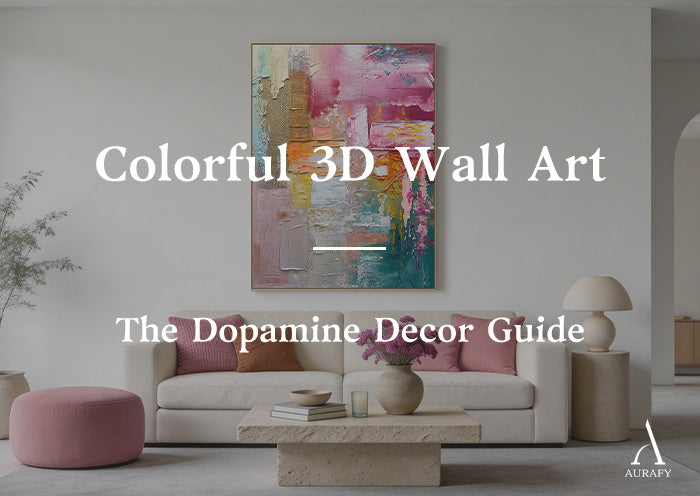
- Choose pink 3D wall art to bring warmth, optimism, and a welcoming atmosphere to a social living space.
- Install red 3D wall art on an accent wall to create a commanding, high-energy focal point in a spacious room.
- Position adjustable track lights at 45 degrees to bring out the full color depth of every raised ridge — flat overhead light flattens the effect entirely.
The last decade gave us restraint. Grey walls, neutral palettes, and interiors stripped back to their structural essentials.
It was beautiful. It was also, for many people, cold.
Dopamine decor is the response — a return to color as an active force in the home, not a risk to be managed. Color that lifts mood, signals personality, and makes a room feel genuinely alive.
But colorful 3D wall art is not the same as colorful wall art. A flat printed canvas in a bold color adds hue to a room. A handmade 3D piece adds something more: physical depth that gives color shadow, weight, and range. The same blue that looks flat on a printed surface becomes a full spectrum of tones on a textured one — light sky-blue on the raised ridges, deep navy in the shadow channels. The color gains dimension. The room gains presence.
Blue 3D Wall Art: Calm, Focus, and Visual Depth

Blue is one of the most psychologically consistent colors in interior design. Across cultures and contexts, it reads as calm, intelligent, and trustworthy. It slows the heart rate slightly. It reduces ambient anxiety. It creates a mental environment that supports sustained concentration.
These are the reasons blue 3D wall art works particularly well in bedrooms and home offices — the rooms where calm focus matters most.
Texture deepens every quality blue already has.
On a flat surface, a blue piece delivers its color and stops there. On a textured surface, blue operates across a full tonal range. The high points of the ridges catch direct light and read as bright, airy blue — the tone of a clear sky. The recessed channels fall into shadow and read as deep, dense navy. Between these two extremes, every grade of the blue spectrum appears.
This tonal range is not applied by the artist. It is produced by the surface itself, in response to the light in the room. The piece changes from morning to evening as the light angle shifts. It looks different on a bright day than on an overcast one. That responsiveness is what gives a blue 3D piece its calming, living quality — and what makes it worth choosing over a flat print.
Best uses for blue 3D wall art:
A large blue textured piece above the headboard in a bedroom creates a visual anchor that supports rest. The cool tonal range and the organic movement of the surface contribute to a sense of calm without making the room feel cold.
In a home office, a blue 3D piece on the wall facing the desk gives the eye a resting point between screen sessions. The physical depth of the surface provides genuine visual relief from the flat, backlit plane of a monitor — something a flat canvas print cannot offer.
Pink 3D Wall Art: Warmth Without Sweetness

Pink has spent years trapped in a narrow aesthetic category — associated with children's rooms and overly decorative interiors. Contemporary design has moved past this completely.
The pinks that define current high-end interiors are not soft pastels. They are dusty rose, warm terracotta-pink, grey-toned blush, and muted peach — tones that read as sophisticated neutrals with warmth rather than as sweet or decorative colors. In the right context, they are among the most versatile tones available.
Texture removes the sweetness from pink.
A flat printed canvas in even a muted pink can tip into saccharine. The smooth, uniform surface reinforces the softness of the color.
A handmade pink 3D wall art piece works differently. The palette knife marks — rough edges, sharp planes, the occasional raw or unresolved surface detail — counter the softness of the color directly. The contrast between a warm pink tone and a physically assertive, textured surface creates a piece that reads as confident rather than delicate.
This is the combination that makes pink 3D work effective in social spaces — living rooms, dining areas, entryways. The warmth of the color makes people feel welcome. The physical character of the texture communicates that the choice was deliberate. The room feels curated, not decorated.
Pairing guidance for pink 3D wall art:
Dusty pink works exceptionally well against deep green — whether that is a forest green sofa, a dark sage wall adjacent to the piece, or deep green botanical styling. The contrast between the warm pink and the cool green is one of the most reliably sophisticated combinations in contemporary interior design.
Matte black metal frames, shelving, or fixtures alongside a pink textured piece anchor the warmth of the color with visual weight and prevent it from reading as too light for the room.
Red 3D Wall Art for an Accent Wall: Presence Without Aggression
Red is the most demanding color in interior design. It is the first color the human eye detects. It raises energy, stimulates appetite, and commands attention before any other element in the room.
Used incorrectly, red is exhausting. A large flat red canvas on a living room wall creates a persistent visual demand that is difficult to relax around. The color is too uniform, too present, and too unrelenting.
Red 3D wall art for an accent wall solves this through physical variation.
When red modeling paste is built up several millimeters in depth on a canvas, the raised areas catch the light and read as bright, warm red. The recessed channels and shadow faces of the ridges fall into deeper, darker red — almost burgundy in strong sidelight. The color shifts across the surface. It is not uniform. It breathes.
This variation is what allows red to work at large scale. The eye does not encounter one flat expanse of red — it encounters a surface with tonal complexity, where the color ranges from vivid to deep depending on the angle of the ridge and the direction of the light. The result is a piece with genuine presence that does not feel aggressive to sit with over extended periods.
How to use red on an accent wall:
Keep the surrounding room deliberately neutral. White or near-white walls, pale grey upholstery, light natural timber, and matte metal fixtures all allow a red 3D accent piece to carry the room without competing for attention. The contrast between the bold red surface and the neutral surroundings is what makes the piece work as a focal point.
Scale matters more with red than with any other color. A red piece that is too small for the wall looks like an afterthought. Choose a format that fills at least two-thirds of the accent wall's width — large enough to justify the color choice and command the space with the authority the color is designed to deliver.
Color and Furniture: A Practical Pairing Guide

|
3D Artwork Color |
Complementary Room Materials |
Visual Balance Principle |
|
Blue 3D Art |
Warm yellow velvet seating / natural oak flooring / brass fixtures |
Cool blue calms the energy of warm yellow; the combination creates vibrant but balanced contrast |
|
Pink 3D Art |
Deep green vintage sofa / matte black metal shelving |
Forest green and matte black ground the warmth of pink without dulling it |
|
Red 3D Art |
White micro-cement walls / pale grey fabric sofa / stainless steel surfaces |
Maximum contrast between neutral surroundings and bold color; red becomes the single focal point |
|
Terracotta 3D Art |
Raw linen upholstery / whitewashed timber / woven jute |
Earthy tonal harmony; natural materials deepen the warmth of the terracotta |
|
Deep teal 3D Art |
Warm ivory walls / aged brass / warm walnut furniture |
Teal provides cool depth; warm surrounding materials prevent it from reading as cold |
Why Color Quality Requires Handmade Production

Color exposes production quality more clearly than almost any other design element.
Machine-sprayed colorful panels use industrial paint applied in a uniform coat across a molded surface. The color is consistent — perfectly, mechanically consistent. Under light, it reflects with the uniform sheen of a sprayed coating. The piece reads as plastic. In a room designed to feel alive and personal, this is a significant problem.
Handmade color works differently.
At AurafyArt, every piece is made to order in our dedicated artist studio. Each color is mixed by hand — combining acid-free mineral pigments with flexible modeling paste until the specific tone the composition requires is achieved. This mixing process is not reproducible on a production line. The exact ratio of pigment to paste, the depth of the color saturation, the way the tone shifts under different light conditions — all of these are determined in the studio, by the artist, for that specific piece.
The color is applied in layers. Each layer is allowed to cure fully in natural conditions before the next is added. This layered process creates color depth that a single sprayed coat cannot achieve. In certain light conditions, you can see variation in the color between the uppermost layer and the deeper layers visible in the shadow channels. This depth is what prevents handmade colorful work from looking flat.
Two coats of UV-resistant, low-VOC matte varnish seal the finished surface. This protective layer maintains color saturation and prevents the gradual fading and yellowing that affects unprotected or lower-quality colorful work over time.
How to Light Colorful 3D Art

Install track lighting at 45 degrees.
Position a narrow-beam adjustable spotlight on the ceiling, 12 to 15 inches from the wall. Angle it at approximately 45 degrees across the face of the piece — not directly overhead and not directly frontal.
This angle does two things simultaneously. It reveals the physical depth of the surface by creating shadow contrast between the ridge faces and the channels. And it allows the color to read across its full tonal range — bright and saturated on the lit faces, deeper and richer in the shadows.
Without this directional light, a colorful 3D piece loses half its visual range. The color becomes uniform. The texture becomes invisible. The piece looks like a flat canvas with a slightly uneven surface.
Match the bulb temperature to the color of the piece.
For warm colors — red, pink, terracotta, gold-toned tones — use bulbs in the 2700K range. This warm temperature enhances the richness of warm hues and makes reds glow rather than read as flat.
For cool colors — blue, teal, soft green — use bulbs in the 3000K range. This slightly cooler temperature allows cool colors to retain their clarity without the excessive warmth that can make blues look grey or murky.
In all cases, avoid fluorescent or cool white bulbs above 4000K. These flatten color saturation and produce harsh, shadowless light that eliminates the dimensional effect entirely.
Frequently Asked Questions
Will colorful 3D wall art fade near a window with direct sunlight?
The mineral pigments used in AurafyArt pieces are significantly more light-stable than standard inkjet or giclée printing inks. The two UV-resistant varnish coats applied to every piece provide additional protection against sunlight exposure. For pieces hung near a window that receives several hours of direct sun daily, the protection is sufficient for normal residential use over many years. If the piece will sit in intense, unfiltered direct sunlight for most of the day, position it on the adjacent wall to reduce direct exposure — this is good practice for any art, including museum-quality works.
Can I use multiple colorful 3D pieces in the same room?
Yes, with one important guideline: use a single dominant color per room and treat additional pieces as supporting tones. A room with a bold red accent wall piece, a smaller terracotta piece on an adjacent wall, and warm pink cushions reads as a considered warm palette. The same room with a blue piece, a red piece, and a yellow piece competing on separate walls reads as chaotic. Let one color lead. Use the others to support it.
How do I choose the right color for a specific room?
Start with the room's existing material palette. If the room runs warm — timber, linen, terracotta tile, warm metal — choose a 3D piece in a color from the warm spectrum (red, pink, terracotta, warm orange) or a cool color in a warm tone (dusty blue rather than electric blue, soft teal rather than bright turquoise). If the room runs cool — concrete, steel, grey upholstery, cool stone — choose a 3D piece in a color with enough saturation to hold its own against the cool surrounding palette. Deep teal, cobalt blue, and warm red all work well in cool-toned interiors.
Color Is Not a Risk. It Is a Decision.
The rooms that feel most alive are the ones where color was chosen with intention rather than avoided out of caution.
Colorful 3D wall art gives that intention physical form. The color is not flat — it has depth, shadow, and tonal range that flat surfaces cannot produce. It shifts through the day. It responds to the light in the room. It carries the evidence of the hand that mixed and applied it.
Choose the color that matches the mood you want the room to have. Then choose a surface that does it justice.
Share:
Black and Gold 3D Wall Art: A Luxury Lighting Guide
Extra Large Textured Wall Art: The Installation Guide