


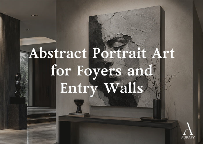
- Curate a black and white abstract portrait painting on a foyer feature wall to establish an immediate gallery presence — hand-sculpted facial relief strips away illustrative detail and anchors the entryway with sculptural weight.
- Position the geometric center of the piece at 58 to 60 inches from the floor — entry halls are transition zones where standing eye level determines the first impression.
- For a console table below the piece, apply the two-thirds rule: the artwork width should cover two-thirds to three-quarters of the table length.
- Use the side-offset spotlight technique — position the light slightly to the left or right of the canvas center to create asymmetric shadow depth that reads like natural gallery lighting.
- The anti-static varnish on every AurafyArt piece keeps dust from bonding to the portrait's facial channels — maintain with a dry soft brush or compressed air every two weeks.
The foyer is the first room people see. It sets the tone for everything that follows.
Most foyers are under-designed relative to the rest of the home. A console table, a mirror, a flat decorative canvas that reads as exactly what it is — a placeholder. The space technically functions. It does not make the statement the entrance to a considered home should make.
The problem with typical foyer art choices is one of presence. A standard landscape or abstract print adds imagery but no physical weight. A realistic portrait carries emotional content but can feel intrusive — a face watching you from the wall as you come and go.
A black and white abstract portrait painting in 3D relief occupies a specific space between these options. The human form is present — the viewer immediately reads the facial structure — but the treatment is architectural rather than representational.
The nose bridge becomes a ridge. The eye socket becomes a shadow channel. The brow becomes a raised plane. The composition communicates the weight of a human presence without depicting a specific person. It creates the gallery-like quality that a private home entrance deserves.
Deconstructing the Face: How Abstraction Creates Architectural Weight

The move from a realistic portrait to an abstract one is not simply a stylistic shift. In a foyer context, it changes the entire psychological register of the piece.
A realistic portrait in an entrance hall creates a specific tension. The face watches you. It demands engagement. In a space where guests are arriving and departing, this sustained eye contact reads as slightly uncomfortable — more like a formal ancestral hall than a gallery.
An abstract portrait removes this tension while retaining the emotional resonance of human form.
The face becomes geometry
The artist does not paint an eye. Instead, the depth of the eye socket — the way it recesses from the surrounding brow bone and cheekbone — is built as a physical recess in the surface. The area that would contain the eye falls back from the surface by 10 to 15 millimeters.
The brow above it projects forward. Under directional light, this recess fills with deep shadow while the brow above it catches a bright highlight. The viewer reads this as an eye without seeing one. The emotional response is present; the literal depiction is not.
The bone structure becomes relief
The nose bridge is built as a raised ridge running vertically across the center of the composition. The cheekbones are raised planes, and the jaw line is a horizontal ledge. These structural elements are built up in modeling paste to 15 to 20 millimeters of physical relief — real dimensional height that casts real shadows.
The result is a composition that the eye reads as a face from any distance and any angle. This happens not because the details are depicted, but because the structural relationships between the major facial elements are physically replicated in the surface. It is a face the way a map is a landscape: structurally accurate, abstractly rendered, and more powerful for the abstraction.
Placement: Positioning Abstract Portrait Art on Entry Walls

Entry halls and foyers present specific placement requirements that differ from living rooms and bedrooms. The space is primarily transitioned through rather than occupied. Viewers encounter the art while moving — entering, exiting, passing through. The placement must account for these dynamic viewing conditions.
The foyer anchor wall
For a wide foyer with a console table or credenza below the primary wall, apply the two-thirds proportion rule. The artwork width should cover two-thirds to three-quarters of the console table length.
· For a standard 60-inch console, choose artwork between 40 and 48 inches wide.
· For a wider 72-inch table, artwork between 48 and 56 inches is the right range.
The Furniture Gap: The bottom edge of the canvas should sit 6 to 8 inches above the table surface. This gap is critical: it connects the art to the furniture visually without crowding it. A gap narrower than 6 inches looks compressed, while a gap wider than 8 inches disconnects the art from the surface below it.
The corridor vista
For a long corridor that ends at a closed wall — a dead-end vista rather than an opening — position a single large vertical canvas at the end wall. When evaluating how to position a black and white abstract portrait on entry walls, this is one of the most effective setups in residential design.
The viewer sees the piece from the moment they enter the corridor. As they walk toward it, the portrait grows in scale. The experience of approaching the piece — seeing it first as a distant abstract form and then in close sculptural detail — is genuinely gallery-like.
Choose a vertical format — 40" × 60" or 40" × 80" — for this position. The vertical proportion fills the wall height appropriately and reinforces the upward visual movement that a long corridor benefits from.
The standing eye-level rule
In all foyer and entry positions, center the artwork at 58 to 60 inches from the floor. This is standard standing eye level — the height that produces the immediate, level engagement with the piece that makes the first impression work.
Foyers and entry halls are the one room where you almost never view art from a seated position. The standing eye-level calculation applies here more purely than anywhere else in the home.
Material Alignment: Relief Paste and Avant-Garde Interior Surfaces

High-end contemporary homes use a specific material vocabulary: Italian black marble, textured imported art plaster walls, hand-hammered matte dark metal fixtures, raw concrete, and unpolished stone. These surfaces share a quality — they are controlled, precise, and cool.
An abstract portrait painting in mineral modeling paste introduces a specific counterpoint to this environment.
The paste surface is imperfect by nature. The edges of the raised forms break slightly rather than resolving cleanly. The texture within the facial planes varies — smoother where the knife passed flat, rougher where the knife edge caught the surface.
Some areas carry visible tool marks. Others resolve to an almost smooth flatness before breaking again into raised relief. This variation is not a defect. It is the quality that separates hand-made from machine-made. In an environment built on controlled, engineered surfaces, the evidence of a hand in the work creates exactly the contrast that makes the piece worth noticing.
A painting abstract black and white masterpiece hung against a polished black marble wall reads as two different expressions of the same material intention. Both are serious, both are monochromatic, and both command attention. The marble is precise and permanent. The paste is organic and varied. Each makes the other more interesting by contrast.
Shadow Engineering: Lighting the Sculpted Face

The lighting approach for an abstract portrait piece differs in one important way from the standard 3D art lighting setup: the light source position needs to be offset from the center of the canvas.
Why centered light fails for portrait work
A spotlight positioned directly above the center of an abstract portrait fills both sides of the facial relief evenly. The nose bridge receives equal light on left and right. The brow projects equally on both sides. The result is a symmetrically lit surface that looks flat relative to what side-lit portrait work can achieve.
Real portrait photography, museum sculpture lighting, and gallery-hung figurative work use side lighting specifically because the asymmetry it creates is what reads as dimensional. One side of the face bright, one side in shadow — this is how we perceive three-dimensional faces in real life, and it is what makes a relief portrait feel like a face rather than a surface.
The side-offset technique
1. The Core Layout: Install a narrow-beam adjustable spotlight on the ceiling, 12 to 15 inches from the wall, aimed at the canvas at 30 to 45 degrees from the wall surface.
2. The Asymmetric Offset: Move the spotlight position to the left or right of the canvas center by approximately 10 to 15 degrees.
This side offset directs the light across the face of the portrait from one side rather than straight on. The brow on the lit side catches a bright highlight. The eye socket on the lit side is partially illuminated. The cheekbone casts a shadow across the cheek below it. The nose bridge casts a shadow to the opposite side.
The shadow side of the portrait falls into progressively deeper contrast. The eye socket on the shadow side becomes a deep recess. The cheekbone plane on that side reads as a dark plane rather than a lit one.
This precise asymmetry is what makes the abstract portrait piece read as a sculptural face rather than a textured panel. Use 2700K to 3000K warm white bulbs throughout. The warm temperature keeps the white areas of the portrait warm and the shadow areas deep brown-black rather than cold grey — keeping the piece alive rather than clinical.
Maintenance in High-Airflow Entry Spaces

Foyers and entry halls circulate more air than any other room in the home — doors open and close, air conditioning systems often terminate near entry zones, and foot traffic creates continuous air movement. Dust accumulates faster in these spaces than in settled living rooms or bedrooms.
Every AurafyArt piece ships with two hand-applied coats of anti-static, UV-resistant matte varnish. In a high-airflow environment, this anti-static property is specifically what makes maintenance practical.
How the anti-static varnish works
A surface with a high static charge actively attracts airborne particles. The particles bond electrostatically to the surface — particularly in the recessed areas like the portrait's eye sockets and jaw channels, where they accumulate and are difficult to remove without physical contact.
The anti-static varnish reduces this charge significantly. Particles that land on the surface rest there loosely rather than bonding. Air movement — even from a door opening — can displace some of them. The rest can be removed with minimal physical intervention.
The maintenance routine
· Every Two Weeks: Use a wide soft data-focused natural-bristle brush to sweep gently along the directional flow of the palette knife marks. Follow the structural lines of the portrait — downward along the nose, outward along the cheekbones, and upward along the brow ridge. This directional approach displaces the loosely resting particles without creating friction against the relief edges.
· Deep Recesses: For the deeper eye sockets and jaw channels, use short bursts from a can of compressed air at 6 inches or more from the surface. The bursts displace the particles without introducing moisture or physical contact.
Important: Never use a damp cloth, water, or any chemical cleaner on the portrait surface. Moisture introduced into the relief channels bypasses the protective varnish and can affect the modeling paste structure beneath it.
The Entrance as a Statement of Intent
Every home makes an implicit argument about who lives in it. The entrance is where that argument begins.
A high-contrast black and white abstract portrait painting in 3D relief on the foyer wall makes a specific argument: that the people who live here understand the difference between decoration and art. It proves that material quality matters, and that the hand-made — with all its evidence of process and individual judgment — belongs alongside precision architectural materials in a serious home.
The foyer is not a waiting room. It is the opening line of the home's narrative. A piece with genuine sculptural presence on the entry wall sets a standard for everything that follows — and it sets it from the first step inside the door.
Explore the AurafyArt private museum portrait collection — and commission the handmade piece that makes your entrance impossible to walk past without stopping.
Share:
Abstract Horse Painting for Executive and Boardroom Walls
Black White Grey Abstract Art for Industrial Interiors