


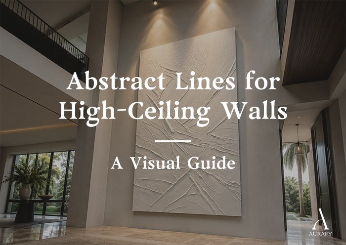
- Use abstract black and white paintings with vertical relief lines to visually stretch high-ceiling walls — the continuous ridges draw the eye upward along a structured axis.
- A wall taller than 10 feet, a single 40" × 80" vertical canvas or a triptych of matching panels is the most effective solution.
- When using multiple panels, keep the gap between them at 2 to 4 inches and ensure the vertical line patterns continue across the panels for a unified composition.
- Install narrow-beam spotlights 12 to 15 inches from the wall at 30 to 45 degrees — high walls need this raking angle to activate the shadow depth of the surface.
- The anti-static varnish on every AurafyArt piece means dust rests loosely on the surface rather than bonding to it — a long-handled dry brush clears it without removing the piece from the wall.
A double-height wall is one of the most impressive architectural features in a home. It is also one of the hardest to handle.
The scale is the problem. A wall that rises 12 to 16 feet dwarfs almost any art intended for standard ceiling heights. A horizontal composition that works beautifully in a living room looks small and ineffective against the vertical expanse of a grand entry hall. A group of small frames arranged in a gallery cluster gets lost entirely. The wall remains empty — impressively sized and architecturally unresolved.
The solution lies in matching the orientation and scale of the art to the specific spatial qualities of a tall wall. Abstract black and white lines in vertical 3D relief are built for exactly this configuration: their upward orientation aligns with the wall's height, their physical depth activates shadow under the specific light conditions of high spaces, and their monochromatic palette fills the vertical expanse without introducing color complexity that a large-scale wall would amplify.
Why Vertical Lines Stretch Space: The Visual Mechanism

The eye follows continuous lines. This is not a design preference — it is a characteristic of human visual processing. When a continuous line exists in a field of view, the eye tracks it from beginning to end.
Horizontal lines direct the eye sideways. They make walls feel wider. Vertical lines direct the eye upward. They make walls feel taller.
In a room with a 12-foot ceiling, a painting with strong vertical relief lines creates what functions as a visual corridor — an upward pathway that the eye follows from the floor level to the top of the composition and then naturally continues to the ceiling above it. The ceiling feels more intentionally tall. The transition from the wall to the ceiling feels connected rather than abrupt.
This is why incorporating an abstract black and white painting with vertical relief lines manipulates perceived volume: the continuous physical ridges stretch high-ceiling walls by drawing the eye upward along a structured visual axis — an effect that horizontal or diagonal compositions cannot replicate.
The key word is physical.
A flat printed canvas with vertical lines drawn in ink produces a version of this effect from a fixed viewing angle. Move to the side — approach the wall from the hallway — and the lines read as flat marks on a surface. The directional quality is visual, not structural.
A 3D relief piece with vertical ridges built 15 to 20 millimeters above the canvas base produces the upward pull from every angle. The ridges are genuinely upright. They catch light on their upper-facing edge and fall into shadow on the lower-facing edge regardless of where the viewer stands. The directional quality is physical, and it persists through every viewing angle and every light condition.
Flat Prints vs. Hand-Sculpted Relief: What Large Scale Reveals

At standard sizes, the difference between a flat printed canvas and a handmade 3D piece is clear to a careful observer. At the scale required for a double-height wall — 40 × 80 inches or larger — the difference is visible from across the room.
What happens to flat printed lines at large scale
A flat canvas print with black lines scaled to 40 × 80 inches exposes the limitations of the medium immediately. The black ink, spread across a large surface area, picks up ambient light and reflects it uniformly. Under the natural light that enters a grand foyer through tall windows, the black areas develop a reflective quality that makes the surface read as plastic rather than matte.
The edges of the printed lines, crisp at small scale, appear to blur and soften at large scale — not because the print resolution has changed, but because the eye has more surface to scrutinize and the digital origin of the marks becomes apparent.
The piece reads as an oversized poster. At the scale of a double-height wall, this reading is unavoidable.
What hand-sculpted vertical ridges do instead
A handmade piece with vertical abstract black and white lines is not drawn — it is built. The artist loads a wide-blade palette knife with flexible modeling paste and draws it upward from the base of the canvas to the top in a single continuous stroke. The paste builds up along the leading edge of the knife, leaving a raised ridge on the canvas surface.
Each stroke is different. The pressure applied at the start of the stroke — where the knife first contacts the surface — determines the height of the ridge base. The pressure at the end of the stroke — where the knife lifts away — determines whether the ridge tapers to a fine point or ends with a slightly raised edge. The speed of the stroke affects the surface texture along the length of the ridge.
The result is a line that is genuinely three-dimensional. It has a lit face — the upper edge of the ridge that catches direct light — and a shadow face — the lower angled side that falls into shade. Under any directional light source, it reads as a structural element rather than a mark on a surface.
At 40 × 80 inches, this quality is amplified. The vertical ridges on a large canvas catch light across their full two-meter height. The shadows they cast extend across the full canvas width. The piece reads as an architectural element — closer to a carved stone relief than to a painting — and it holds the tall wall with the authority the space requires.
Multi-Panel Layouts for Wide, Tall Walls.

A single 40" × 80" canvas suits tall walls that are 36 to 48 inches wide — the proportion of a typical door surround or chimney breast. For wider feature walls — the full-width wall of a double-height entry hall, the primary wall of a vaulted living room — a single panel is insufficient to fill the horizontal dimension.
The diptych and triptych solution
Two or three matching 40" × 80" canvases hung in a horizontal row fills the width while maintaining the critical vertical orientation. Two panels give a total arrangement width of approximately 82 to 84 inches (including the gap). Three panels extend to approximately 124 inches — appropriate for walls from 12 to 16 feet wide.
The gap between panels is a specific decision. 2 to 4 inches is the correct range.
Below 2 inches, the gap reads as a seam rather than a deliberate interval. The arrangement looks like a single piece that was cut for shipping and not quite correctly reassembled.
Above 4 inches, the gap reads as a visual break — two or three separate pieces placed near each other rather than a unified composition.
At 2 to 4 inches, the gap creates a gallery rhythm. The eye registers each panel as individual while reading the full arrangement as a unified composition. The interval is present but not disruptive.
Ensuring continuity across panels
The vertical lines in each panel should align or flow naturally from one panel to the next. The lines do not need to be perfectly continuous — a slight variation in alignment from one panel to the next actually reads as more natural and intentional than mechanical precision — but the general direction and density of the vertical marks should be consistent across the arrangement.
When commissioning a multi-panel arrangement from AurafyArt, this cross-panel continuity is planned during the composition stage — each panel is designed in relation to the others rather than independently.
Lighting High Walls: A Specific Technical Challenge

High-ceiling spaces present a lighting challenge that standard residential rooms do not. The ceiling is further from the wall. Standard recessed downlights positioned in the ceiling field are often too far from the wall surface to create the raking angle that activates 3D relief effectively.
The problem with standard high-ceiling lighting
In a room with a 12-foot ceiling, a recessed downlight positioned in the middle of the ceiling sits 6 to 8 feet from the wall. Light from this position hits the upper sections of a tall wall piece at a steep downward angle and barely grazes the lower sections at all. The result is uneven illumination — brighter at the top, dimmer at the bottom — with insufficient side-to-side raking to create meaningful shadow on the relief surface.
The track spotlight solution
Install a narrow-beam adjustable track head on the ceiling at 12 to 15 inches from the wall surface — closer to the wall than most people position ceiling lights. At this distance, the track head can be aimed at a 30 to 45 degree angle from the wall surface, sending light raking across the vertical ridges of the piece from top to bottom.
A 10-degree narrow beam is ideal for this application. A wider beam diffuses across the surface rather than focusing the light along the ridge structure. The narrow beam concentrates the illumination on the surface and produces sharper, more defined shadows in the channels between ridges.
For a 40" × 80" piece, one well-positioned spotlight covers the full surface effectively. For a three-panel triptych arrangement, use two or three spotlights spaced across the width of the arrangement, all positioned at 12 to 15 inches from the wall and all aimed at the same 30 to 45 degree angle. Consistent angle across all fixtures is essential — varying the angle creates uneven shadow patterns that break the visual unity of the arrangement.
Use 2700K to 3000K warm white bulbs throughout. On a tall wall, the color temperature of the light affects the full character of the space. Warm light keeps the black areas deep and the white areas warm. Cool light above 4000K makes the black areas appear grey and the white areas appear blue-grey — the opposite of the high-contrast, refined quality the piece is designed to deliver.
Maintaining Art on High Walls: Practical Guidance

The maintenance question for high-wall installations is a practical one: once the piece is hung at height, how do you clean it without taking it down?
How dust behaves on the surface
Every AurafyArt piece ships with two hand-applied coats of anti-static, UV-resistant matte varnish. This finish significantly reduces the static charge on the canvas surface. A surface with high static charge actively draws airborne particles — they bond to the surface rather than simply resting on it.
The anti-static varnish changes this behavior. Dust particles that land on the surface rest there loosely rather than adhering. They can be displaced by air movement — or by a light brushing — without the friction needed to remove bonded particles.
This is specifically what makes tall-wall maintenance practical. Use a long-handled soft-bristle brush — the kind used for high dusting — to sweep gently along the direction of the vertical lines every few months. The loosely resting dust displaces without requiring pressure. A can of compressed air directed along the vertical channels from a safe distance achieves the same result more quickly.
Never use a damp cloth or any liquid cleaner on the piece at any height. The physical process of pressing a wet surface against the texture channels introduces moisture that the varnish is designed to exclude.
UV protection for south-facing foyers
Grand entry halls with tall windows often receive significant direct sunlight, particularly south-facing windows in the afternoon. The UV-blocking agents in the matte varnish protect the white base tones from yellowing and maintain the depth of the black areas over time. For pieces that receive several hours of direct, unfiltered sunlight daily, positioning the piece on the wall adjacent to the window — where it receives reflected rather than direct light — extends the protective benefit. Under diffused or indirect natural light, the UV protection is more than adequate for long-term color stability.
When Architecture and Art Meet at the Ceiling
A double-height wall is not empty space waiting to be filled. It is an architectural statement — one that the home's design has already made. The art placed on it either reinforces that statement or diminishes it.
Abstract black and white lines in vertical 3D relief reinforce it. The upward orientation of the ridges aligns with the wall's height rather than contradicting it. The physical depth of the surface gives the art the mass it needs to hold its position at scale. The monochromatic palette completes the composition without introducing color complexity that a large wall would amplify into something uncontrollable.
The wall stops being a problem to solve. It becomes the piece's best feature.
Share:
Sizing Black and White Abstract Art Above a Sofa
Abstract Horse Painting for Executive and Boardroom Walls