


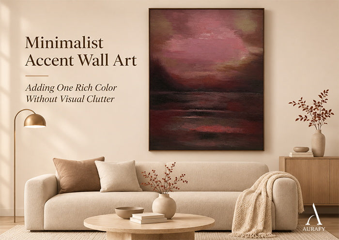
Minimalist Accent Wall Art: Adding One Rich Color Without Visual Clutter

Picture a living room with a pale sofa, a plain console and a bold painting on the wall behind it. Now add a patterned armchair and a crowded shelf beside the intended spot. The artwork is identical, but the result is not. Minimalist accent wall art works when it has a clear role among the objects already present. This guide uses a Room-Level Color Competition Audit to decide whether one red-dominant painting can lead, and what to adjust if it cannot.
For another perspective on red artwork and accent walls, read our black and red abstract painting guide.
Find the Room's Existing Visual Leader Before Adding Color
Start by standing where people normally enter the room, then sit where you usually sit. Notice what your eye reaches first. It might be a large existing painting, a bright chair, a pronounced rug or a dense display of objects. That item is the room's current visual leader.
Can a minimalist room have a bold red painting? Yes. A red-dominant canvas can serve as a clear color accent when the surrounding room does not create unwanted competition for attention. That is a statement about relationships, not a promise that every red painting suits every minimalist room.
Next, separate permanent features from movable ones. A fireplace, built-in shelving or a strongly colored sofa is unlikely to change. A tray of objects, a patterned throw or a secondary print can move easily. If a permanent feature already leads, decide whether it should remain the leader. Sometimes the better outcome is a painting that supports an existing focal feature rather than challenging it.

Audit What Will Compete With a Red-Dominant Canvas
Once you know the current leader, list what else asks for attention near the proposed wall. Look for four kinds of competition: conspicuous color, strong pattern, crowded groupings and proximity. A saturated chair right beside the painting may matter more than a colorful object across the room, because the eye can compare them in a single glance.
Also distinguish background color from an object that actively draws attention. A softly colored wall or a muted rug usually sits behind everything else. A vividly patterned cushion or a gallery grouping full of contrasting images behaves differently. A room can look entirely neutral and still feel busy if it holds many small decorative items, each asking for a moment of notice.
How do you know whether accent wall art will make a room look cluttered? Identify the room's existing visual leaders, then assess whether the proposed artwork would introduce another competing point of attention. A practical way to check is to hold up a realistically proportioned stand-in, such as paper or a cutout, and see how it sits among the objects nearby.
Two hypothetical layouts show the difference. These are illustrations only, not photographs or documented installations of any real customer room.
- Layout one: A red canvas hangs above a plain console. Nothing nearby carries strong color or pattern, so the painting is the obvious point of interest.
- Layout two: The same canvas hangs beside a brightly patterned gallery grouping. Each piece pulls the eye in a different direction, and the red field has to share attention.
Name the strongest actual competitor before changing anything. You are not trying to remove every colorful object, only the one most likely to undermine the painting's role.


Decide What to Keep, Move or Leave Unmatched
With the main competitor identified, make decisions in three groups.
Keep anything functional or quiet. A reading chair, a bookshelf or a mixed-color rug can stay even if it introduces other colors, as long as it sits behind the painting in visual rank rather than beside it as a rival.
Move the item that competes most directly. Try relocating or temporarily removing one nearby accessory, such as a patterned pillow, a bright vase or a small secondary print, before touching larger furniture. Change one thing, look again from your entry and seating points, then decide whether more is needed. The smallest useful adjustment is usually the right one.
Leave unmatched anything you might be tempted to buy simply to echo the painting. Red cushions, a red lamp or a red throw are optional, not requirements.
Do you need matching red accessories around red wall art? No. The artwork can carry the intended color accent by itself, and adding matching objects may introduce visual competition rather than improve the arrangement.
Consider a room with a sofa in a warm gray-and-oatmeal weave. It already works as a calm backdrop for a red painting. Adding a red cushion could create unwanted competition, depending on its prominence and placement, so leaving the sofa untouched may be the better call. A deliberate echo can work, but it should be a choice you can defend, not a reflex.

AURA116: Treat the Whole Painting as the Rich Color Accent
Crimson Stillness red abstract minimalist art, AURA116, is a vertical, red-dominant abstract canvas. Its palette centers on deep red, with a burgundy and maroon tonal family and layered transitions between those tones. The abstraction is restrained and nonfigurative, and the surface shows subtle variation with textured brushstroke.
The important point for this audit is what "one red accent" means here. AURA116 is not a neutral canvas with a single red mark on it. The entire red-dominant painting is the accent, and the room-level question is whether that whole field can serve as the main color statement.
Consider a conditional example. If the painting hangs against a relatively quiet arrangement, its overall red field may be more noticeable because little nearby competes with it. If a boldly patterned textile or a busy display sits close by, the painting may read as one voice among several.
The AURA116 Crimson Stillness red abstract canvas Crimson Stillness-Red Abstract Minimalist Art-AURA116 is one example of a whole-canvas red accent, rather than a neutral composition with a small red detail.

The Final Color-Competition Test: When Should You Stop?
Return to the entry and seating positions you used at the start, now with the painting in place or approximated with a temporary stand-in. Does the red canvas fulfill the role you intended? Does anything still compete with it unintentionally? Your answers lead to one of three outcomes.
- Keep: The painting has the intended focal role and nothing significant competes. Leave the arrangement alone.
- Adjust: The painting fits, but a nearby decorative element still competes. Change one competing item at a time and reassess.
- Reconsider: An immovable feature, such as a dominant built-in or a strongly colored permanent surface, forces a second focal point you do not want. Try another wall, or choose a visually quieter artwork rather than forcing the red accent.
When should you stop adding accent colors? Stop when the artwork has the intended visual role and additional objects would create competing focal points instead of supporting the arrangement.
More accessories are not evidence of a more finished room. Nor does a room need to be completely neutral for a red painting to work. It only needs a clear hierarchy that you are comfortable with.
If your room can support a distinct deep-red accent, review Crimson Stillness as a possible red-dominant room accent. If your audit shows red would be too dominant, the minimalist art collection offers other directions to compare.

Frequently Asked Questions
Can red minimalist wall art work in a room that already has colorful furniture?
Yes, depending on how prominent the furniture is compared with the artwork. Muted or low-contrast furniture may sit comfortably behind a red canvas, while a highly saturated or patterned piece nearby may need to be moved or accepted as the room's leader.
What if the room already has a permanent focal feature?
Decide whether the painting should support that feature or occupy a different location. If both demand attention in a way you dislike, a quieter painting may suit the room better than a red-dominant one.
Should two red artworks be displayed in the same minimalist space?
They can be, but decide whether they read as one intentional grouping or as separate competing accents. One artwork is a useful planning choice, not a universal maximum. If the pair feels like a deliberate unit from your usual viewpoints, it may work.
How can I test a rich-colored painting before changing the room?
Use a realistically proportioned temporary representation, view the room from normal positions, and adjust one movable item at a time. Treat the result as an approximate planning aid rather than proof of how the final artwork will look.
Share:
Organic Minimalist Wall Art: Why Curved Forms Work in Quiet Interiors
Ordering Custom Wall Art Before Christmas: Production, Shipping & Holiday Deadlines