


How to Choose Neutral Wall Art: Color, Size & Placement

Most people shop for neutral wall art the way they shop for a throw pillow: pick a color, see if it "goes," buy it. That approach works for pillows. It rarely works for art, because a single piece has to solve five problems at once — undertone, contrast, orientation, scale, and placement — and color is only one of them. If you decide color first and everything else later, you end up with a piece that matches the sofa but fights the ceiling height, or fills the wall but reads as too flat to notice.
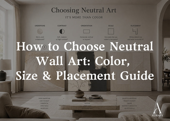
This guide walks through those five decisions in the order that actually prevents mismatches. Each step depends on the one before it, so working through them in sequence — rather than jumping straight to browsing — will narrow your options faster than scrolling a full beige wall art collection from the top.
Step 1: What undertone already leads the room?

What is the first thing to decide when choosing neutral wall art? Identify the undertone your room has already committed to — warm (beige, sand, taupe), cool (gray, greige with blue undertones), or true neutral (stone, oatmeal, unbleached white) — before looking at any artwork. Neutral is not one color; it is a family of undertones, and mixing warm and cool neutrals in the same sightline is what makes a room feel unresolved rather than calm.
Walk the room at midday and note where the undertone shows up most clearly: the sofa fabric, the rug, the wood tone of the floor or shelving. Paint color is a weaker signal than you'd expect, since wall paint shifts under different light. The largest fixed or hard-to-change surface — flooring, cabinetry, a large upholstered piece — should set the undertone you're matching to, because that's the surface you're not replacing.
Once you know the undertone, you're not choosing "neutral art" anymore. You're choosing warm-neutral art or cool-neutral art, which cuts a broad category down to a workable shortlist immediately.
Step 2: How much contrast does the wall need?

Should neutral artwork match the sofa? No — matching the sofa's exact tone usually makes both the art and the seating recede into each other. The goal is undertone agreement with a deliberate difference in value (how light or dark the piece reads), so the art stays visible as a distinct object rather than blending into the upholstery behind it.
This is where a lot of neutral-art shopping goes wrong. People assume "neutral" means "low contrast," and default to a piece that's barely a shade off the wall. That works in a room with other sources of visual interest — patterned textiles, layered lighting, varied furniture silhouettes. In a room that's already quiet, a low-contrast piece disappears, and you're left wondering why the art you paid attention to when buying it goes unnoticed once it's hung.
Look at your wall and ask what's already present in terms of contrast:
Sparse, monochrome room: choose art with real tonal range — light cream against deep charcoal, for instance — so it functions as the room's one clear focal point.
Busy or layered room: a softer-contrast piece keeps the wall from competing with everything else in the space.
A piece like the Organic Swirl Painting in cream, gray and charcoal tones illustrates the first case: flowing diagonal cream and gray bands set against charcoal negative space, giving a quiet room something to focus on without introducing color outside the neutral family.
Step 3: Which orientation fits the available wall?

How do you choose wall-art orientation? Match the artwork's orientation to the proportions of the wall space and the furniture beneath it, not to the shape of the piece you happen to like best. A tall, narrow wall segment — between a doorway and a window, for example — generally calls for vertical art. A wide, low expanse, such as the run above a sofa or console, generally calls for horizontal or square art.
This step is separate from size for a reason: two pieces can be the same overall dimensions and still read completely differently depending on whether that dimension runs up or across. A square piece and a vertical piece of similar height will sit very differently over a low sofa back — the square holds its position without pulling the eye upward, while the vertical draws attention toward the ceiling line.
If your wall is genuinely ambiguous — not clearly tall or clearly wide — let the furniture decide. Art placed above seating usually benefits from a horizontal or square shape that echoes the width of the piece below it, while art in a stairwell, hallway, or narrow gap between windows almost always reads better vertical.
Step 4: How large should the artwork read from the main viewpoint?

How large should neutral wall art be? Size the piece to the wall segment and the distance it's viewed from, not to a fixed rule of thumb. A common starting point is filling roughly 60–75% of the width of the furniture it hangs above, but the number that matters more is how the piece reads from where you actually sit or stand most often — across the room, not from three feet away.
Two mistakes show up repeatedly with neutral art specifically, because low-contrast pieces are more forgiving of sizing errors up close and less forgiving from a distance:
Undersizing above a large piece of furniture. A modestly sized piece over a wide sofa reads as an afterthought once you're viewing it from the opposite side of the room, even if it looked appropriately scaled when you held it up against the wall.
Choosing size in isolation from contrast. A large, low-contrast piece can still under-perform visually if nothing anchors the eye. If you're sizing up to fill a wall, pair that decision with the contrast level you settled on in Step 2 — a bigger canvas doesn't compensate for a composition that has nowhere for the eye to land.
A square-format piece like Silence Geometry in ivory and charcoal works at scale because its broad geometric divisions carry weight even from across a room — the composition doesn't rely on close-up detail to register.
Step 5: Where should the visual center sit?

Where should artwork be positioned? Center the visual mid-point of the artwork roughly at eye level for a standing adult when the piece hangs alone on open wall, or align it with the furniture below when it's placed above a sofa, console, or headboard — leaving enough blank wall around the frame that the piece reads as a distinct object rather than crowding the space.
Placement is the step most people treat as an afterthought, but it's where undertone, contrast, orientation, and size either come together or fall apart. A well-chosen piece hung too high above a low sofa creates a gap that reads as unplanned. The same piece hung so its center sits 6–8 inches above the furniture back usually resolves that gap and makes the whole grouping look intentional rather than accidental.
If you're hanging on an otherwise bare wall — a stairwell landing, an entry, a narrow hallway — eye-level centering (roughly 57–60 inches from the floor to the piece's midpoint) is the more reliable reference point, since there's no furniture line to key off instead.
Compare two verified neutral-art directions

Once undertone, contrast, orientation, and size are settled, most rooms end up choosing between two broad directions within neutral art: organic and geometric.
Organic, high-contrast, vertical — best for a narrow wall that needs one clear focal point. The Organic Swirl Painting is hand-painted with a 3D textured acrylic technique, using palette-knife relief to build flowing cream and gray bands over charcoal. Its vertical orientation and strong tonal range make it a fit for spaces identified in Step 3 as tall and narrow, and for rooms in Step 2 that need a definite focal point rather than background texture.
Geometric, structured, square — best for a wide, low wall segment above furniture. Silence Geometry is a hand-painted, textured-brushwork piece with broad charcoal geometric divisions set over an ivory field. The square format and strong ivory-charcoal contrast suit a wall where the furniture below is wide and low, and where the room can support a clear geometric anchor rather than a softer, blended tone.
If your room's contrast assessment in Step 2 landed on "needs something quieter," the Grid Relief Painting in cream and beige tones is worth a look before either of the two above — its nine rows of hand-applied vertical relief strips sit in a much narrower cream-to-beige range, with the texture itself doing more of the visual work than tonal contrast.
Both directions, along with related pieces, sit within the site's minimalist art collection, where composition style is easier to compare side by side once you already know which orientation and contrast level you're shopping for.
Final decision checklist

Before you compare individual pieces, confirm you can answer each of these in order:
Undertone: Is the room warm-neutral, cool-neutral, or true neutral, based on the largest fixed surface?
Contrast: Does the room need a clear focal point (higher contrast) or a quieter layer (lower contrast)?
Orientation: Is the wall segment taller than it is wide, or wider than it is tall?
Scale: Does the piece hold its own from where you actually view it, not just up close?
Placement: Does the visual center align with eye level or with the furniture beneath it, with enough blank wall left around it?
Working through those five in order — rather than starting from a color you like — is what separates art that gets noticed once and forgotten from art that continues to anchor the room a year later.
Frequently asked questions
Should wall art be lighter or darker than the sofa?
Neither is a fixed rule; what matters is that the art's value is different enough from the sofa's to stay visually distinct. A piece within the same undertone family but one or two shades lighter or darker than the upholstery will register as its own object instead of blending in.
Is square or vertical artwork better for a narrow wall?
Vertical generally suits a narrow wall better, since the shape follows the available space and draws the eye along its height rather than trying to stretch a wide format into a tight gap.
How much blank wall should remain around artwork?
Enough that the piece reads as a distinct focal point rather than crowding the edges of the wall or furniture — as a rough guide, several inches of breathing room on all sides, more for larger statement pieces and less in a tight hallway.
Can neutral artwork have strong contrast?
Yes. Neutral refers to the color family — cream, beige, gray, charcoal, ivory — not to how much tonal range the piece contains. A high-contrast neutral piece, like cream against charcoal, can anchor a room just as effectively as a bold color choice would, without introducing hue outside the room's existing palette.
Share:
How to Choose Neutral Textured Wall Art for a Living Room
Beige Textured Wall Art for Living Rooms