


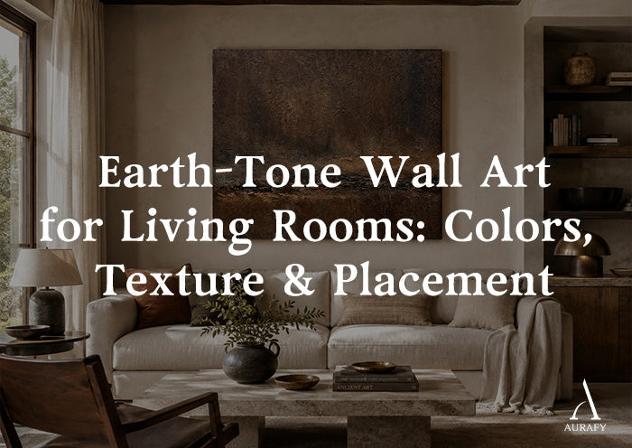
Earth-Tone Wall Art for Living Rooms

Earth-tone wall art works because it borrows its palette from things you already trust — clay, bark, dried grass, rusted metal. But "earth tone" isn't one color story. It's at least six, and mixing them up is the fastest way to end up with a piece that looks muddy instead of grounded. This guide breaks down the families, how to read undertones against your existing furniture, and where texture and placement actually matter versus where they're just preference.
What Counts as an Earth Tone, and Why the Family Matters

Earth tones fall into six overlapping but distinct families: clay, umber, ochre, bronze, rust, and sand. Each one reads differently in a room, and confusing them is why some earth-tone art clashes instead of anchoring a space.
Clay is a warm, matte terracotta-adjacent tone — think unglazed pottery. It leans orange-pink and works best as a mid-tone accent rather than a dominant field, because too much of it can start to look like a pumpkin display.
Umber is a deep brown with cooler undertones than clay, closer to raw earth or aged leather. It's the workhorse neutral of the earth-tone family — it recedes rather than demands attention, which makes it useful as a base color in larger pieces.
Ochre is a yellow-brown, closer to mustard or turmeric depending on saturation. It's the most polarizing of the six because it can skew warm-cheerful or warm-dated depending on what's paired with it. Ochre next to ivory or onyx, rather than next to more yellow tones, tends to keep it looking intentional instead of retro.
Bronze carries metallic undertones even in flat paint or canvas work — a bit of olive, a bit of copper. It photographs differently in daylight versus lamplight more than any other earth tone, which matters for placement (more on that below).
Rust is the reddest of the group, closer to oxidized iron than to clay's pink-orange. It's the highest-contrast earth tone and the one most likely to function as a focal accent rather than a background note.
Sand is the lightest and most neutral — closer to a warm greige than a color. It's the safest choice for smaller rooms or rooms with a lot of competing pattern, because it doesn't ask for much visual real estate.
The mistake most people make isn't choosing an ugly earth tone. It's mixing families that don't share an undertone — pairing a cool umber sofa with a warm ochre painting, for instance — and ending up with a wall that looks slightly off without being able to say why.
Match or Contrast? Reading Your Sofa Before You Read the Art

Direct answer: match your art's undertone family to your sofa's undertone, and use contrast in value (light versus dark) or saturation instead of contrast in hue.
If you have a beige or oatmeal sofa, it almost certainly has a warm undertone, which pairs naturally with sand, ochre, or clay-based art. A piece like Earthen Harmony Wall Art in Ochre, Ivory & Onyx Earthen Harmony Wall Art-Ochre, Ivory & Onyx-AURA054 works in this scenario because its beige-and-brown neutral palette sits in the same warm family as a beige sofa without repeating it exactly — the onyx accents give it enough contrast in value to stand apart from the wall and the seating instead of blending into a single beige mass.
Gray sofas are trickier because gray itself doesn't have a strong undertone commitment — it can lean warm (greige) or cool (charcoal-blue). Cooler gray sofas pair well with umber or bronze pieces, which have enough depth to contrast against a cool base without fighting it. A piece such as Terra Meridian Painting in Burnished Bronze & Espresso Umber Terra Meridian Painting-Burnished Bronze & Espresso Umber-AURA014 reads well against cool gray upholstery because its espresso and umber base gives it enough weight to hold its own, while the bronze and chestnut undertones keep it from looking flat or purely brown.
Leather sofas — especially cognac, chestnut, or saddle tones — are already earth-toned themselves, so the goal shifts from matching to layering. You want art that shares a family but isn't a literal color match, or the wall and the seating start to look like they were bought as a set rather than curated. Rust-toned pieces, like Urban Erosion Painting in Rust & Neutral Tones Urban Erosion Painting-Rust & Neutral Tones-AURA027, tend to work well against leather because rust sits close enough to sit comfortably but has enough red saturation to read as a distinct accent rather than a repeat of the sofa's color.
Texture: When It Should Match the Room and When It Shouldn't

Direct answer: texture should contrast with your dominant surface finish, not match it — a smooth-finish room benefits from textured art, and a heavily textured room benefits from a visually smoother piece.
This is where earth-tone art earns its keep beyond color. A lot of earth-tone painting is hand-worked with visible brush or palette texture, which behaves differently under light than a piece with a visually smooth surface would. In a room dominated by smooth surfaces — a leather sofa, a glass coffee table, painted drywall — a textured canvas adds a tactile layer that a flatter surface can't. This is part of why hand-painted, textured-canvas work like Terra Meridian tends to feel more substantial on a wall than a smoother alternative; the horizon-like composition and visible texture give it a physical presence rather than just a color block.
The inverse holds too. If your room already has a lot of texture — a chunky-knit throw, a jute rug, exposed wood beams — a heavily textured painting can start to compete rather than complement. In that case, a piece with cleaner geometric structure, like the abstract geometric layout of Earthen Harmony, gives the room a visual rest point instead of adding another textured surface to an already busy mix.
Texture also interacts with color saturation. Rust and clay tones, which are more saturated, tend to look better with some surface texture because the texture breaks up the intensity and keeps the color from reading as flat and graphic. Sand and umber, being closer to neutral, can carry a smoother finish without losing their grounding effect.
Daylight vs. Lamplight: Why the Same Piece Looks Different by Evening

Direct answer: bronze and rust tones shift the most between daylight and warm lamplight, while sand and umber stay comparatively stable — so consider your room's primary light source before finalizing your undertone.
Bronze, because it carries some metallic undertone, tends to look more olive and muted in cool daylight and warmer, almost coppery, under incandescent or warm LED lamplight in the evening. If your living room gets strong north-facing daylight for most of the day but you spend evenings there under lamps, a bronze piece will essentially give you two different looks — which can be a feature if you like variation, or a problem if you were sold on the daytime version and find the evening version too warm.
Rust behaves similarly but more dramatically, since it's already the most saturated of the six families. Under warm lamplight, rust can intensify toward a deeper red-orange that reads more dramatic than it did earlier in the day. This is worth checking in person or under your room's actual evening light before committing to a large-format rust piece, since scale amplifies whatever color shift is happening.
Sand and umber are the safer choices if your lighting is inconsistent or you haven't settled on your evening lighting plan yet, because their lower saturation means the shift between light sources is more subtle. Ochre sits in between — it warms up under lamplight but doesn't swing as dramatically as rust or bronze.
If you're set on a bronze or rust piece and your room leans heavily toward one light source, that's not a reason to avoid it — it's a reason to view it under that light source before hanging it, not just under retail photography.
Orientation and Scale: Matching the Painting to the Wall, Not the Trend

Direct answer: horizontal pieces suit wide, low sightlines above sofas and consoles; vertical pieces suit narrower walls or spaces that need visual height; there's no single universal size rule, but mocking up the space on your actual wall is more reliable than guessing from a product photo.
Horizontal orientation works best above a sofa, credenza, or console table where the wall space is wider than it is tall. Terra Meridian's horizon-like composition is a good example of horizontal art doing double duty — the composition itself echoes the horizontal line of a sofa back, reinforcing the sense of a grounded, wide focal point rather than fighting the furniture's proportions. It's available across a horizontal selector range from 20x40 up through 55x110 inches, which gives you room to scale up for a longer sofa wall or scale down for a smaller console.
Vertical orientation suits narrower walls, spaces flanking a doorway or window, or rooms where you want to draw the eye upward — useful in living rooms with lower ceilings, where a vertical piece can make the wall feel taller without any structural change. Both the Wabi-Sabi Patina Wall Art in Weathered Copper & Tobacco Umber Wabi-Sabi Patina Wall Art-Weathered Copper & Tobacco Umber-AURA017 and Urban Erosion's rust-and-neutral palette are available in vertical formats, which makes them worth considering for exactly this kind of narrower wall situation, rather than forcing a horizontal piece into a space that doesn't suit it.
Square formats are the most flexible for irregular walls, gallery-style groupings, or spaces where you're not committed to a strict horizontal or vertical axis. Earthen Harmony's square format, with a selector range from 28x28 up through 80x80 inches, means the same composition can function as a modest accent piece or scale up to anchor an entire wall, depending on the size you choose.
On scale specifically: there isn't a single rule that works for every wall, because ceiling height, furniture size, and how much negative space you want all change the answer. One low-effort way to test scale before buying is to run painter's tape along the wall in the rough outline of the size you're considering — as a starting point, some people like the outline to cover somewhere around two-thirds of the furniture's width below it, but that's a visualization aid, not a fixed formula. Live with the taped outline for a day or two and adjust based on how much breathing room the wall has above and beside it.
Avoiding "Too Brown": Where Earth Tones Go Wrong

Direct answer: rooms read as "too brown" when every element sits in the same narrow value range with no contrast in lightness or saturation — the fix is usually adding one lighter or higher-contrast element, not removing color.
This is the most common complaint about earth-tone rooms, and it's rarely about the actual hues being wrong. It's a value problem — everything sitting at a similar medium-to-dark brightness with nothing to break it up. A room with a brown leather sofa, wood floors, and a mid-tone umber painting can start to feel heavy and undifferentiated, even if every individual piece is attractive on its own.
The fix isn't to abandon the earth-tone palette — it's to introduce contrast within it. Ivory or onyx accents within the art itself, like those in Earthen Harmony, do this job without introducing an unrelated color family. A piece with visible lighter and darker passages — rather than one flat mid-tone — gives the eye somewhere to land and breaks up what would otherwise be a wall of uniform brown.
Saturation contrast works the same way. If your furniture and flooring are all low-saturation neutrals, a more saturated rust or ochre piece reads as an accent rather than "more brown." This is part of why rust-forward pieces tend to work well as a single focal point in earth-toned rooms rather than as one of several similarly-toned pieces — the saturation does the contrast work that a different color family would otherwise need to do.
A Short Checklist Before You Buy

- Identify your sofa and floor undertone first — warm (beige, oatmeal, cognac leather) or cool (charcoal gray, cool-toned wood) — and choose an earth-tone family that shares it.
- Decide whether you need texture contrast (smooth room, add texture) or texture restraint (busy room, keep it smoother).
- Check the piece under your room's actual evening lighting if you're considering bronze or rust, since both shift more than sand or umber.
- Measure the wall and mock up your chosen orientation with painter's tape before picking horizontal, vertical, or square.
- Look for at least one lighter or higher-contrast element within the piece itself if the rest of your room already sits in a mid-to-dark brown range.
If you want to see how these families sit next to each other before deciding, the Wabi-Sabi art collection and the best sellers collection are useful places to compare orientation and palette side by side rather than judging a single product page in isolation.
Frequently Asked Questions
What's the difference between rust and clay wall art?
Rust leans red-orange, closer to oxidized metal, and tends to be the most saturated and highest-contrast of the earth tones — good as a single focal accent. Clay is warmer and more pink-orange, closer to raw pottery, and works better as a supporting mid-tone rather than the room's boldest element. If your room already has strong color elsewhere, rust is more likely to compete; clay blends more easily.
Can I mix two different earth-tone families in the same room?
Yes, but it's easier to keep them in the same value range (both mid-tone, or both light) than to mix a very dark umber piece with a very light sand piece and expect them to read as coordinated. The safest combinations share an undertone — warm ochre with warm clay, or cool umber with cool bronze — rather than mixing warm and cool earth tones in the same sightline.
Does earth-tone wall art work in a small living room?
It can, particularly lighter families like sand or a light-value ochre, which don't visually shrink the space the way a large dark umber or rust piece might. In a small room, a single well-scaled piece with some lighter passages tends to read better than multiple smaller earth-toned pieces competing for the same wall.
Should earth-tone art match my wood floor or contrast with it?
Contrast in value works better than an exact match. If your floor is a warm mid-tone wood, art with some lighter or darker passages — rather than an identical mid-brown — keeps the floor and the wall from blending into one indistinct mass, especially in rooms with limited natural light.
Choosing Between the Families
If you're still deciding, let your existing undertone make the call rather than a trend. Warm beige or leather rooms lean toward ochre, clay, or sand; cooler gray rooms lean toward umber or bronze; rooms that need one confident accent point toward rust. From there, weigh texture against your room's existing surfaces, check your top contenders under both daylight and lamplight, and let orientation follow your wall shape rather than the reverse. Browse the Wabi-Sabi art collection to compare palettes side by side before you commit to a size.
Share:
How to Choose Wabi Sabi Wall Art for a Living Room
Brown and Beige Abstract Wall Art for Warm Neutral Interiors