


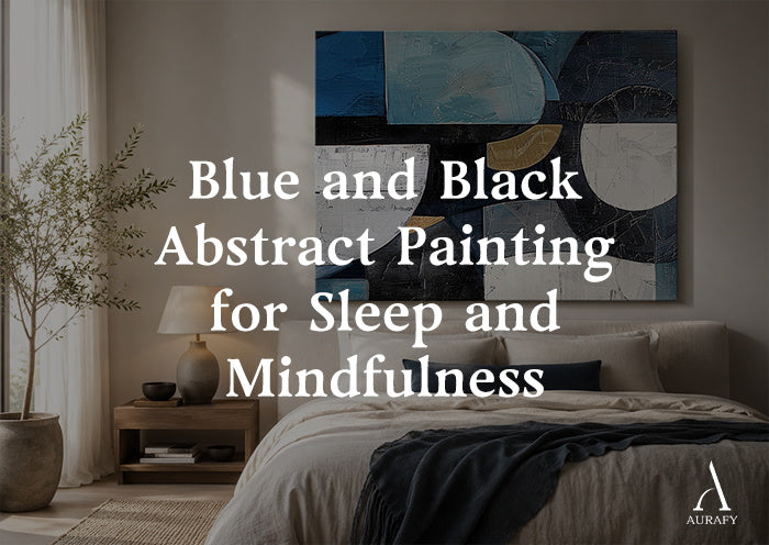
- A blue and black abstract painting in 3D mineral relief functions as a sensory absorber in a bedroom — the matte black base captures ambient light that would otherwise continue stimulating the visual cortex after you close your eyes.
- Mineral-reflected blue at 450 to 480nm wavelength — the kind produced by cobalt and ultramarine pigments in matte paste, not by digital screens — activates the parasympathetic nervous system and supports the physiological transition toward sleep.
- The micro-shadows produced by 15 to 20mm surface relief under low ambient light move and shift slowly with the room's changing light conditions — the brain processes this slow movement as a visual analog to natural rhythms like tides or breath, which supports the shift from active beta-wave thinking to pre-sleep alpha and theta states.
- For a deep-rest bedroom, use 70 percent matte black and 30 percent deep cobalt blue — the black absorbs stray light and the blue provides a chromatic anchor without introducing visual stimulation.
- Flat blue canvas prints fail in a sleep environment because their coated surfaces reflect light rather than absorbing it — the opposite of what a bedroom wall needs after dark.
Modern bedrooms fail sleep more often than most people realize.
The problem is not simply light pollution from outside. It is the accumulation of low-level visual stimulation from within the room itself — the ambient glow of standby indicators, the slight reflectance of smooth painted walls under streetlight seeping through curtains, the flat surfaces of ceiling fixtures that catch and scatter available light in all directions.
None of these light sources is bright enough to register consciously. Together, they maintain a background level of retinal stimulation that prevents the visual cortex from completing its disengagement from active processing. Melatonin production is suppressed. The transition from wakefulness to sleep is delayed and disrupted — not dramatically, but chronically.
A blue and black abstract painting in 3D mineral relief addresses this problem at a material level. This is not a metaphorical claim. The optical properties of matte black mineral paste, the specific wavelength of mineral-reflected cobalt blue, and the micro-shadow behavior of a deeply textured surface all have measurable effects on how the visual environment of a bedroom behaves after dark.
Neural Chromatics: How Blue and Black Wavelengths Affect the Nervous System

The relationship between color wavelength and neurological state is one of the better-documented areas of environmental psychology. The specific effects of blue and its interaction with black in a low-light environment are directly relevant to the bedroom application.
The distinction between digital blue and mineral blue
The blue light associated with sleep disruption — the blue emitted by phone screens, televisions, and LED ceiling fixtures — falls primarily in the 460 to 480nm wavelength range at high luminance. It is this combination of wavelength and brightness that suppresses melatonin production and delays sleep onset.
The blue produced by mineral cobalt and ultramarine pigments in a matte paste surface behaves entirely differently. The pigment reflects incoming light selectively — returning only the blue wavelengths in the 450 to 480nm range while absorbing most of the incident light energy. The luminance of this reflected blue is a fraction of the luminance of digital blue — it is a soft, absorbed blue rather than an emitted one.
Under the low ambient light conditions of a bedroom at night, a cobalt blue mineral surface reads as a deep, matte presence rather than a light source. The visual cortex registers the blue wavelength without receiving the high-luminance stimulus that triggers the alerting response. The neurological effect of mineral blue at low luminance is the opposite of digital blue at high luminance: it activates the parasympathetic nervous system — the calming branch — rather than the sympathetic system's alert response.
What the black base actually does to light
The black mineral paste used in a blue black abstract painting is not simply the visual absence of color. It is a material with a specific optical property: near-total light absorption. Carbon black mineral compound absorbs approximately 95 to 98 percent of incident light across the visible spectrum, returning almost nothing to the room.
In a bedroom context, this absorption function is specifically valuable. Every surface in a room contributes to the room's total ambient light level — walls, ceiling, and objects reflect some portion of whatever light enters the space. A dark matte surface reduces this contribution to near zero in its area of the wall.
A large-format black and blue abstract painting with a predominantly black mineral base reduces the ambient light contribution from the section of wall it occupies. In practical terms, the bedroom gets darker where the painting is — not dramatically, but measurably. For light-sensitive sleepers, this reduction matters.
The black surface also eliminates the specific visual problem of a flat, smooth wall under low light — the way a painted wall develops a slight glow as it scatters available light across its surface. The matte black mineral absorbs this scatter and eliminates the glow. The wall behind the painting becomes optically passive.
Chrono-Texture: How Surface Relief Creates Slow Visual Entrainment

The 3D surface depth of a handmade abstract painting does something in a low-light bedroom environment that no flat surface can replicate: it creates a field of micro-shadows that shift and change slowly as the room's ambient light changes through the night.
What micro-shadows do in a dark room
Under a bedside reading lamp at low setting, the raised ridges of a blue and black abstract painting with 15 to 20mm of surface relief cast small, precise shadows into the channels between them. These shadows are not dramatic — they are subtle, slightly darker zones within an already-dark surface. But they are present, and they change.
As the reading lamp dims further, the shadows deepen slightly. If moonlight enters the room at a low angle, the shadows shift direction. As the viewer moves their head on the pillow, their viewing angle to the surface changes and different ridge faces catch the low light. The surface is never completely static.
Why this slow movement supports sleep
The visual cortex processes slow, rhythmic movement differently from static images and from fast movement. Slow, non-repeating visual movement — the kind produced by low-frequency natural phenomena like waves, clouds, and fire — reduces cortical arousal. The brain shifts from the active pattern-recognition and information-processing mode of wakefulness toward the passive, diffuse processing mode that precedes sleep.
A textured surface under low ambient light produces exactly this kind of slow, non-repeating visual movement. The micro-shadow field changes gradually and without regularity — no two moments in the shadow pattern are identical. The brain cannot predict what the pattern will do next, which prevents it from generating the repetitive tracking response. Instead, attention diffuses across the surface without fixating on any specific element.
This diffusion of attention is the visual equivalent of the breath-focus technique in meditation practice — the mind settles on the surface without engaging with it analytically. The transition from the analytical, linguistic thinking of the beta-wave waking state toward the associative, imagistic thinking of the alpha and theta pre-sleep states begins.
The difference from flat blue art
A flat blue canvas print in a bedroom does not produce this effect. Its surface is static — no shadows, no variation, no movement. The visual cortex engages with it briefly and then ignores it. Moreover, most flat canvas prints have a slight surface coating — UV laminate or acrylic medium — that produces a low-level specular reflection at certain angles. In a dark room, this reflection registers as a faint glow: a surface that is adding light to the environment rather than absorbing it.
The flat blue print fails the bedroom application at two levels: it does not provide the micro-shadow movement that supports cortical deactivation, and its surface coating adds rather than removes ambient light from the room.
Application Guide: Blue-Black Ratios for Three Rest Environments

The correct proportion of blue and black in the composition depends on the specific sensory function the space requires. These are not aesthetic choices — they are psychological calibrations.
Deep-rest bedrooms for light-sensitive sleepers
The primary requirement in this environment is light absorption and chromatic quietness. Every surface element needs to support the shift toward unconsciousness rather than maintaining alertness.
Use 70 percent matte black mineral paste as the dominant surface and 30 percent deep cobalt or prussian blue. The black provides the maximum light absorption and the minimum visual stimulus. The blue provides a tonal anchor — a point of chromatic warmth within the dark field that prevents the composition from reading as empty or oppressive. The blue does not stimulate. It provides depth.
Choose deep cobalt over bright cerulean or aqua. Deep cobalt's saturation is high but its value is low — it reads as dark blue rather than bright blue, which maintains the low-luminance quality the deep-rest environment requires.
Home meditation rooms and yoga spaces
The sensory requirement in a meditation or yoga space is different from a sleep environment. The goal is not unconsciousness but focused, present attention — the absorption of active thinking into a quiet, breath-centered awareness. This requires a visual environment that provides a focal point without demanding analytical engagement.
A black and blue abstract painting with 50 percent fluid Klein blue, 30 percent charcoal black breathing lines, and 20 percent lead-grey transitional zones serves this function. The high-saturation Klein blue provides a visual focal point strong enough to hold the meditator's attention without requiring interpretation. The charcoal lines give the eye a path to follow — the fluid, non-repeating curves of hand-applied knife strokes mirror the movement of breath without depicting it. The grey transitional zones soften the boundary between blue and black, preventing the contrast from reading as sharp or energetically high.
The flowing quality of the composition — the absence of straight lines, geometric patterns, or representational imagery — supports the specific cognitive state of mindfulness practice: present, non-analytical, open. The eye rests on the surface without reading it.
Morning-awakening master suites
A bedroom designed for quality sleep but also for a gentle, clear morning awakening requires a composition that functions differently in the room's two primary light conditions: the low-light of night and the natural light of morning.
A composition with 60 percent bright mid-value blue, 20 percent charcoal black, and 20 percent white clay mineral paste addresses both conditions. At night, under low ambient light, the deeper value of the charcoal provides the absorption function and the blue reads as contained and quiet. In the morning, under natural light, the white clay paste activates — its warm, slightly granular surface scatters morning light diffusely across the canvas rather than reflecting it sharply. The blue reads as bright and present. The composition supports gentle cortical reactivation rather than the jarring stimulus of a bright lamp or phone screen.
The white clay paste is specifically important here. Its warm undertone — cooler than titanium white but warmer than grey — diffuses natural morning light without producing the high-contrast reflective response that would signal the visual cortex to move into high-alert mode. The awakening is gradual and physiologically smooth.
The Psychology of Hand-Made Marks in a Sleep Environment

There is an aspect of handmade textured art in a bedroom context that falls outside color psychology and into evolutionary psychology — and it may be the most important quality of all.
Human beings evolved in environments where surfaces were never perfectly smooth. Rock, soil, bark, water, woven fiber — every surface in the natural world has variation, texture, and non-repeating pattern. The visual cortex developed in this context and is calibrated to process it.
Contemporary bedroom surfaces — smooth latex paint, flat plasterboard, laminated furniture panels — present a visual environment that is evolutionarily novel. Every surface is perfectly smooth. Every edge is perfectly straight. No surface has the organic variation that the visual system evolved to process as "safe" and "natural."
The chronic, low-level mismatch between what the visual cortex expects and what contemporary bedroom surfaces provide may contribute to the subtle environmental stress that makes modern bedrooms less restful than their design quality suggests they should be.
A handmade blue and black abstract painting with 3D surface relief restores something of the organic material environment the visual cortex recognizes as natural. The hand-applied paste surfaces carry the variations and irregularities of a material shaped by human hands — the slight roughness of the dried paste, the directional quality of the knife strokes, the non-repeating variation in ridge height across the composition. The wall, in the area occupied by the painting, presents a surface that the visual system reads as materially honest.
This honest material quality is not a decorative addition to the bedroom. It is a physiological one. The room becomes, in that area of the wall, a space the body recognizes as a place where rest is possible.
The Material Case for Blue and Black in Rest Spaces

The choice of a blue and black abstract painting for a bedroom, meditation room, or yoga space is ultimately a material choice as much as an aesthetic one.
The matte mineral surface absorbs light rather than reflecting it. The cobalt or prussian blue pigment reflects at the specific wavelength that activates parasympathetic calming rather than sympathetic alerting. The 3D surface relief creates the slow micro-shadow movement that supports cortical deactivation. The hand-applied marks provide the organic material variation that the visual system registers as environmentally safe.
None of these properties are available in a flat canvas print, regardless of its color or design. The print's coated surface reflects. Its flat plane produces no shadows. Its machine-produced or digitally generated marks lack the organic variation that distinguishes natural from synthetic surfaces.
The bedroom deserves the material that actually does the sensory work the space requires. Not the simulation of calm, but its physical substrate.
Explore the AurafyArt blue and black collection — and find the handmade piece calibrated for the specific rest function your bedroom or meditation space needs.
Share:
Red Black and Gold Art on Concrete and Brick Walls
Black White and Blue Abstract Art for Tech Desks and Studios