


News

Bronze Wall Art for Modern and Wabi Sabi Interiors
Bronze wall art for modern interiors works best when its finish, surrounding palette, lighting, scale, and orientation are considered together. This guide explains how bronze shifts from earthy and grounded with umber tones to more modern and contrast-driven with charcoal, while showing how daylight, warm artificial light, texture, and placement affect the way the artwork reads in modern and Wabi Sabi spaces.

Rust and Copper Wall Art for Warm Earth-Tone Interiors
Rust colored wall art works best in warm earth-tone interiors when the tone, texture, backdrop, and scale are chosen together. This guide compares rust, terracotta, copper, and umber, then explains how each works with beige, cream, dark wood, and charcoal, plus how lighting, orientation, and placement affect the final look.

Ivory Textured Wall Art for Japandi Interiors
Ivory textured wall art works especially well in Japandi and minimalist interiors because it adds warmth, relief, and visual depth without disrupting a restrained neutral palette. This guide explains how ivory compares with white and cream, how undertone and lighting affect texture, and how to coordinate it with wood, linen, stone, negative space, scale, and placement.
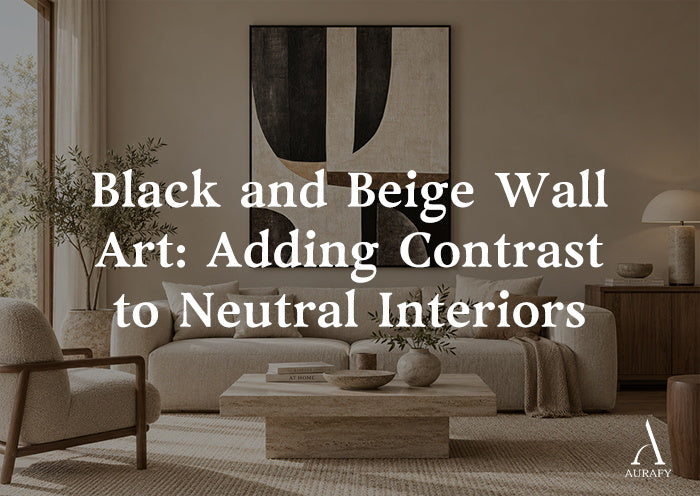
Black and Beige Wall Art for Neutral Interiors
Black and beige wall art adds contrast to neutral interiors without sacrificing warmth. Choose the right piece by considering how much black the room can support, matching beige undertones to existing materials, and balancing texture, lighting, scale, and geometry with the space.
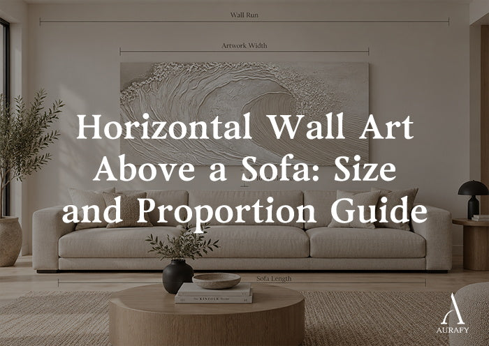
Horizontal Wall Art Above a Sofa: Proportion Guide
Horizontal wall art above a sofa looks most balanced when its width is about two-thirds to three-quarters of the sofa, the aspect ratio fits the wall, and the artwork hangs 6–10 inches above the sofa back. This guide compares sizing for loveseats, standard sofas, and sectionals, along with panoramic ratios, groupings, texture, and lighting to help you choose a proportion that feels intentional rather than undersized or crowded.

Large Textured Wall Art for Living Rooms
Large textured wall art for a living room works best when size, visual weight, viewing distance, orientation, lighting, and negative space are considered together. Use sofa and wall measurements as a starting point, then adjust for relief depth and how the artwork reads from across the room.
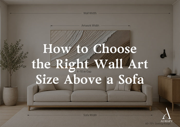
How to Choose the Right Wall Art Size Above a Sofa
For wall art above a sofa, start with artwork that spans about 60% to 75% of the sofa width and position the bottom edge roughly 6 to 10 inches above the sofa back. Then check the actual wall width, ceiling height, the artwork’s visual weight, and whether a single large piece or grouped arrangement fits the room better. Treat these measurements as starting points rather than fixed rules.
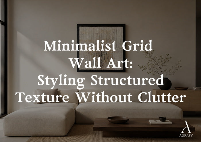
Minimalist Grid Wall Art Without Visual Clutter
Minimalist grid wall art brings structure to a room without creating visual clutter when spacing, negative space, symmetry, texture, and scale are carefully balanced. This guide explains how to choose between symmetrical and asymmetrical grid compositions, match horizontal, vertical, or square formats to different wall shapes, coordinate neutral palettes with wall colors, and use relief texture and lighting to add depth. It also covers practical placement above sofas and consoles, helping homeowners choose grid artwork that feels calm, intentional, and visually balanced.
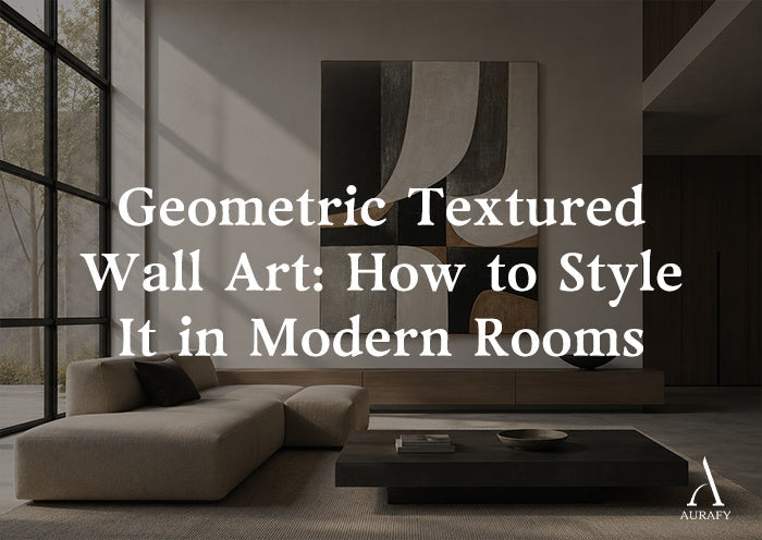
Geometric Textured Wall Art: How to Style It in Modern Rooms
Geometric textured wall art works best when its shape, relief, scale, and orientation respond to the room’s existing furniture lines and architecture. This guide explains how to style it in modern living rooms, dining rooms, bedrooms, and entryways by balancing contrast, lighting, negative space, palette, and furniture geometry.